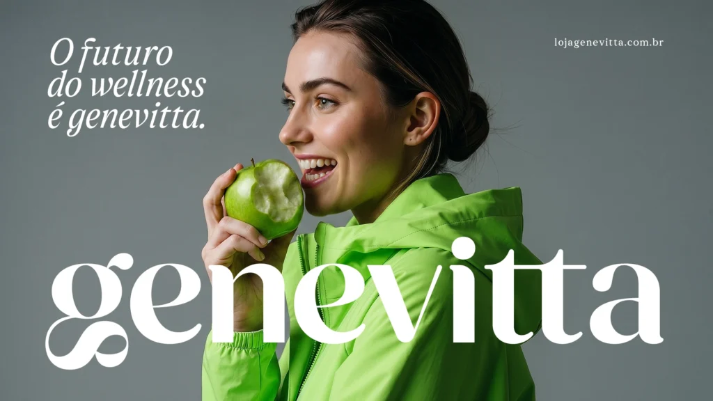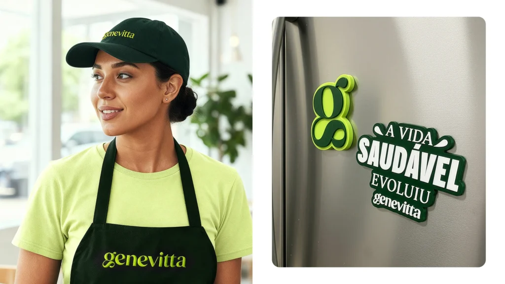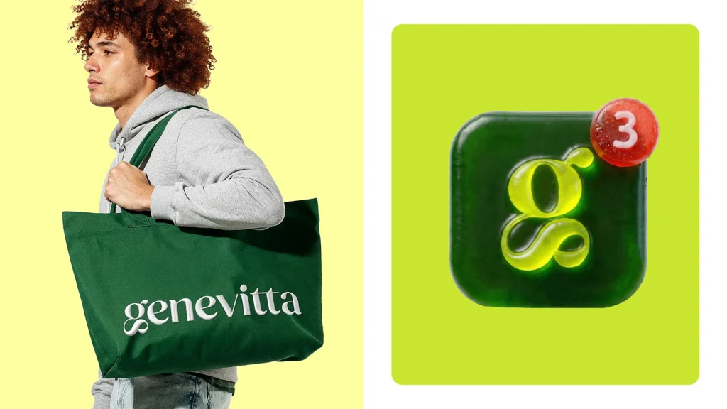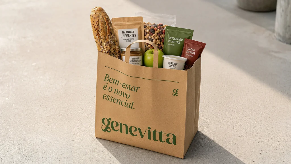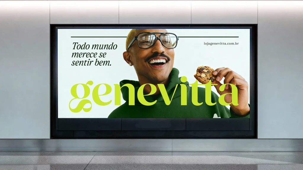

This is Genevita's brand design. Genevita has established a new identity by expanding from a market centered on healthy groceries into an ecosystem encompassing wellness, convenience, and lifestyle. This rebranding demonstrates that the brand has shifted from merely talking about 'healthy food' to addressing the entirety of everyday well-being.
The new symbol originates from the first letter of Genevita, 'g'. Transformed into a single, unbroken link, the 'g' symbolizes connection, balance, and movement. It is a design that compresses the continuous flow of body, mind, and routine into a single form. The typography and whitespace, which are more solid than before, add a sense of stability to the brand, while the deepened green color transforms healthiness into a calmer and more enduring image.
The brand message has also been expanded. The phrase “The future of wellness is Genevita” functions as a linguistic platform that extends to products, campaigns, spaces, and sub-brands. This project is akin to a brand system designed to enable Genevita to expand nationwide. It embodies the direction that a healthy lifestyle has become a natural part of daily life, rather than a special choice.