Gangnam Unnie has unveiled a new brand identity. This rebranding focused on integrating the brand experience used in Korea with the service experience abroad into a single brand framework. This change aims to more clearly convey the identity of the service, which has grown into a medical tourism and aesthetic medical platform.
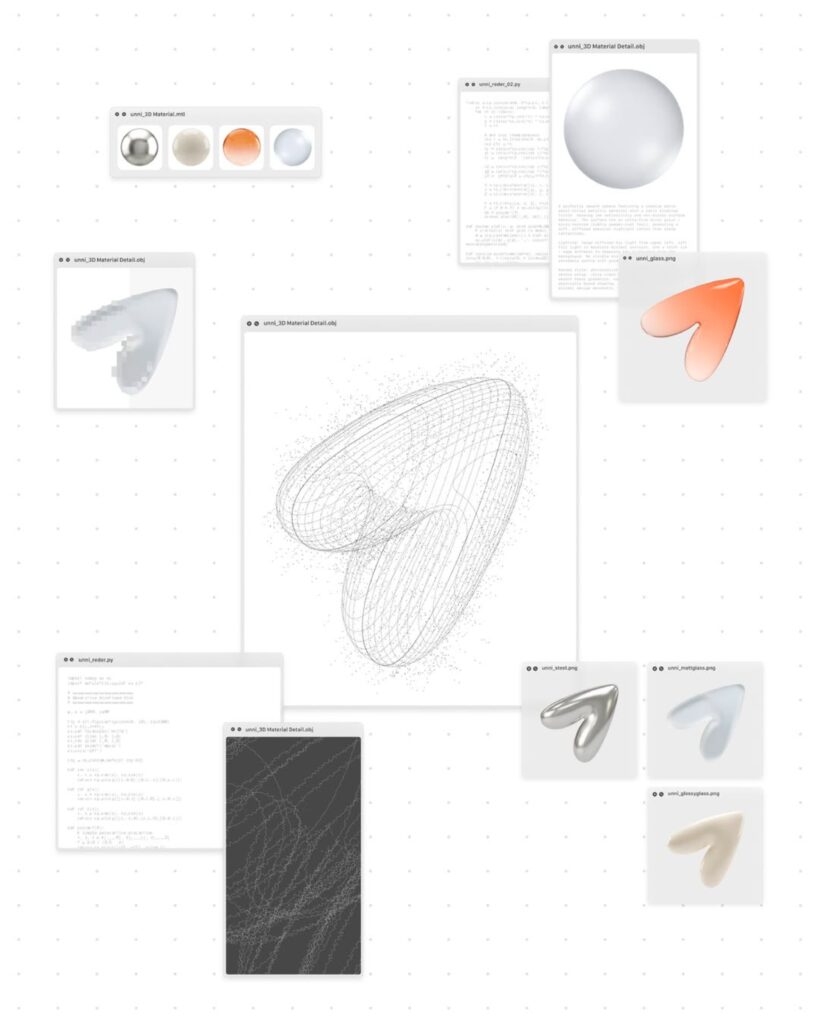
The new brand has revamped its overall design system, including the logo, symbol, colors, typography, and illustrations. While maintaining the existing friendly image, the design has been refined into a concise form suitable for global services. Design assets have been integrated to provide a consistent brand experience across apps, the web, marketing, and offline touchpoints. Furthermore, a foundation has been laid to apply a consistent interface throughout the service flow, extending from medical information search to hospital appointments.
From the user's perspective, service screens and brand presentation methods become more unified. Users in Korea, as well as overseas in Japan, Thailand, and other regions, will receive the same brand experience. Another feature of this rebranding is the ability to enhance brand awareness during the hospital search and reservation process, and to manage design elements that were previously scattered across countries into a single system. This can be viewed as an example of revamping brand design alongside a medical platform as it expands beyond a simple reservation service into a global healthcare brand.
More and Sources