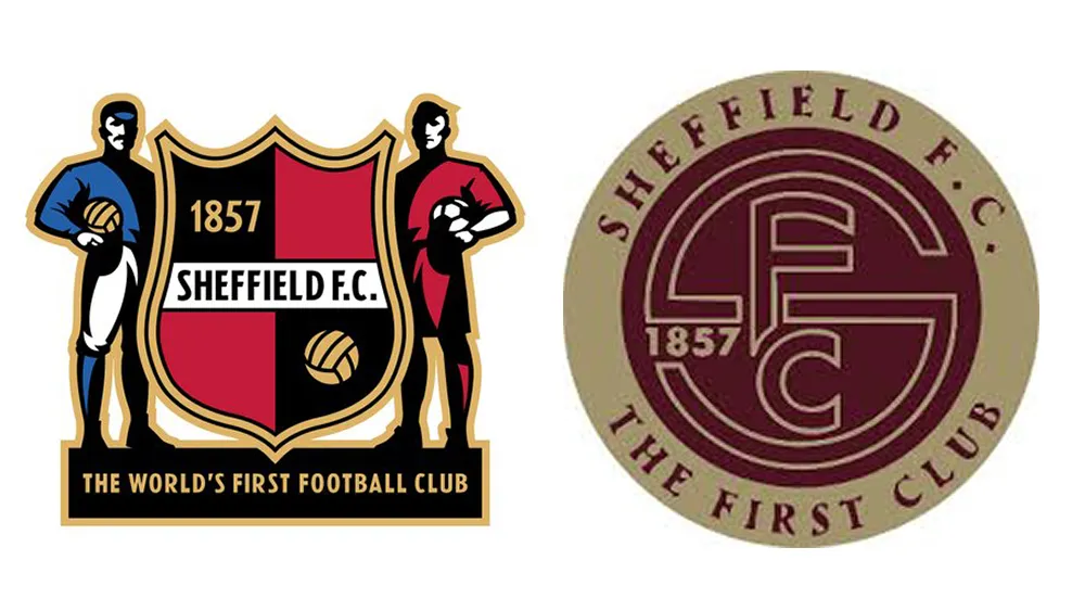
Controversy over the world's oldest football club logo
Sheffield FC, known as the oldest football club in the world, has unveiled a new logo. Founded in 1857, Sheffield FC is the oldest football club in the world recognized by FIFA and is one of the few clubs to have received the FIFA Centennial Order of Merit.
The new logo has largely eliminated the shield shape, player illustrations on either side, and various decorative elements of the previous emblem. Instead, it has been changed to a simple form containing only 'SFC', the founding year '1857', and the phrase 'The First Club' inside a circular badge. The club explained that the change was inspired by historic gold medals and FIFA Achievement Awards, serving to honor tradition while preparing for a new era.
However, the fans' reaction was cold. Criticism continues that the historical significance and symbolism of the previous logo have disappeared. Some fans described the new logo as "boring" and "terrible," while others argued that "the world's oldest football club does not need a modern logo." Criticism regarding the design's quality also persisted. Many pointed out issues with letter spacing, the typeface, and the readability of the centered "SFC.".
Recently, there has been an increasing number of football clubs simplifying their logos to adapt to the digital environment. This is due to the advantage of being easy to apply across various screens, merchandise, and uniforms. However, for a club with a long history like Sheffield FC, the logo itself represents the brand's history and the fans' memories. This case serves as a reminder of the importance of maintaining a balance between modern design and tradition.
From freelancer to head of design at a unicorn startup, I've been creating impact through brand and product design for over 18 years. Currently, as CEO and editor-in-chief of Design Compass, I research design that drives business impact.