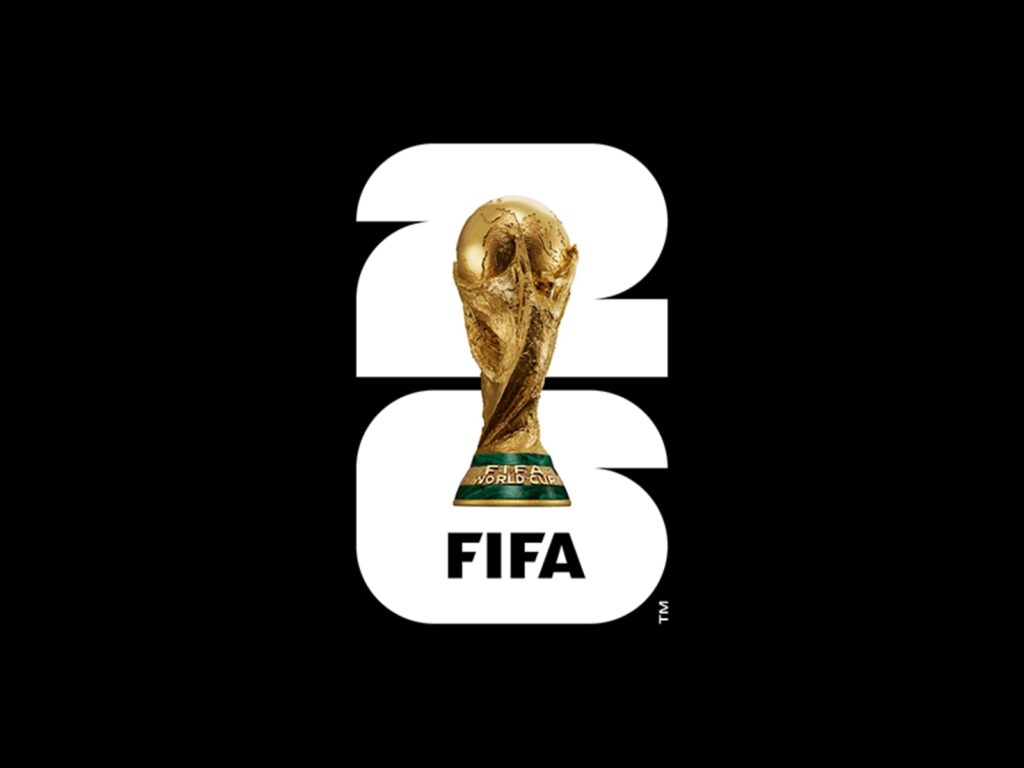
The 2026 FIFA World Cup logo has once again become the center of controversy. FIFA unveiled the official brand for the 2026 World Cup in Los Angeles, USA, on May 18, 2023. The logo features a photograph of the World Cup trophy placed atop a large number '26'. FIFA described this as ‘the first brand to combine the World Cup trophy with the host year.’.
The design of the official logo for the 2026 World Cup is controversial. The 2026 logo features a photograph of the World Cup trophy placed atop the large number '26'. Criticism has arisen from some quarters that the logo is overly simplistic and lacks the cultural identity of the host country. This is because, unlike previous World Cup logos that strongly reflected the host nation's art, history, and regional characteristics, the 2026 logo adopted a structure closer to a system than a symbol.
The 2026 World Cup is the first trilateral tournament co-hosted by the United States, Canada, and Mexico, and the first World Cup to feature 48 teams. Rather than an emblem representing a single national image, a flexible identity was needed that the 16 host cities could each modify and use. In fact, FIFA unveiled a brand system that expands with colors and graphics specific to each host city.
The problem is that this flexibility led to a weakening of the logo's impression. Rather than being a symbol memorable at a glance like Brazil 2014, Russia 2018, or Qatar 2022, the 2026 logo is closer to a modular brand that is easy to apply to various environments. Consequently, it received simultaneous criticism for being "half-hearted" and praise as a "modern brand system.".
This controversy raises the question of how symbolic a sports logo should be. Should the World Cup logo be the face of the host nation, or a scalable system operating across numerous cities and digital channels?

More and Sources