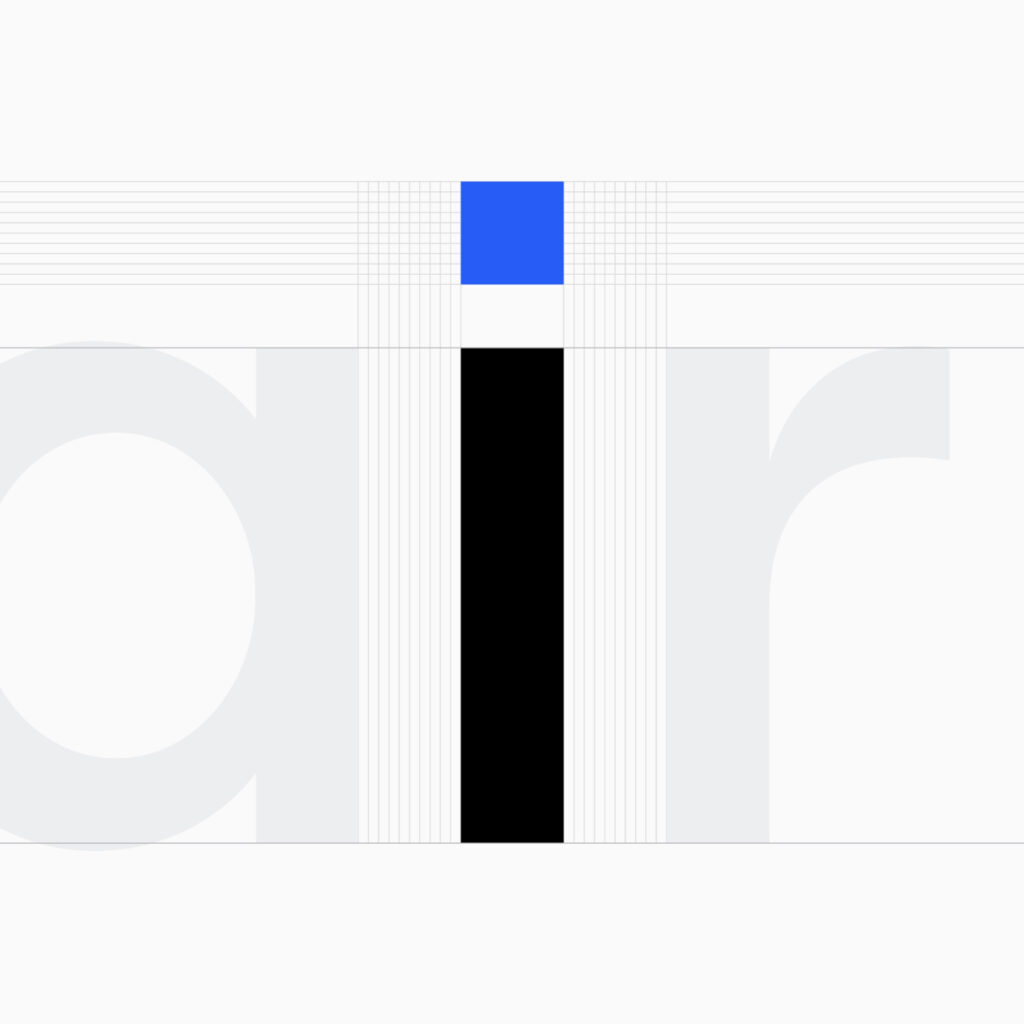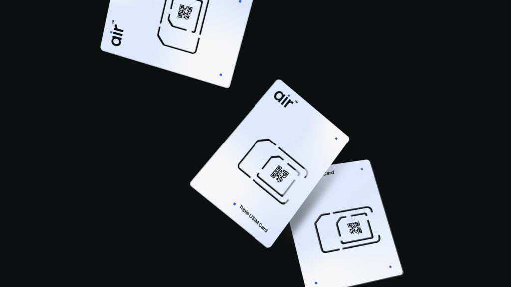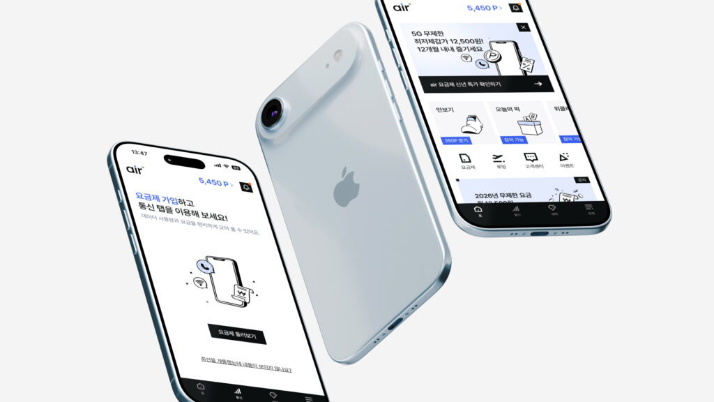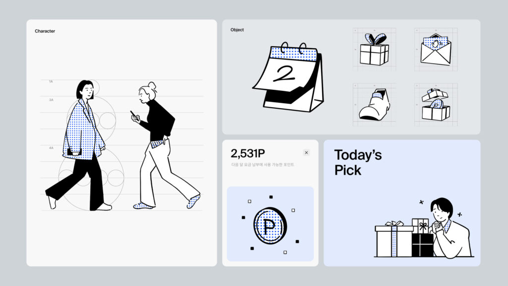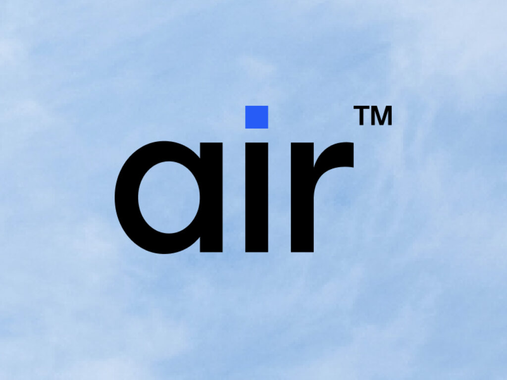
This is the brand design for SK Telecom's new MVNO brand, 'Air'. While existing telecommunications were designed around complex pricing structures and procedures, Air started with an approach that boldly streamlined them. The core is a simple experience tailored to users familiar with the digital environment.
This project was undertaken by design studio BRENDEN. The focus was on clearly conveying the 'lightness' that the brand aims for visually. As the name implies, the entire identity was constructed with an image as light and flexible as air at its center.
The graphic system was designed to eliminate unnecessary ornamentation as much as possible. Instead, the focus is on emphasizing whitespace and flow. This is not merely an implementation of a minimalist style, but a choice deeply connected to the service's structure itself. It is the result of visually reflecting a fast sign-up process, ease of use, and location-independent mobility.