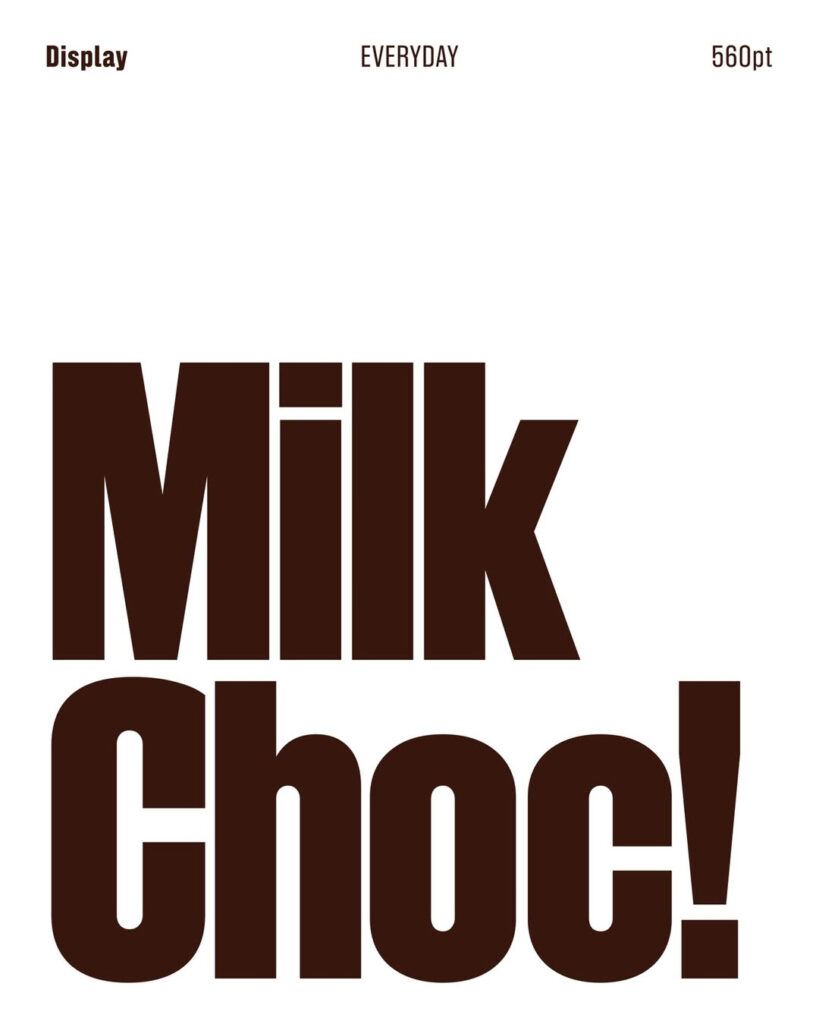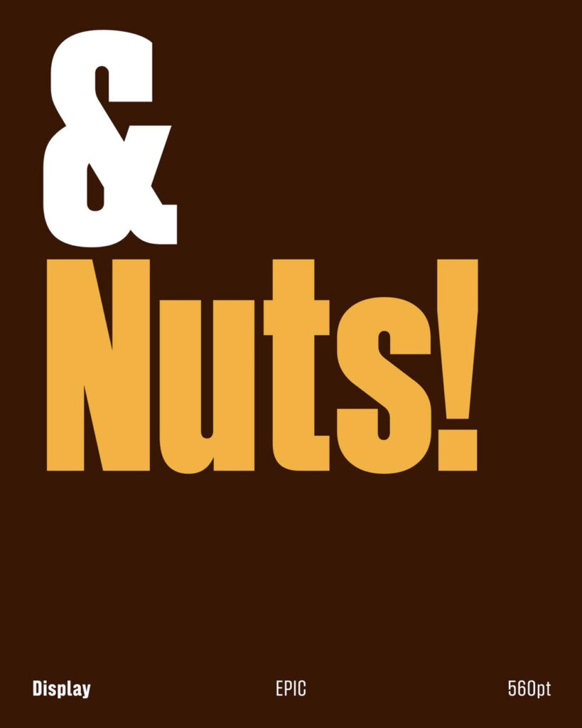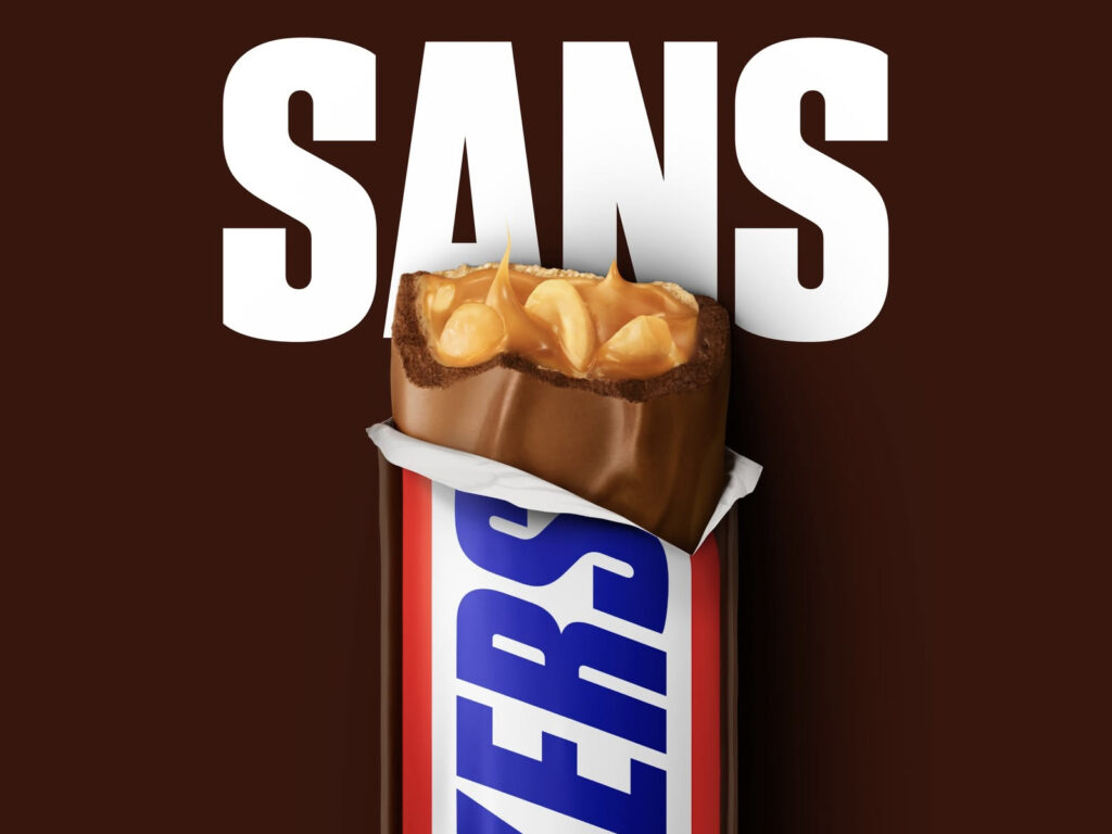
Chocolate brand Snickers has unveiled a new custom typeface, Snickers Sans. It is characterized by a redesigned letter structure derived from formal clues found in the brand's logotype. Inspired by the traditional American Gothic style, it has been reinterpreted with a new tone that adds Snickers' signature thick impression and modern weight.
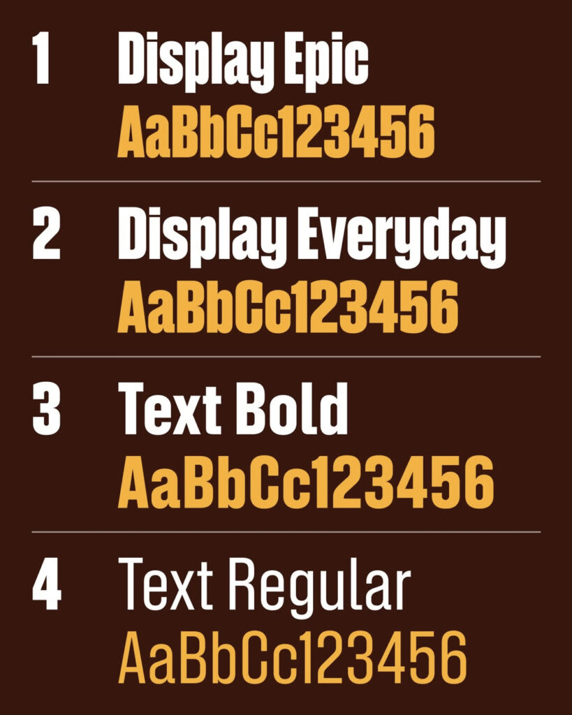
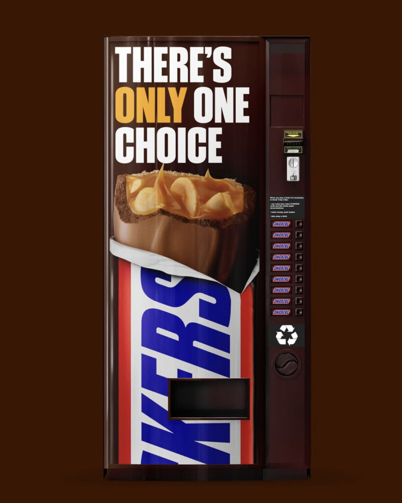
This typeface consists of two families: one for display and one for body text. Stroke and spacing have been refined to ensure a strong presence in large headlines while maintaining an uninterrupted reading flow in smaller body text. Designed to maintain a consistent impression across various sizes from XXL to XS, the goal was to achieve balance in both digital and print environments. The explanation is that the typeface itself has been established as a brand asset to ensure the brand speaks with a consistent voice across touchpoints such as campaign posters, packaging, product pages, and in-store brochures.
The range of supported languages was also emphasized. Snickers Sans supports over 300 languages and has been expanded to include Greek and Cyrillic scripts, ensuring consistent design rules across global markets. This was intended to reduce visual discrepancies that occurred during the localization process and to enhance message consistency.
The project was led by branding agency JKR Global, and the typeface development was handled by the Studio Drama team. Custom typefaces are establishing themselves as a means to extend the nuances of a logo to the sentence level, and there is a growing demand to manage both readability and performance simultaneously in subscription media and app environments.