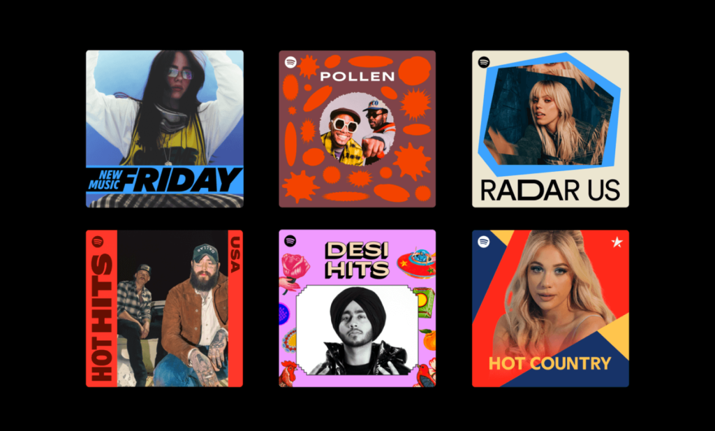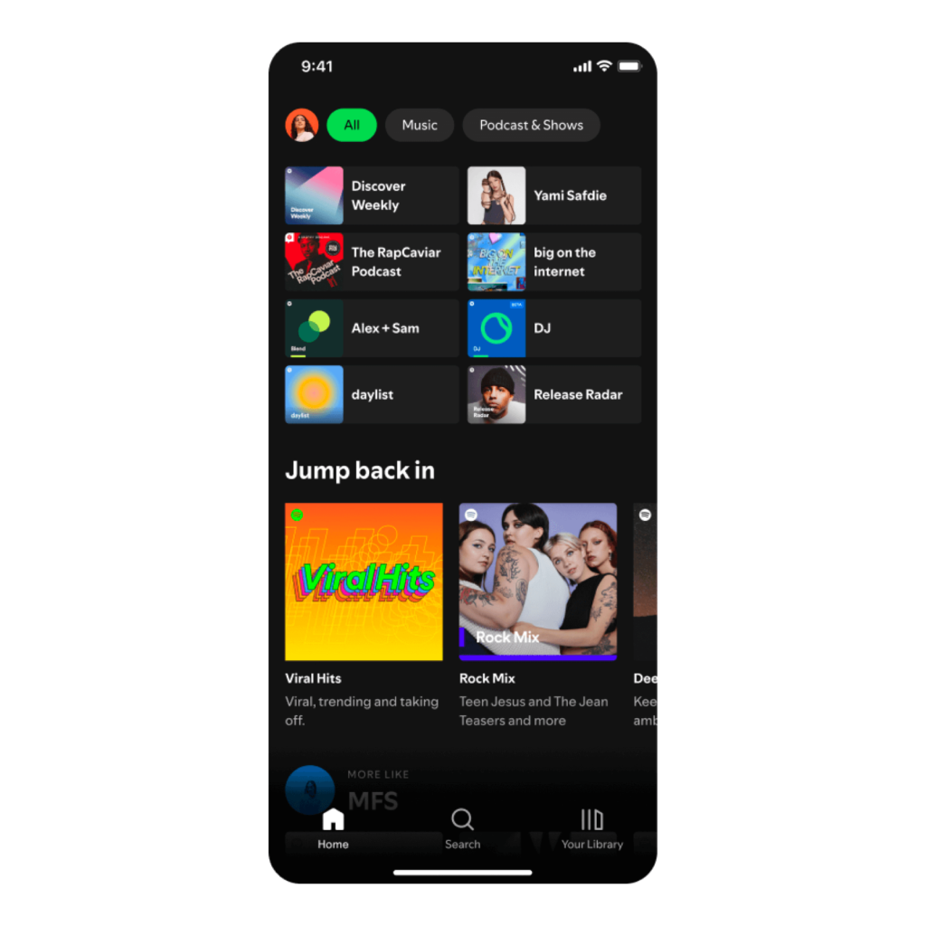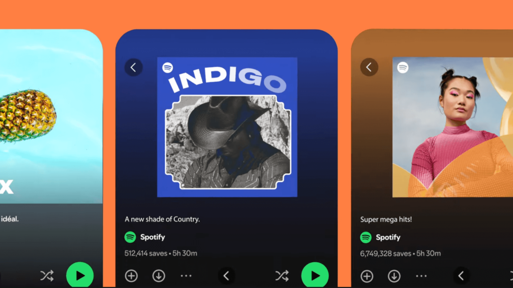

Spotify has announced its exclusive font ‘Spotify Mix’. Created with Berlin-based font creation foundry Dinamo Typefaces. It replaces the Circular font in mobile/desktop app environments and is applied starting from all languages that use Latin character-based scripts, including Vietnamese. Variable fonts have been a hot topic in the brand design market recently, and Spotify, which is serious about design, has finally released a dedicated font.

Spotify's mix reflects the dynamic and evolving nature of music culture. As the name suggests, the various characteristics of the font are mixed up here and there. The geometric structure embodies the modernity of a digital environment, while the pointed end embodies the classic feel of a quick hand scribble.

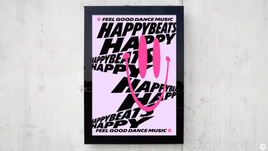
To convey the brand's impression, the variable font was given features that make it recognizable even when its size or shape changes. The unique slope of the lowercase letter t and the extreme thickness contrast between the column and the circle found in p are attractive. When they are thick, like f and y, they are sometimes connected with ligatures.

When you look at the arrangement of thin fonts and bold letters, it feels like sound waves. When you break them down individually, they look like completely different forms, but you can clearly feel them being like Spotify.

Artists and creators can use Spotify Mix in a variety of environments, including playlists and marketing campaigns, to capture their creativity. It will be used starting from events such as ‘Spotify Beach’ during the Cannes Lions Creative Festival on June 17th. Spotify Newsroom For the RecordYou can see the screen with the font applied.


