
Trivago has rebranded. We collaborated with Design Studio, a global agency responsible for the rebranding of Eurostar and Airbnb. Trivago is a German metasearch engine that compares prices of various accommodations such as hotels and hostels. We compare rates for over 2.5 million hotels around the world based on over 250 hotel booking sites.
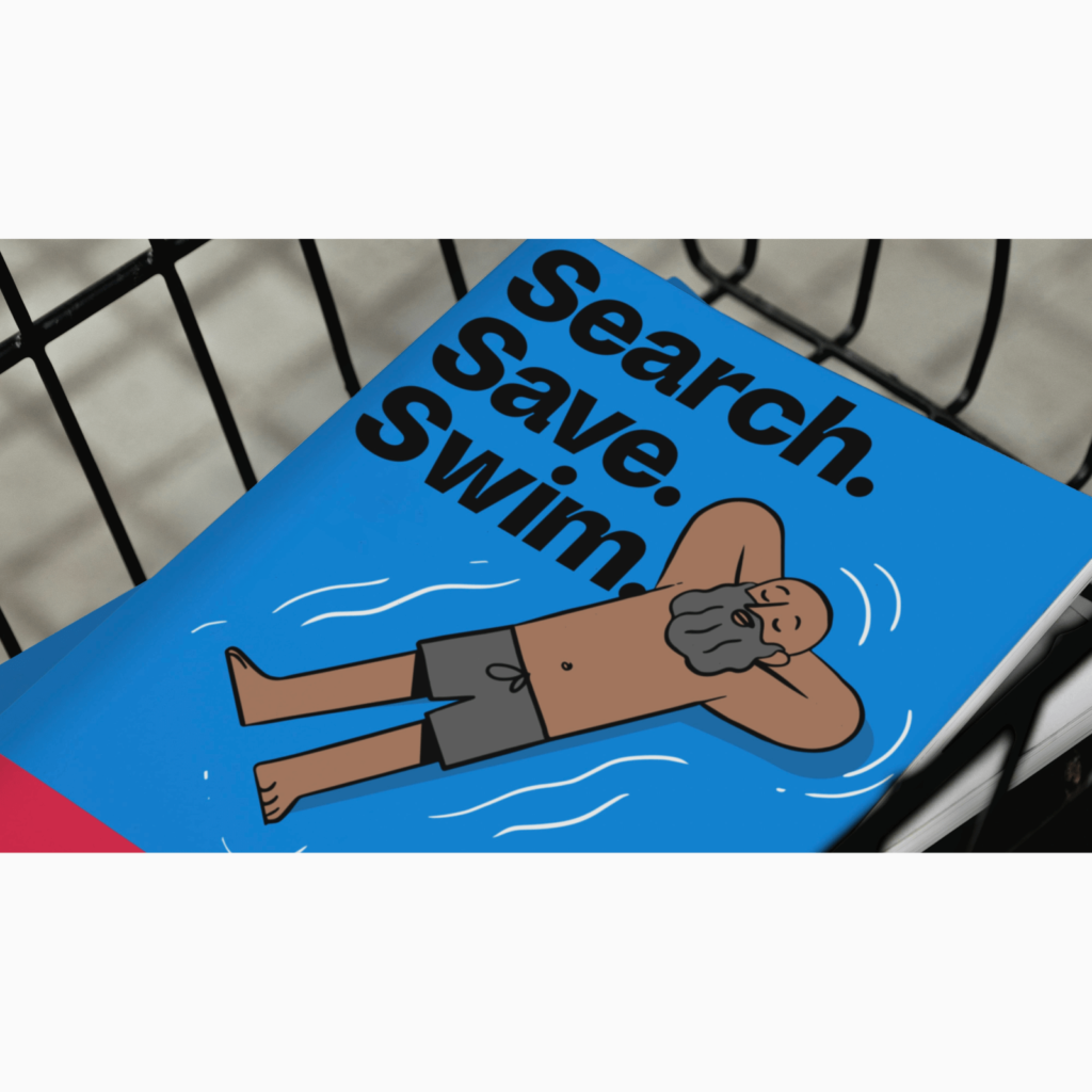
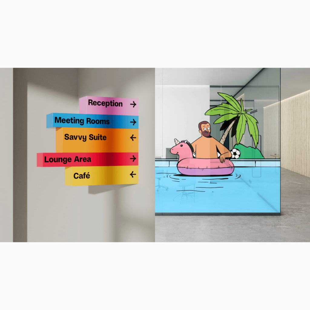
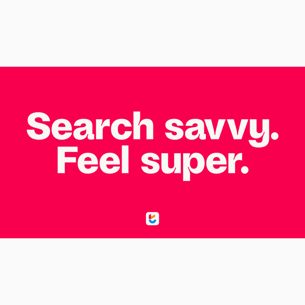
As competition for accommodation reservation services intensifies, we designed a new visual identity to remain etched in customers' memories. ‘Search savvy. Feel super.' We focused on expressing meta search, a feature of trivago, around the slogan.
“We wanted to capture the sense of accomplishment you feel when you get a good deal,” says Design Studio’s Maddy Patterson. ‘Feel super’ is suitable for expressing not only a sense of energetic accomplishment, but also relief and peace.”
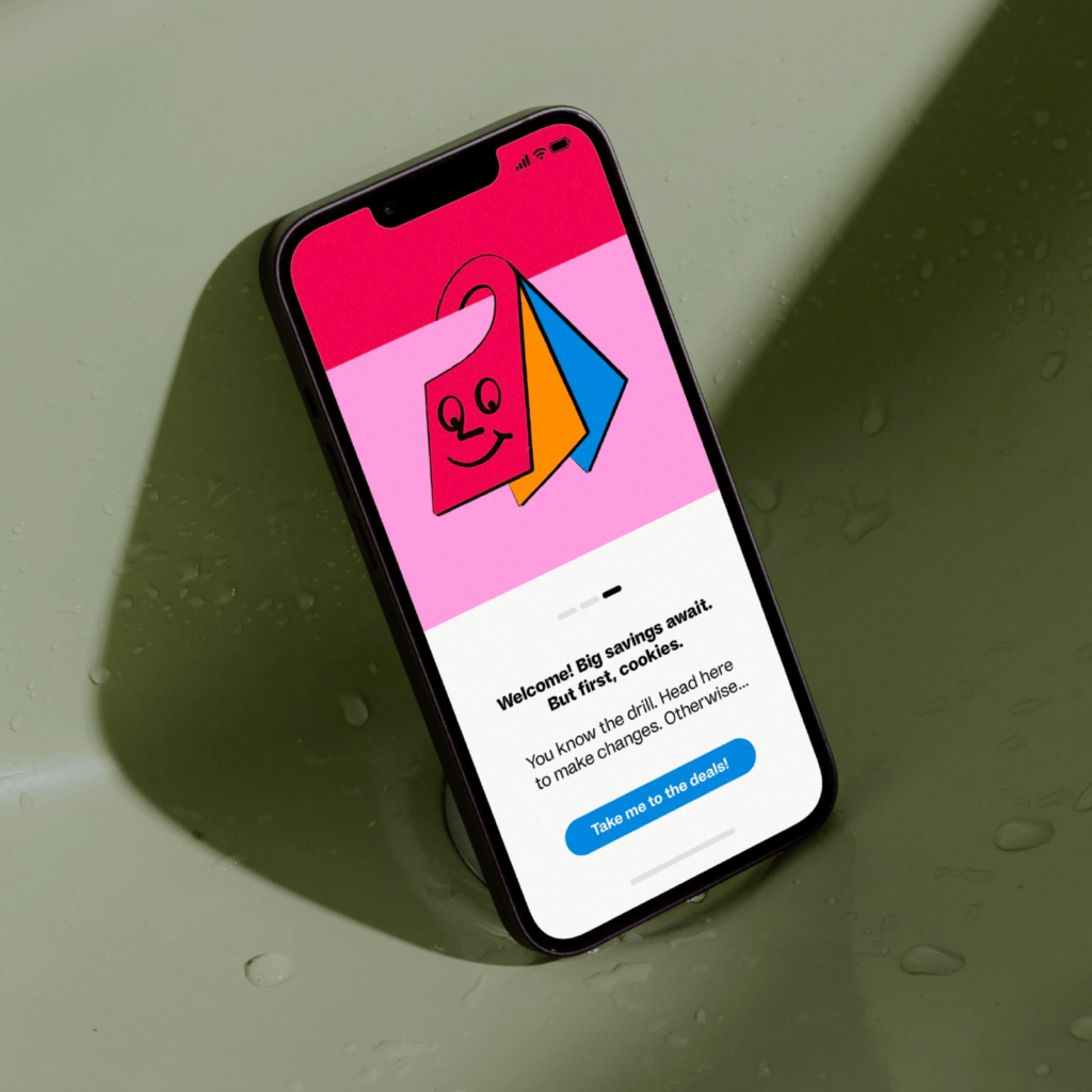
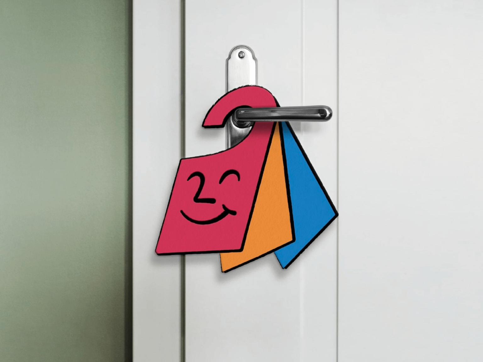
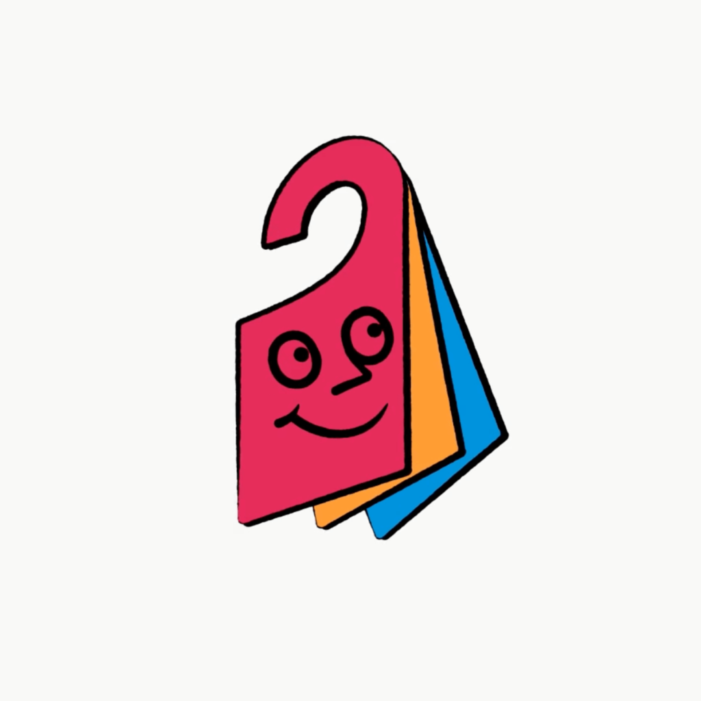
We created a character called Hank with a unique form. Hank is a card with a human face drawn on top of three DND (Do Not Disturb) cards that hang on hotel door hangers. It is composed of three colors that symbolize trivago, expressing that there are multiple accommodations. Inspired by Hank's unique expression, we collaborated with animation Niceshit to create an artistic illustration.

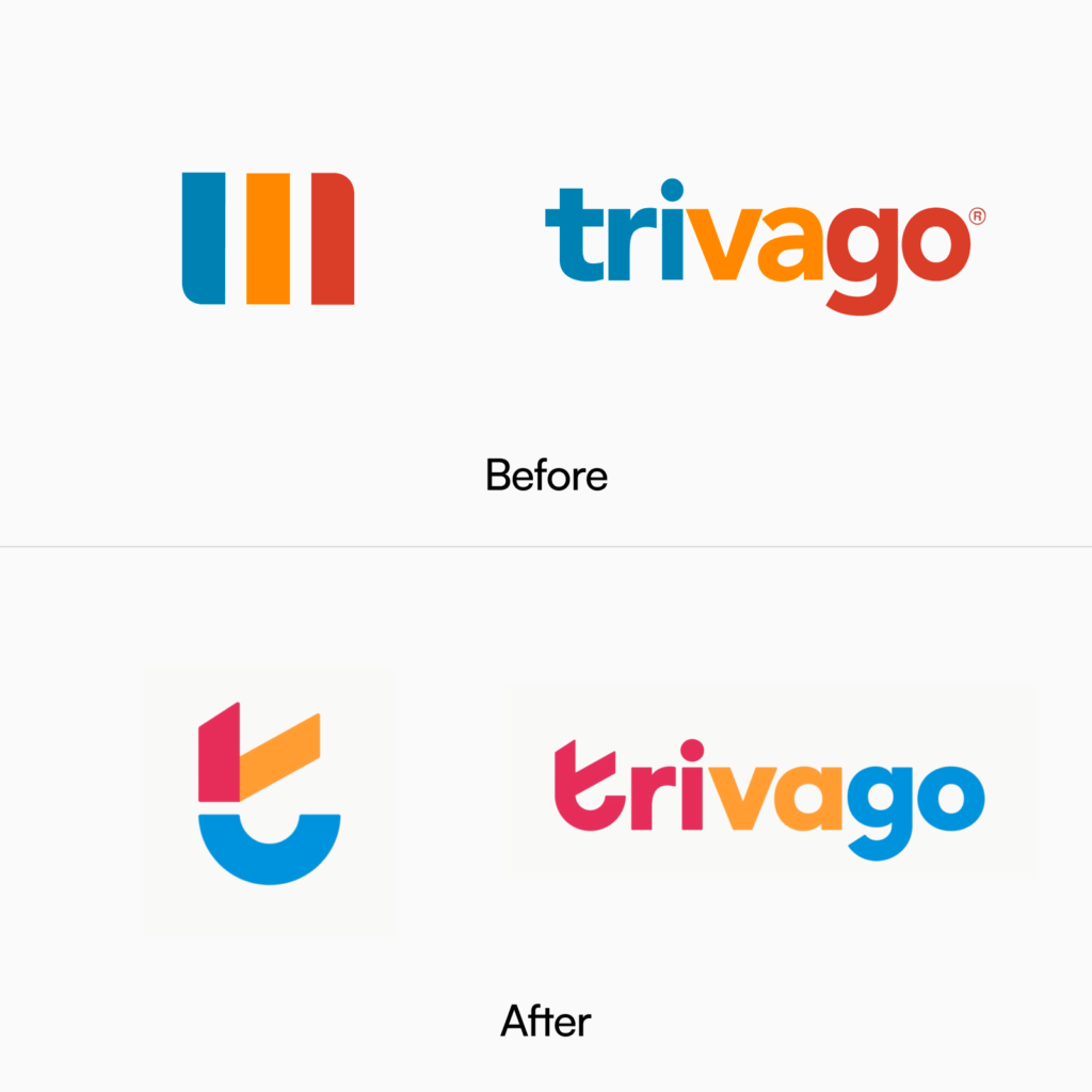
The word mark is made of solid, thick lowercase letters. The symbol contains three colors by breaking up the first letter t. Red and yellow are combined to represent a check symbolizing excellent search, and the blue curve represents a smile symbolizing a good experience with Trivago.
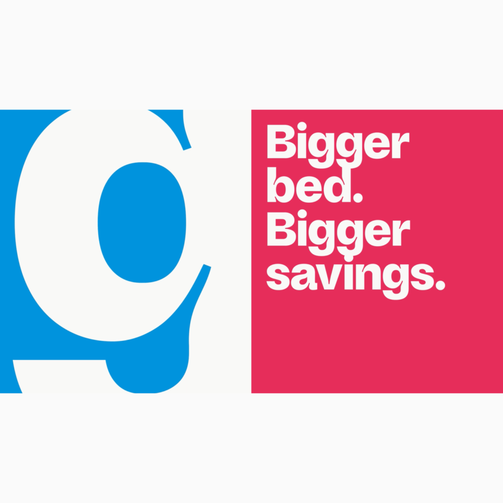
In collaboration with Studio Feixen we created Savvy Grotesk. The font emphasizes the ink trap and gives a similar impression to the illustration. It is unusual that the descender in English is connected to the letter on the next line. Because the text is so thick, it doesn't interfere with reading. As expected from a travel service font, it supports hundreds of languages.
As problem-solving functions become similar, strategies for expressing service differences are becoming more detailed. It seems to be a reorganization of identity to go beyond simply solving problems and leap forward into a service that helps travel. Rebranding using a mascot seems to have gone beyond the persuasion of superior technology and transformed the company into a person whose voice can be felt. I feel like a friend who would be good at recommending affordable but appropriate accommodations.
