Deezer collaborates with Koto to rebrand. Deezer is a music streaming service founded in Paris in 2007. It serves more than 180 countries and has approximately 10 million paying subscribers. This time, in collaboration with global design studio Koto, we carried out a rebranding to reveal our presence and strengthen our sense of belonging.
'We've transformed Deezer over the past two years and this is a significant milestone as we introduce our new identity and logo, while also demonstrating the evolution of our products into a platform where people can enjoy experiences never before possible.' said Jeronimo Folgueira, CEO of Deezer.
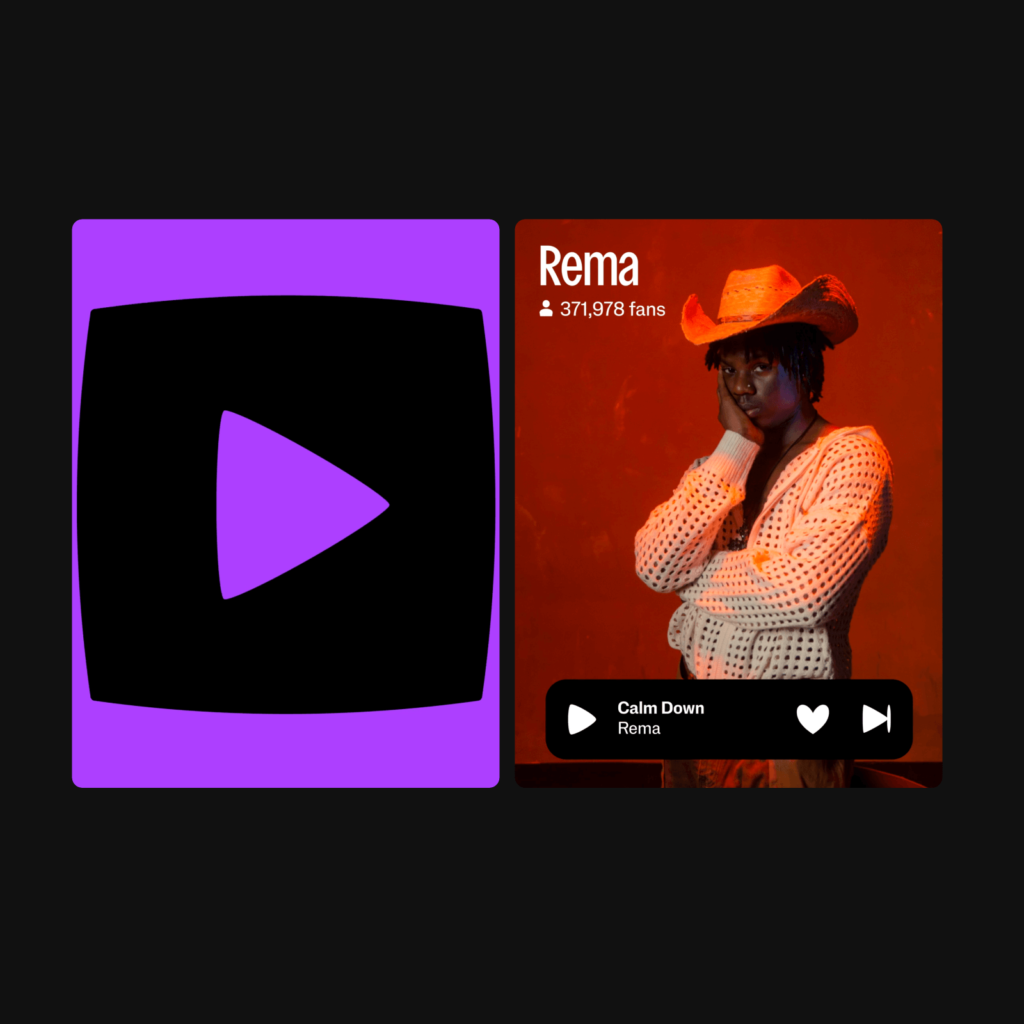
The logo is a combination of a pounding purple heart and a musical equalizer. It expresses how humans experience music as if they were feeling their own heartbeat. It goes beyond simple movements that express the beat, and depicts actions that a person would take when listening to music.
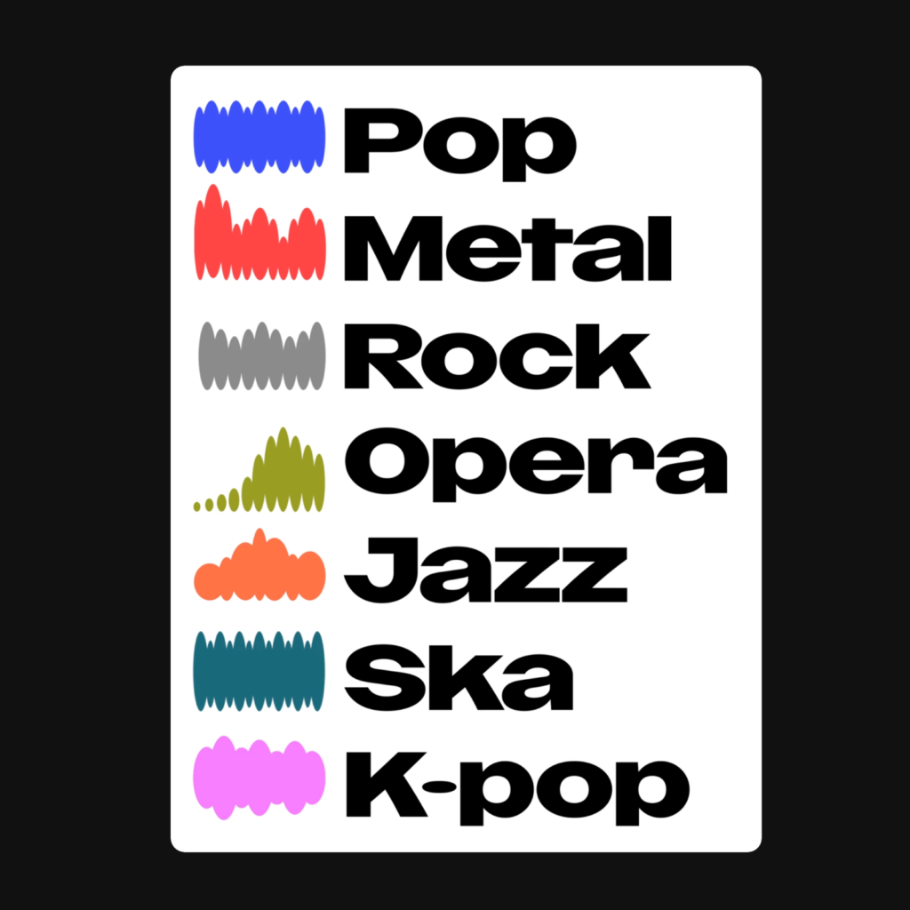
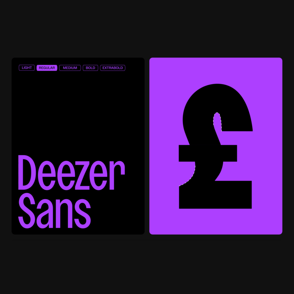
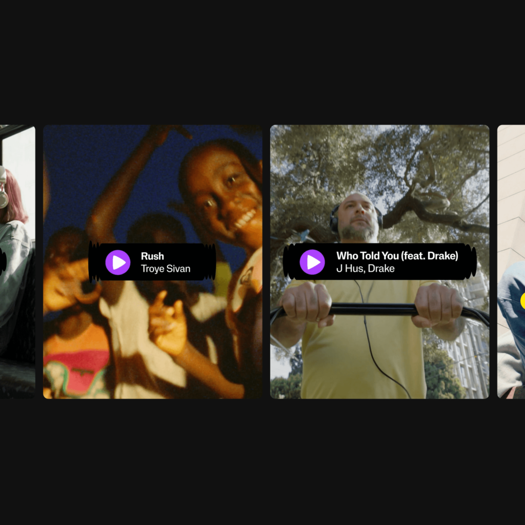
This pulsating pattern and movement became the brand's entire visual identity. It also applies to containers that hold patterns, illustrations, and visual elements. The graphics that express the genre in the shape of an equalizer are also attractive. We also developed Deezer SANS, a variable font that can be used in different contexts of brand touchpoints. It can be freely transformed horizontally and vertically and can be used at various brand touchpoints both online and offline.
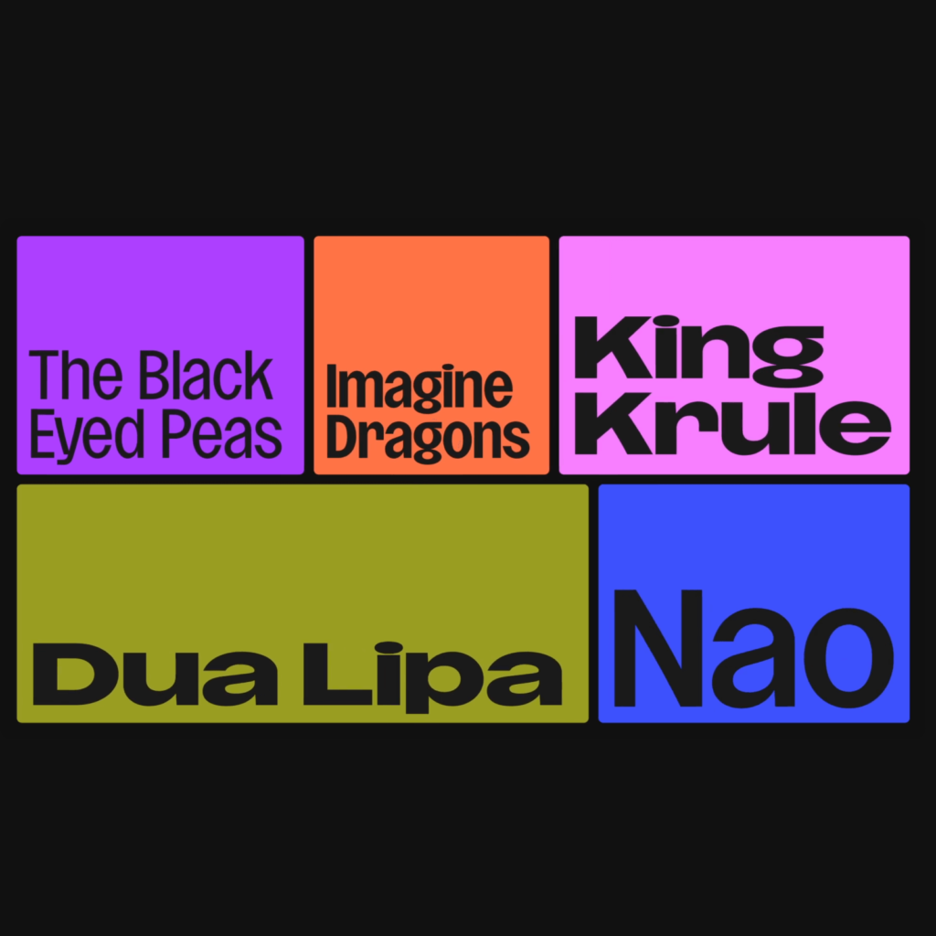
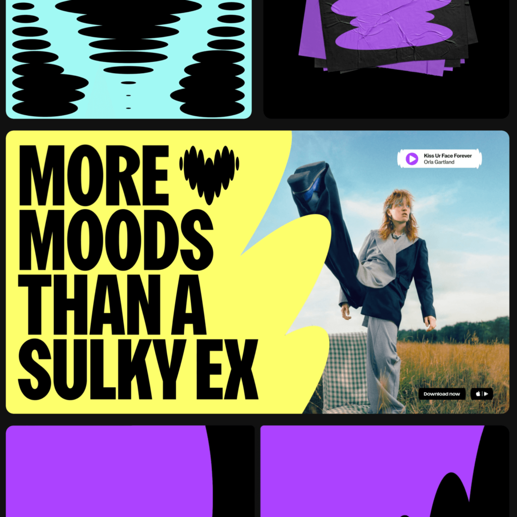
We interpreted the vertically long oval element and applied it as a unique UI identity. Deezer's unique impression is well expressed through subtle changes. It looks like a boom box by placing it on both sides of the container that represents music being played. It is also applied to icons, giving it a fresh feel that is different from geometric shapes.

Expression of brand identity using variable fonts is increasing. As the number of contact points between customers and brands is not increasing, efforts are being made to convey a different impression than before in a limited area. It seems that there has been an increase in the use of variable fonts that can be used in almost all areas, both online and offline, and in expressing movement with large and small screens in mind. In the future, an identity tailored to new environments where brands can be encountered may emerge.