Following the new Sumaksae symbol, a website containing the changed LG brand was released. You can take a look at LG's newly refined brand story, brand expression containing LG Electronics' design philosophy and expression, and Life's Good in action, which contains LG's actions for a better life.
Among them, we looked at Philiosophy, which contains LG Electronics' design philosophy, and Elements that make up the design, such as logos, colors, and slogans, in Brand expression, which contains specific designs.

For consistent and quick recognition, we will continue to use the traditional LG logo. Instructions on how to use a logo that combines a symbol and a wordmark. The recently released Digital Logo Play focuses on interactivity. We introduce the movement of symbols in various situations, such as when a logo appears, when listening to music, or when winking.

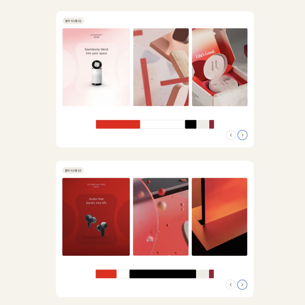
The colors are divided into Active Red and Heritage Red. Different usage examples are shown depending on the color ratio of the color system. In particular, this time we also shared a smooth gradient system. The gradient used in light mode, dark mode, and light + dark mode is like soft silk.

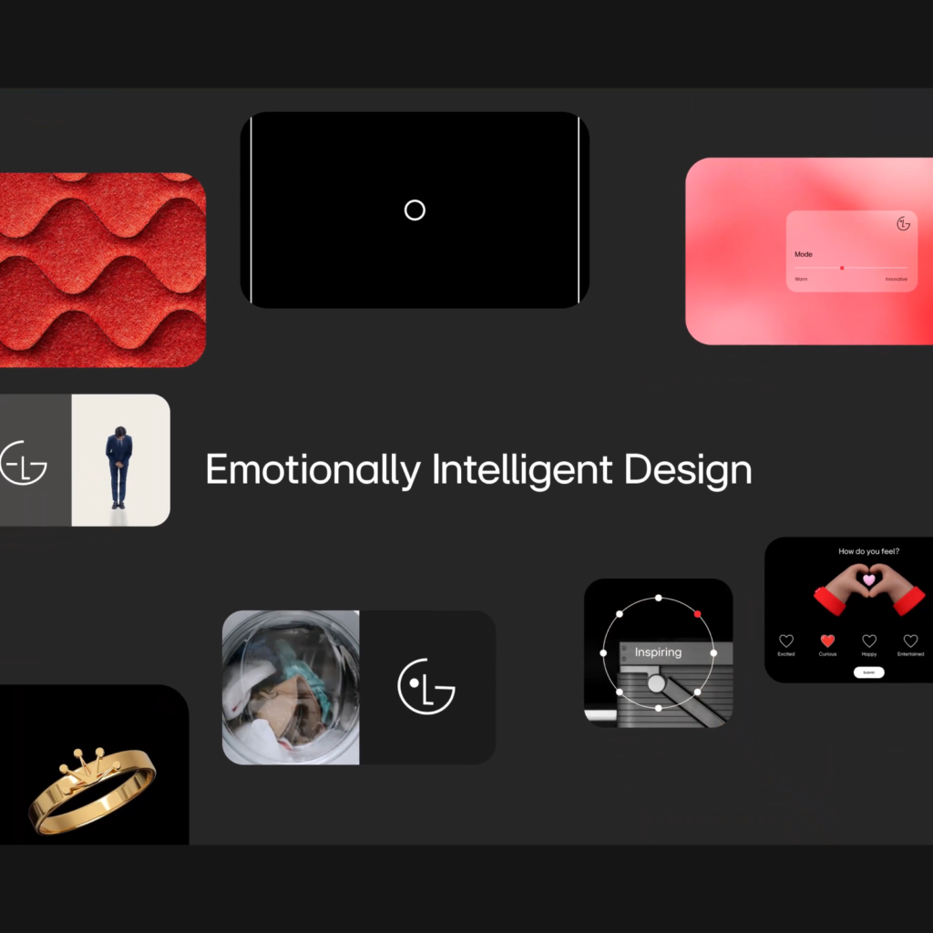
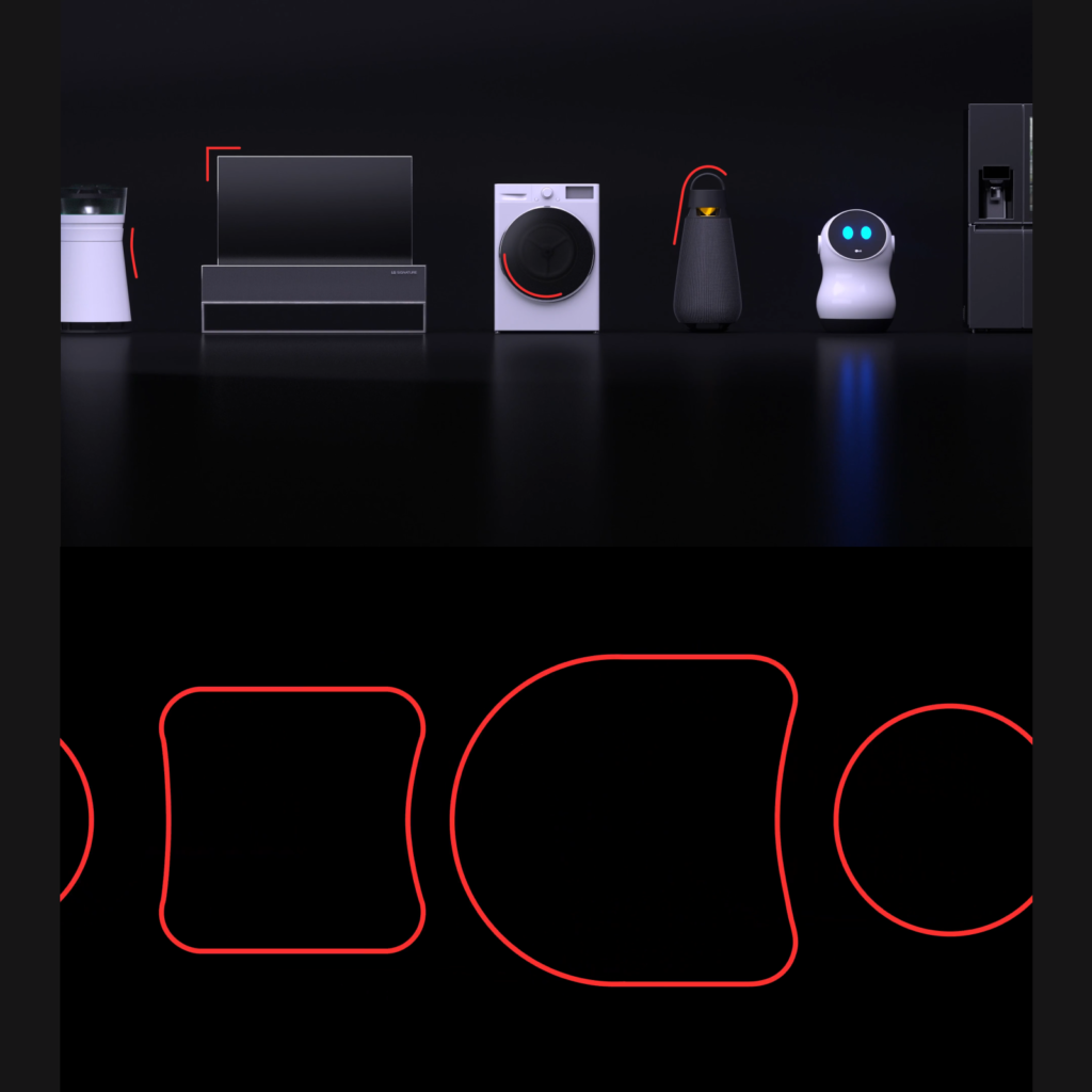
The design system is impressive. We created a design grammar centered on shapes inspired by the shapes of LG's home appliances. These are expressed as Emotionally Intelligent forms. We have released a layout, EI lens, and LG EI font based on this grammar.
It is divided into core states and connected states to express a static yet fluid form. The layout used to express elements that are connected to each other is like the shape of oil being combined.

Voices based on principles are also attractive. We structured the message we deliver to customers based on three principles: emotion, intelligence, and design. Specific examples are also provided for easy understanding.
White goods have the greatest influence on designing ‘life’. White appliances are products that mainly use white, such as refrigerators, washing machines, and air conditioners. Products that are useful in our lives are also called home appliances.
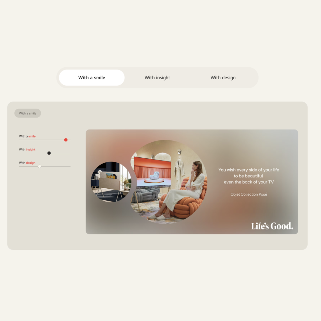
LG is a leader in smart home appliances that are changing our lifestyles. I thought that “Life’s Good” was something LG could say. When I think of LG, 'people' and 'smiles' come to mind, and I thought they captured the key points well in this re-invent.
Although the detailed expression and consistency are lacking, it seems to have done a good job of establishing a dynamic and friendly image while maintaining LG's existing strengths. The website experience is great, so be sure to visit!