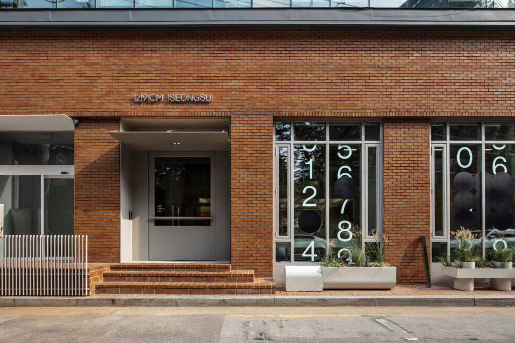

29CM, together with CFC, designed the brand identity of '29CM Seongsu', the first offline showroom.
29CM has created a two-story showroom in Seongsu to reinforce its brand identity as a guide for better choices. The 1st floor is a showroom and exhibition hall, and the 2nd floor is a multi-purpose space for each season. Called 'Lee Sung-soo', this space curates seasonal items like a magazine.
Ha Tae-hee, head of 29CM's branding team, said, "It is a space where people with their own tastes can gather and an area with infinite possibilities, so we decided that it was appropriate to introduce 29CM's first flagship store."
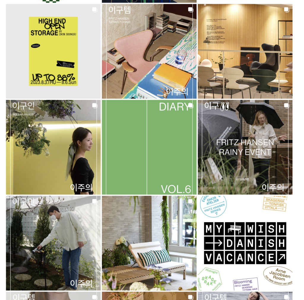
PT (online presentation) continues offline. PT is a media channel that deals deeply with one brand, and the first PT of Lee Sung-soo, an offline space, is 'New Balance'.

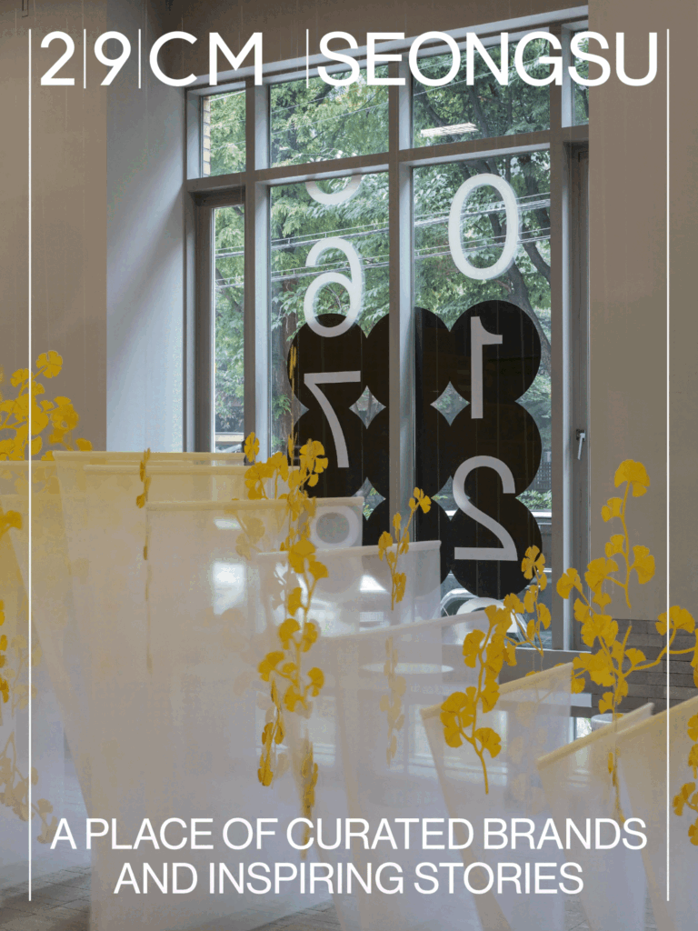
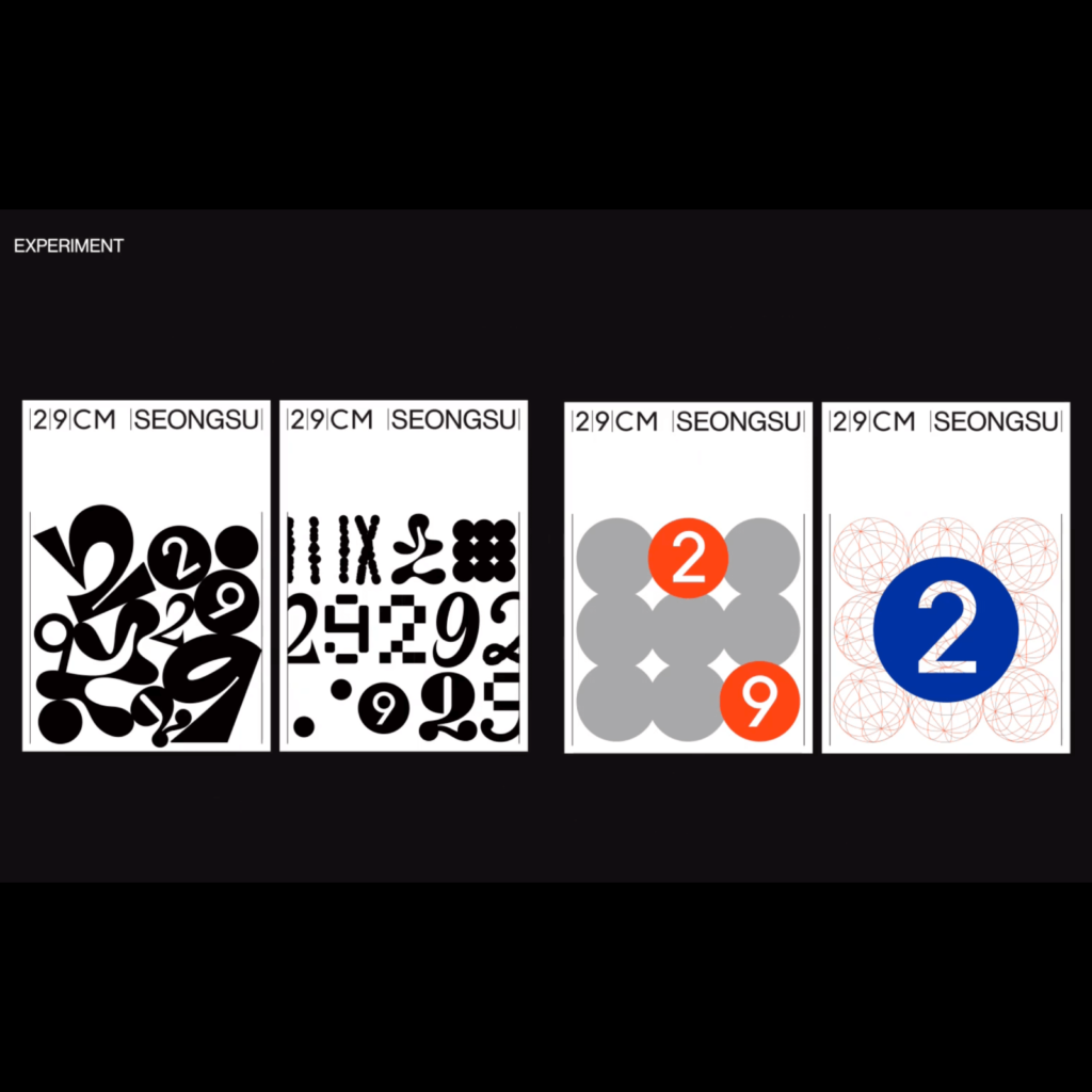
The theme of Lee Sung-soo is 'changing and unchanging'. The old and the new coexist, and '29CM', a bowl that holds the brand in a brand-like manner, was emphasized.
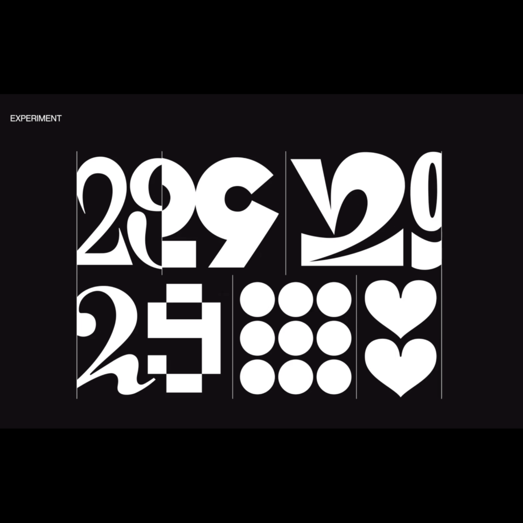
It is difficult to graphically represent what does not change and what does change. Emphasizing the unchanging weakens the changing, and emphasizing the changing weakens the unchanging. CFC solved the unchanging graphic elements extremely concisely but convincingly and made attractive variations on the changing graphic elements.
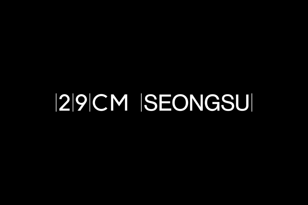

The unchanging essence was expressed as a ruler's scale. Vertical lines are arranged between horizontally lined word marks to remind one of the scale. Even in various mediums, trajectories are placed at the left and right ends instead of parentheses to convey the feeling of being contained in a bowl. A container expression that extends up and down conveys the impression of 'space' better than a conceptual expression containing letters or images.
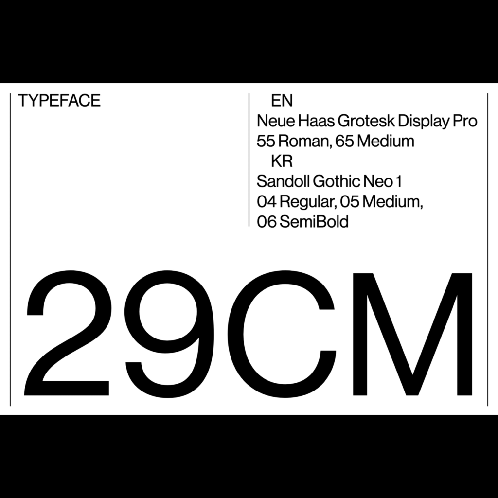
Neue Haas Grotest Display Pro and Sandoll Gothic Neo 1 were used for typography. The various variations appear to have been directly transformed. It is impressive that even the 29CM wordmark that expresses themselves is changing. It is also cute that 2 and 9 are expressed as intuitive dotted numbers. 29CM's adjective expression of 'kind but erratic' melted well.
The B-cut shared by CFC is also impressive. You can imagine how much effort went into creating a convincing, unique impression. In addition to CM expression, I tried to express it in color or form using 2 and 9 in various ways, but this time it seems to have focused on the direction in which the graphic motif is engraved in space. It's a simple branding in many ways.