
On September 4, the official emblem of the Qatar World Cup was unveiled. World Cup design was handled by UN-LOCK Brand. It was designed by combining the trophy shape, the traditional image of the World Cup, with a woolen shawl, a traditional winter attire in the Middle East. The applied pattern is an element that reveals the heritage of Qatari culture and symbolizes the first ever winter World Cup.
In addition, the emblem reminiscent of the number 8 represents the eight stadiums where matches are played, and contains a message that unites the world. The upper curve embodies the waves of sand in the desert dunes of the Middle East, and the lower typography has Arabic calligraphy elements applied.
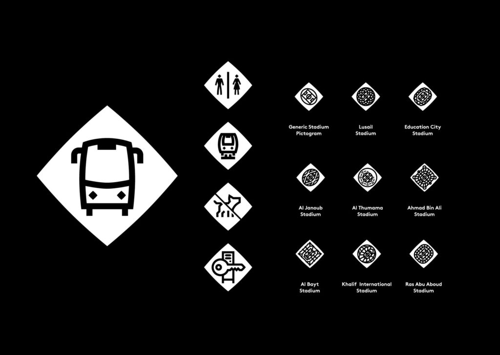
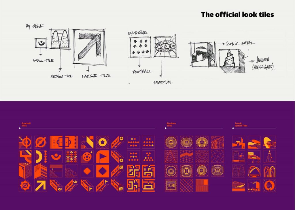
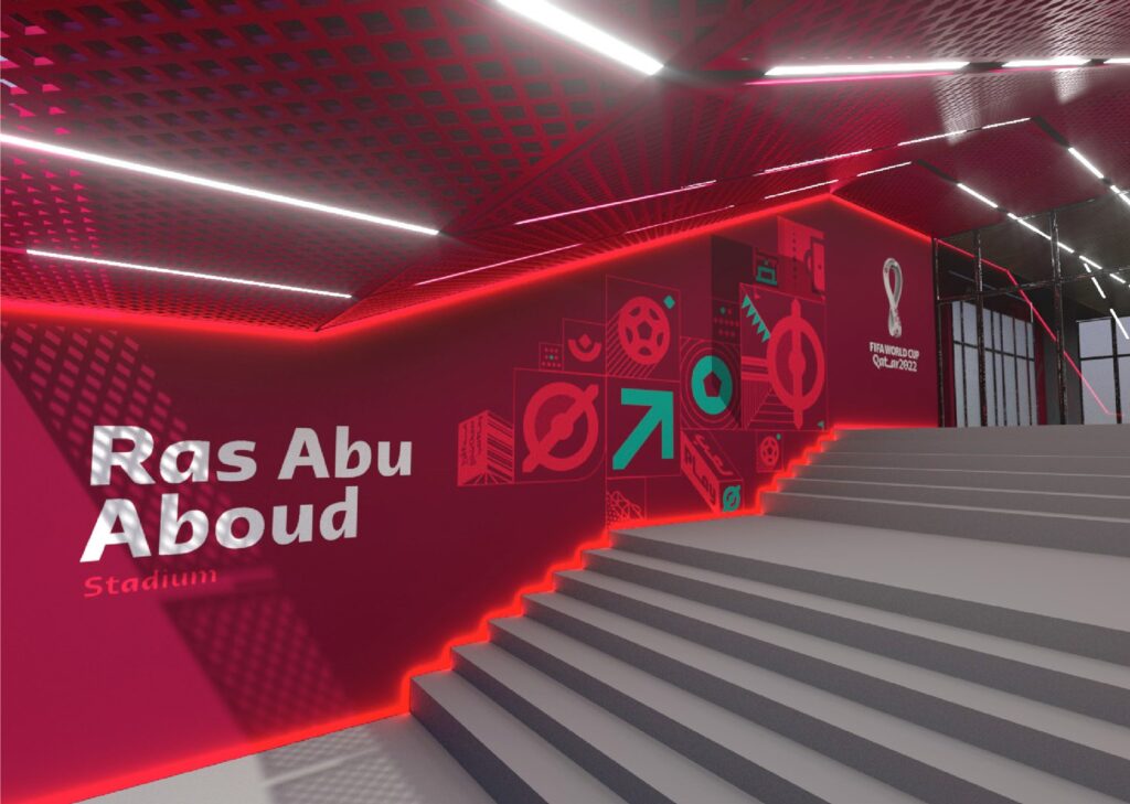
It is the first World Cup held by an Arab country in the Middle East. Over 3 years of designing brand strategy, Arabic typography, 2D, 3D, motion, sound and more. For the first time in the World Cup, the Full 3D emblem was used. The emblem was constructed using the impressions representing the Arab world, a soccer ball, and the number of stadiums. As the emblem rotates, a hidden circle emerges, impressing the look of a soccer ball. Pictograms and tiles with Arabic personality and Kasheeda (linear expression) of Arabic calligraphy are refined.


