



Nowadays, design skills are determined more by 'selection criteria' than 'production speed'.
AI is already creating screens.
Design systems have become more sophisticated, and numerous UI templates and references are readily available for anyone to use.
So, paradoxically, it became more difficult.
While the number of results has increased, it has become more difficult to judge what constitutes good design.
To make a better choice among similar screens, components, and experiences, sense alone is not enough.
What is needed now is Criteria for recognizing good designno see.
This book is designed to help you understand UI design through 'principles' rather than 'feelings'.
A good UI doesn't look good by chance.
Color attracts attention, text organizes information, layout creates order, and interaction drives action.
There is a reason why users feel comfortable, understand quickly, and move naturally.
This book summarizes the reasons.
We have compiled scattered design knowledge, judgments repeatedly encountered in practice, and the principles of creating good visuals into a single system.
If you have ever had such concerns, you need this book.
“It is difficult to explain why this design looks good.”
“Even after receiving feedback, I am at a loss as to what to fix.”
“I look at a lot of references, but I don't know how to apply them to my design.”
“I don't know which of the AI-generated results to choose.”
“I am using a design system, but I don't really understand the principles behind it.”
“I don’t know what standards I should set to grow further as a junior.”
This book is not intended to help you create more screens.
A book for judging, explaining, and selecting good screensno see.
In the AI era, the 'eye for selecting good results' becomes a competitive advantage.
AI produces results quickly.
However, selecting good results is still up to people.
Which of the 10 similar drafts is better.
Which button is pressed more naturally.
Which layout feels more stable.
Which information structure blocks user behavior less.
The person who recognizes this difference makes a better product.
The New Standard UI Design 2025 EditionIt is a UI design standard for developing that judgment.
1. Theory — Why Good Design Is Good
Theory covers the basic principles that make up the UI.
It explains why the design looks good, why it is easy to understand, and why it naturally leads user behavior.
I have organized the core elements that constitute a screen, such as color, characters, icons, text, layers, organization, layout, information structure, and input and output, based on their principles.
It helps you explain the differences in design, which were previously perceived only through the senses, in words.
2. Usage — How the principle is applied in the actual UI
Usage covers UI elements frequently used in practice.
We will examine buttons, text fields, selects, sliders, cards, bottom sheets, tabs, pagination, filters, badges, tags, avatars, process displays, and dialogs in detail.
It is structured to help you understand what role each element plays, when to use it, and what precautions to take.
What you can gain from this book
- You can understand UI design as structure rather than sense.
- I can explain the difference between good design and disappointing design.
- You can judge the results generated by AI more accurately.
- You can gain a deeper understanding of design systems and UI components.
- You can make repetitive UI decisions in the workplace faster and more clearly.
- You can read and apply the principles rather than simply following the references.
I recommend this to people like this.
- Designers who want to systematically organize UI design
- Those who have a sense but feel that they lack explanation and judgment criteria
- For those who want to have stronger standards as a designer in the AI era
- For those who want to improve the quality of UI in practical product design
- For those who use design systems but want to understand the underlying principles
- Designers who want to grow from junior to mid-level
- Planners, PMs, and founders who want better design feedback
index
- Theory
- Element
- color
- message
- icon
- writing
- Composition
- Layer
- organization
- layout
- Interaction
- information structure
- input and output
- Element
- Usage
- Input
- Button
- Text field
- Select
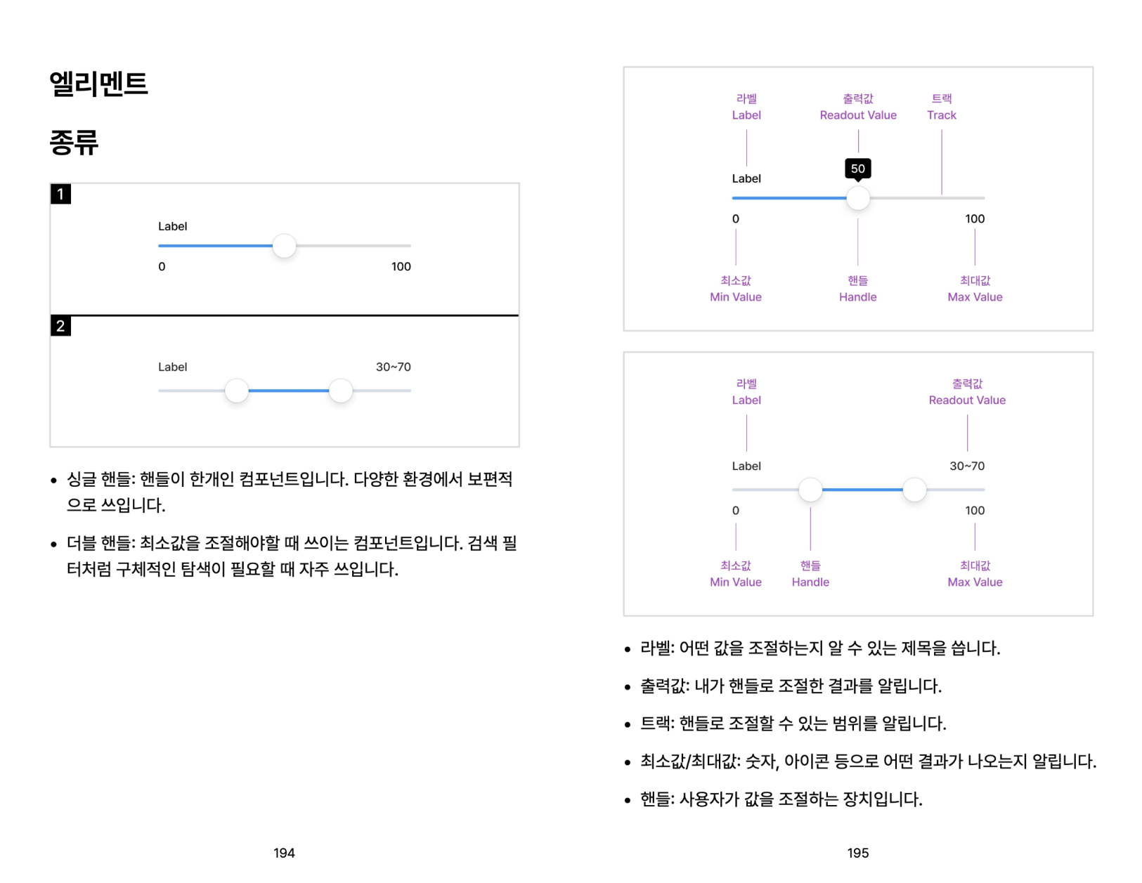
- Slider
- Navigation
- card
- Bottom sheet
- tab
- pagination
- filter
- Information
- Badge
- Tags
- Avatar
- Show process
- Dialogue
- Input
Writer

Jongmin Park
A design leader who has achieved results at every stage of a startup from start to finish.
From being the first designer at a startup to directing the design of a team of 200, I've created design impact at every stage. My goal is to help people experience the world through design in a richer and more engaging way, and to create a design language that everyone can understand.
My first startup was co-founding Lineable, an IoT-based startup that uses Bluetooth location technology to prevent lost children. Later, I designed products and brands for Our Table, a service that provides special recipes for special occasions. Later, I joined the travel startup My Real Trip as a product designer and led the design team there. I also served as Head of Design at Healing Paper, which provides services for Gangnam Unnies. I currently run the design media company "Design Compass.".
- Current) Design Compass CEO
- Former Gangnam Unnie Head of Design
- Former) My Real Trip Design Team Leader
- Former UI/UX designer at Our Table
- Former) Linearble UX Designer


