



A good icon is not a small graphic, but a compressed language.
The icon is small.
However, it includes form, proportion, balance, contrast, rhythm, and visual consistency.
Therefore, icons are the basic elements that allow you to learn graphic design the fastest.
This is because it allows you to train yourself to transform a single concept into a simple form, make the meaning legible even at small sizes, and make multiple icons appear like a single language.
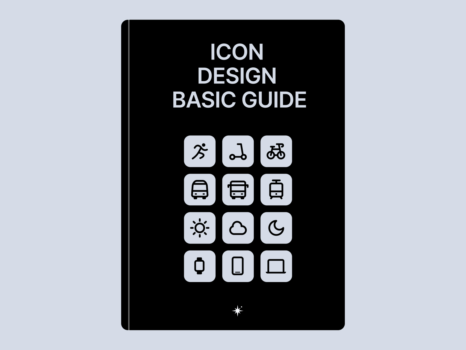
Icon Design GuidebookIt is a package for learning the basics of graphic design through icons and building a visual language that can be used immediately in a digital environment.
If you want to create good icons, you must first understand 'methods of expression'.
Icon design is not simply about drawing pretty lines.
What form will be changed from a certain concept?.
How much must it be simplified to maintain meaning?.
How to consistently apply the same thickness and roundness.
What criteria are needed to ensure that it does not appear blurry even at a small size?.
What needs to be matched so that multiple icons look like a single set.
With such standards, icons are not just simple pictures Visual language operating within the productIt becomes.
This package consists of a PDF guidebook and Figma icon files.
This product consists of two items.
1. Icon Design PDF Guidebook
I have summarized the basic principles of creating icons and visual judgment criteria.
You can learn how to convert concepts into images, how to simplify shapes, grids and pixel perfection, thickness and roundness, and criteria for creating a consistent icon set.
It is structured to be a reference for both beginners learning about icons and designers who need to organize icon sets in their work.
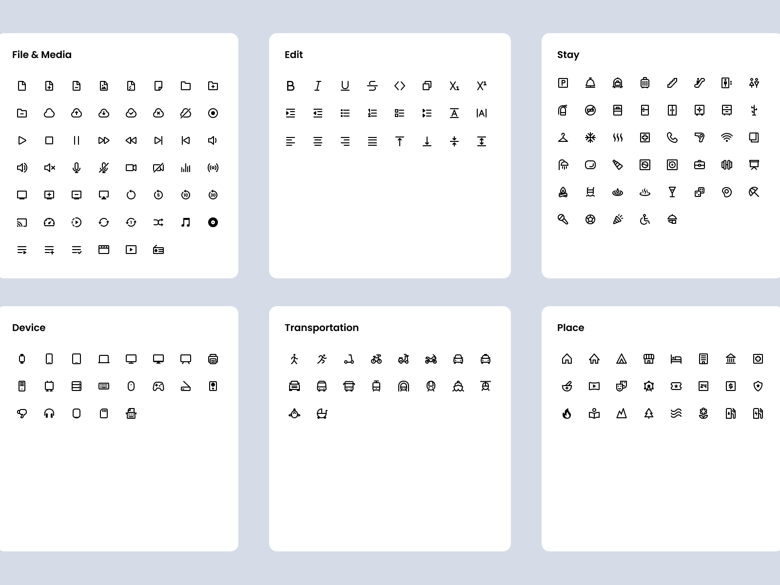
2. 490+ Figma icon files
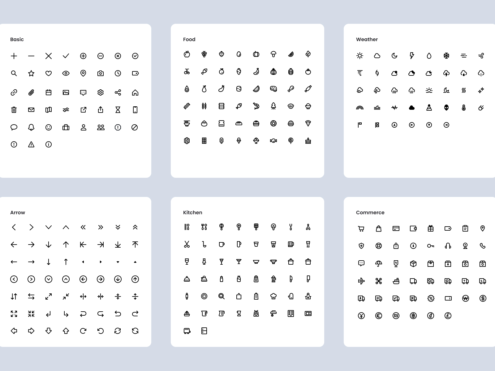
Ready to use on the web and apps Over 490 iconsThis is included.
Built on a sophisticated grid foundation, it can be used clearly in various digital environments.
Since it is provided as a Figma file, you can copy it directly and apply it to products, websites, apps, and design systems.
Precise grid and pixel perfection
Good icons should not be blurry even at small sizes.
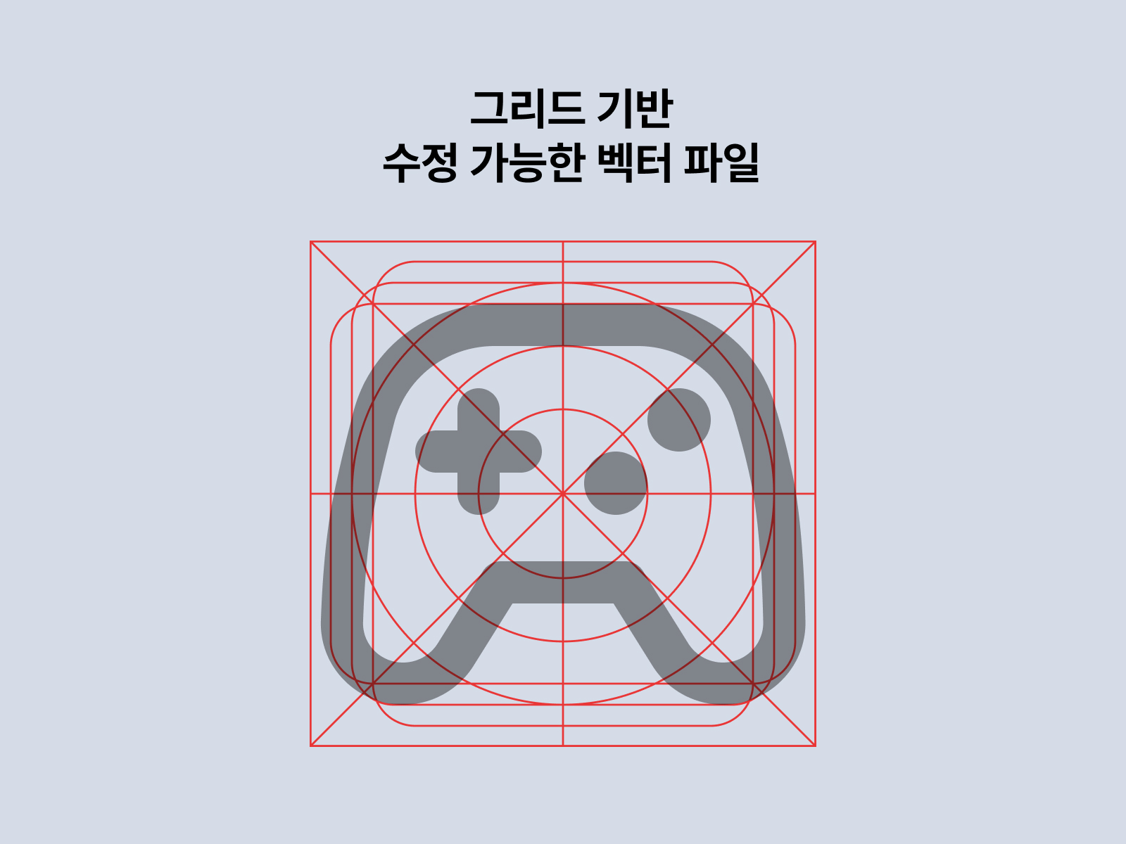
This icon set is designed on a grid basis to appear clearly in digital environments.
By consistently matching the center, spacing, proportions, thickness, and rounding of the shape, it gives a stable impression even on small screens.
A precise, pixel-aligned structure helps icons look cleaner on web, app, and mobile screens, as well as within design systems.
A powerful yet soft impression
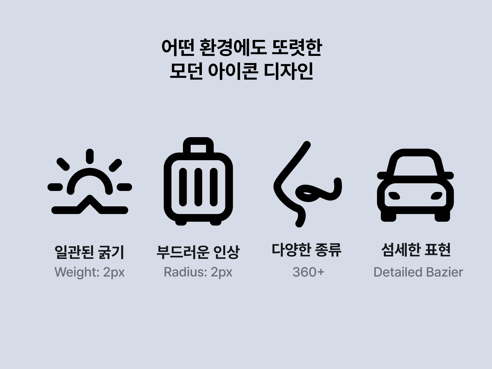
This icon set is 2pt thicknessIt was produced based on.
I balanced it so that it doesn't look too thin and weak, and doesn't look too thick and stuffy.
By applying rounded ends and rounded corners, it creates a functional icon that gives a soft impression rather than a cold one.
Border Position depends on the situation Centerand InnerWe combined them to consider both the clarity and balance of the form.
If you have ever had these kinds of concerns, you need this package.
“"When I draw an icon, the shape looks awkward."”
“Each icon has a different thickness and proportion, so they do not look like a set.”
“I don’t know how to turn the concept into a simple image.”
“We need consistent icons to use in the design system.”
“I need an icon file that can be used immediately on the web or in apps.”
“I want to learn the basics of graphic design starting from the smallest units.”
Icon design may seem like a small task, but it contains the essence of graphic design.
This package helps you directly understand the core and use it immediately.
What you can get from this package
- You can understand the basic principles of icon design.
- You can learn a way of thinking that transforms concepts into images.
- You can learn grid-based icon creation methods.
- You can see the criteria for creating a consistent visual language.
- You can get 490+ icons that are ready to use on the web and in apps.
- You can have an icon system that can be edited and extended directly in Figma.
I recommend this to people like this.
- Designer learning icon design for the first time
- For those who want to learn the basics of graphic design starting from the smallest units
- For those who need icon sets for web and app services
- For those looking for consistent icons that fit their design system
- For those who need icon files that can be used directly in Figma
- For those who want to learn the standards for creating and expanding icons themselves
- For those who want to make the visual language of a brand or product more sophisticated
index
- icon guide
- How to use templates
Writer

Jongmin Park
A design leader who has achieved results at every stage of a startup from start to finish.
From being the first designer at a startup to directing the design of a team of 200, I've created design impact at every stage. My goal is to help people experience the world through design in a richer and more engaging way, and to create a design language that everyone can understand.
My first startup was co-founding Lineable, an IoT-based startup that uses Bluetooth location technology to prevent lost children. Later, I designed products and brands for Our Table, a service that provides special recipes for special occasions. Later, I joined the travel startup My Real Trip as a product designer and led the design team there. I also served as Head of Design at Healing Paper, which provides services for Gangnam Unnies. I currently run the design media company "Design Compass.".
- Current) Design Compass CEO
- Former Gangnam Unnie Head of Design
- Former) My Real Trip Design Team Leader
- Former UI/UX designer at Our Table
- Former) Linearble UX Designer
See more books


Icon Design Guidebook
- PDF, 140x216mm, 15p
- Icon Library for Figma Guide
