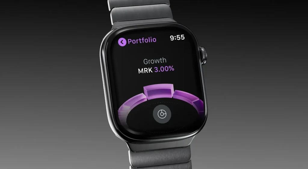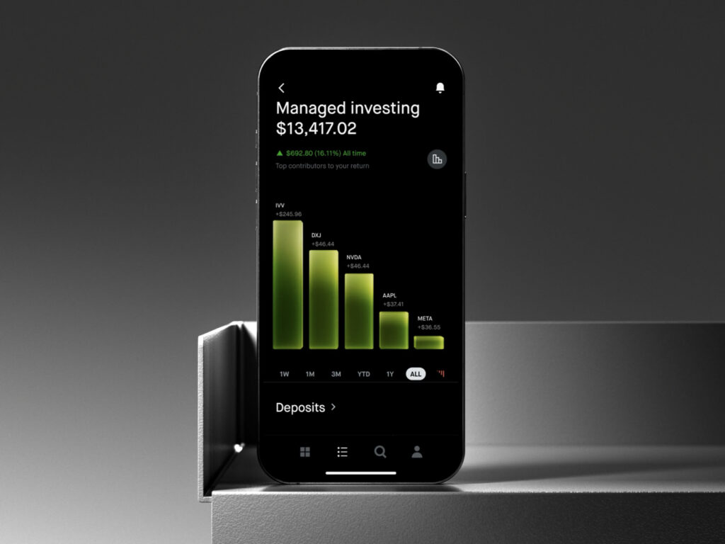
This is Robinhood's product design. It is an attempt to implement the goal of changing the way over 25 million users approach investing within an actual product.
This project started with extending the new brand language defined by brand studio Porto Rocha into digital interactions. The core focus was establishing a design system that makes complex financial information easier to understand.
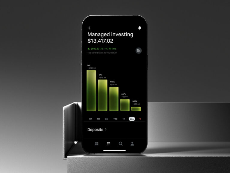
Robinhood redesigned the user experience around ring charts showing portfolio diversification, performance charts, and return analysis charts. Implemented in 3D, these charts apply glass-like flowing motion effects to intuitively reveal the asset allocation structure. It designed a sense of depth that goes beyond a flat UI.
The three charts each have different roles yet are connected as a single system. A unified experience was maintained by consistently applying 3D representations, animations, and material expressions.