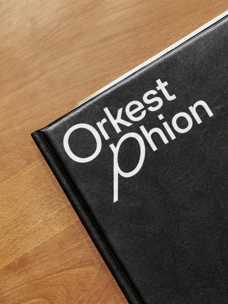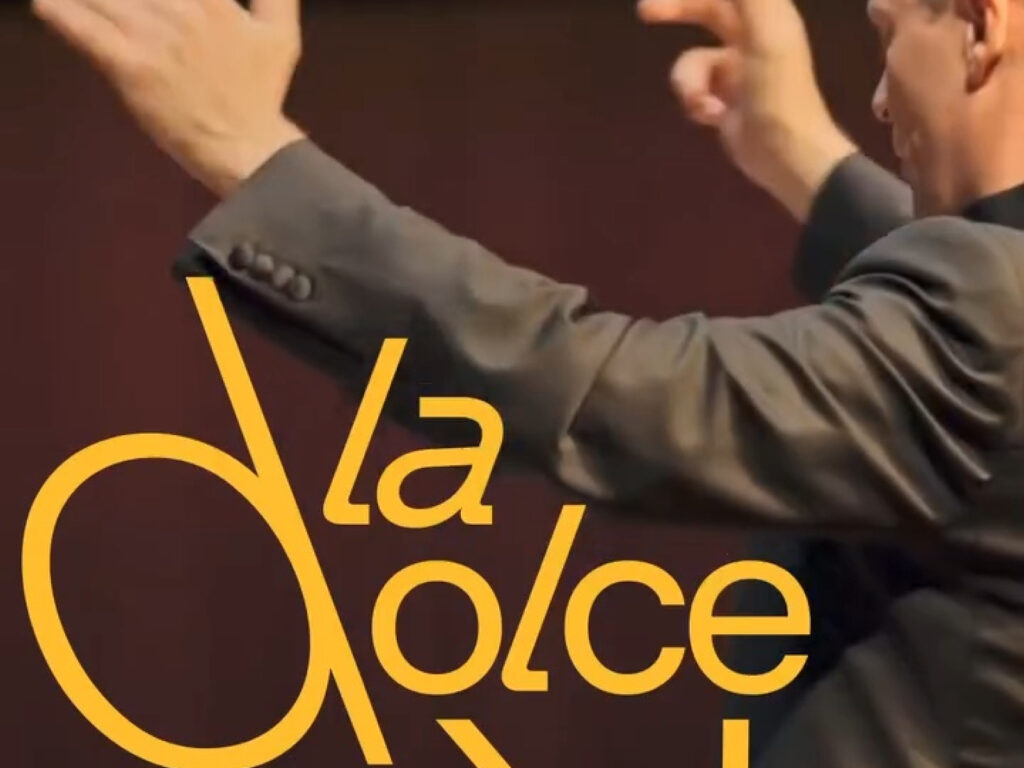

The Phion Symphony Orchestra has unveiled a new identity that translates the movements of a conductor into typography. The key element is a typeface system that sways like a conductor's baton. The uppercase letters move in sync with the flow of the music, and the rest of the text follows that rhythm, creating a visually fluid impression. While music typically determines the atmosphere in orchestra identities, this project extends the movement of the music itself into the forms and dynamics of the letters.
The typeface used is Grilli Type’s GT Planar, customized for the project. Based on a linear and structural font, it incorporates swaying movements reminiscent of a conductor's gesture to create Phion’s unique dynamic language. Recognized for its typographical excellence, this identity was selected for The World's Best Typography in the Type Directors Club's yearbook. Overall, Phion’s new identity is a motion-centric brand system that captures the energy of an orchestra and the rhythm of a conductor within the letters.