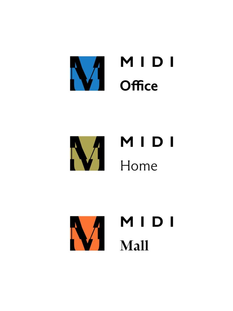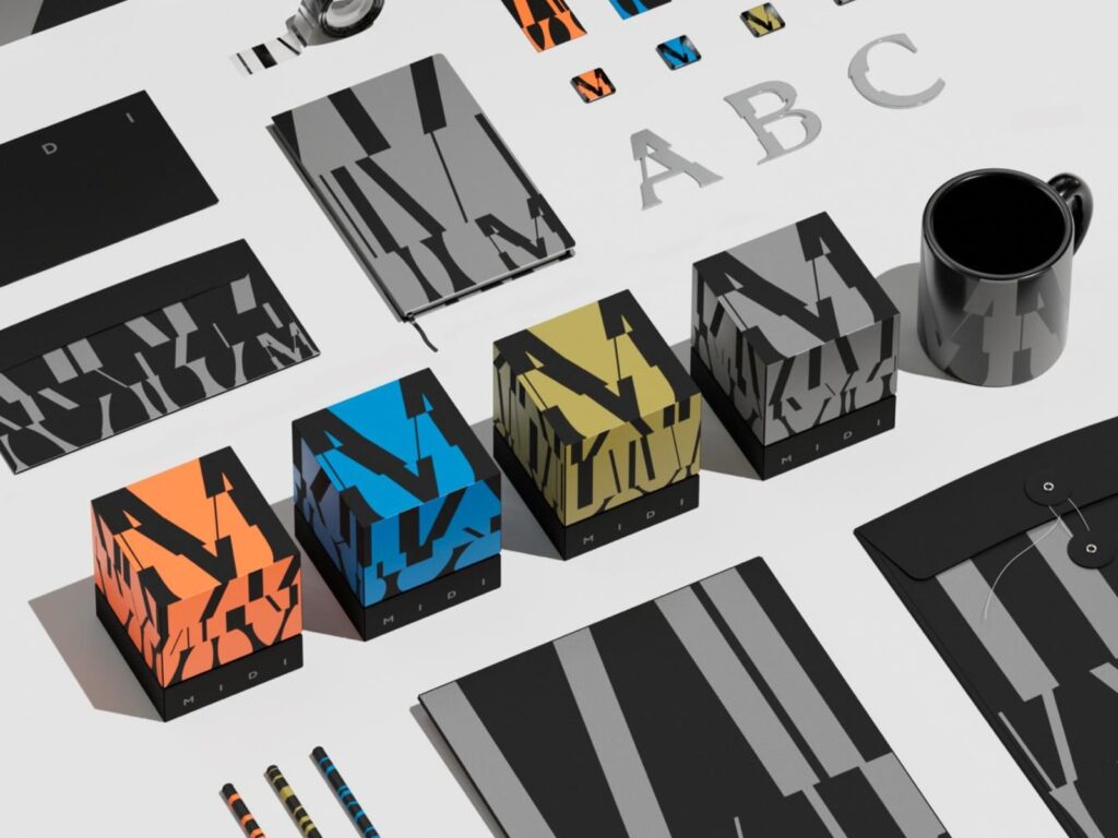
This is a real estate MIDI branding project located in Shanghai. It is a mixed-use development project that combines office, residential, and commercial spaces at a high density. While typical real estate developments define space based on floor plans and partitions, this project features a vertically stacked, three-dimensional structure as its core characteristic.
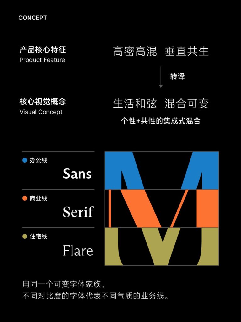
The brand design originated from this product characteristic. The core concept is 'high-density mixed-use.' To translate the structure of multiple functions combining vertically within a single building into a visual language, the designer created a vertically stacking typography system. The logo and letter structure resemble architectural forms rising layer by layer.
Typography is applied differently depending on the characteristics of the three spaces. Office lines use rational and organized sans-serif fonts to express the efficiency and reliability of the workspace. Commercial spaces use more dynamic serif fonts to emphasize vitality and rhythm. Residential spaces use semi-serif fonts, which fall somewhere between sans-serif and serif, to create a comfortable and soft impression.
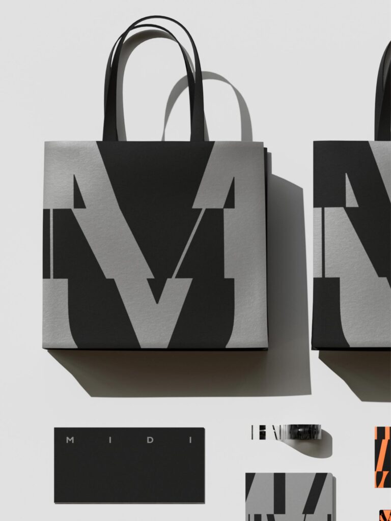
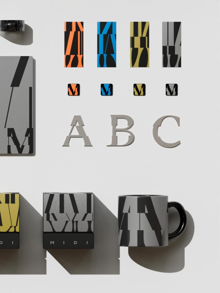
The graphic system was designed based on the same principle. We created a graphic language that allows letters to be expanded and combined, based on the structure of the logo. This system is not a fixed decoration but expands freely to suit various media and spaces. It is a method in which the building's vertical structure extends into the brand's visual structure.