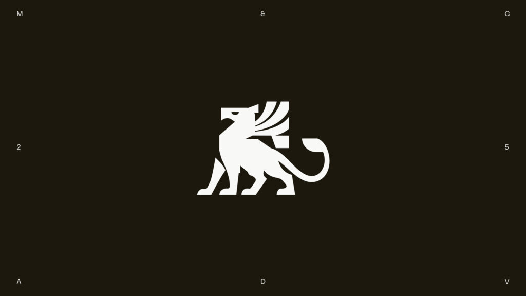
This is the brand design for Mamedes & Gasch. Mamedes & Gasch is a law firm led by Sarah Mamedes, specializing in litigation and legal consulting. The core of their work is procedural efficiency, clear step-by-step guidance, and communication that adheres to professional standards and confidentiality principles.
The brand's atmosphere is institutional, dense, and restrained. Rather than packaging legal services with a promotional image, it focuses on clearly conveying practical information such as deadlines, documents, and next steps. The fields covered include legal consulting and advisory, litigation, medical law, corporate and corporate law, administrative law, civil law, and consumer law.
The visual identity directly reflects this character. High-contrast serif typography is used for titles, combined with rational sans-serif for secondary text. This clarifies the hierarchy of information and establishes a direct layout for both documents and digital screens.
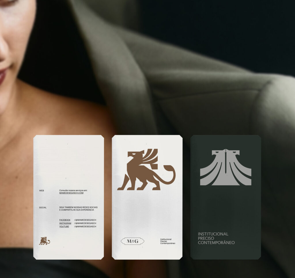
The color palette consists of deep green-black, earthy bronze, and gray. The overall impression is calm and heavy. Instead of drawing attention with strong colors, readability and trustworthiness are prioritized. This choice reinforces the law firm's professionalism and prudent attitude.
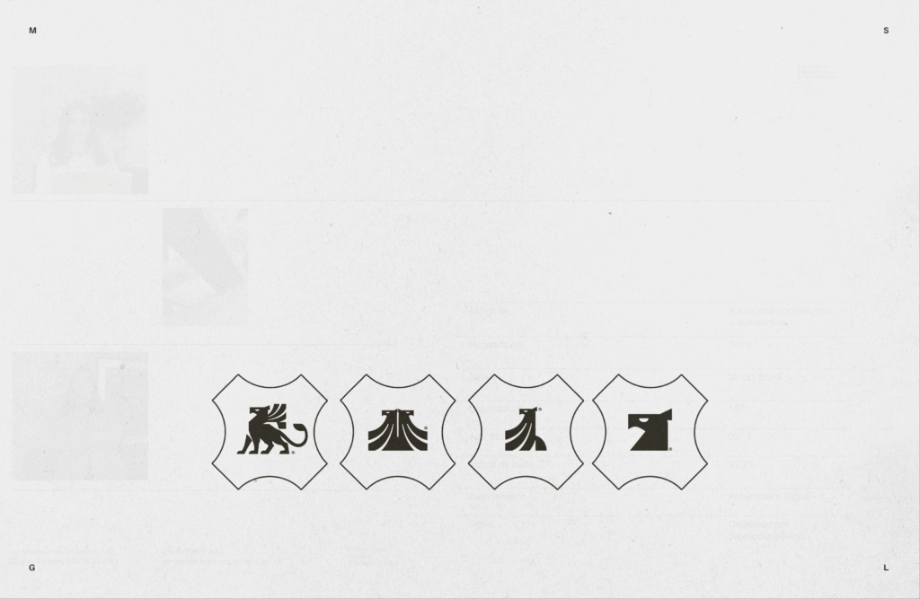
The core symbol identifying the brand is the griffin. With its solid form and precise cut edges, the griffin extends to seals, monograms, and signature elements. It is a device that links the authority of traditional legal documents with modern graphic systems.

More and Sources