The Brooklyn Museum has rebranded to celebrate its 200th anniversary, working with Brooklyn-based graphic design studio Other Means. “We needed a new brand that would be relevant to today’s needs, honor our rich history, and bring a tremendous amount of energy,” says Anne Pasternak, the museum’s Shelby White and Leon Levy Director.


The Brooklyn Museum has always resisted convention, thinking about and changing what it means to be a museum for the community. It has grown from Brooklyn’s first free library to an encyclopedic museum to the first feminist arts center.


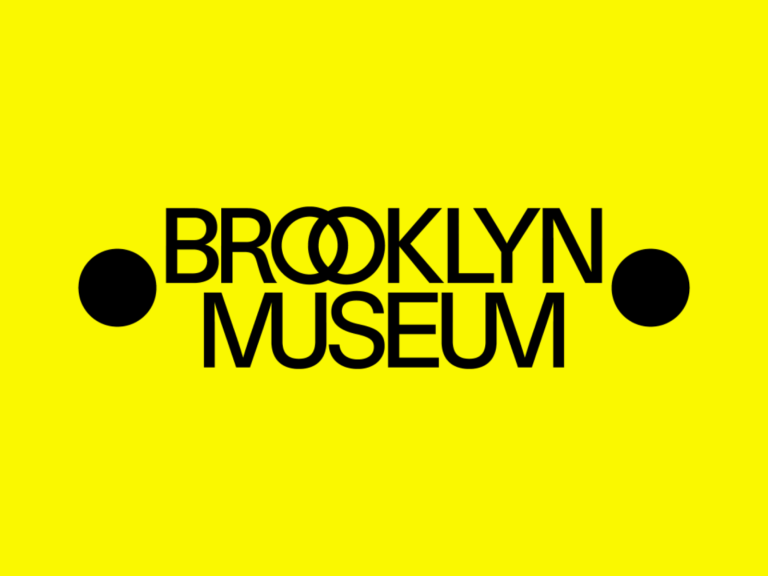
새로운 시각 정체성은 건물 정면에 고대 철학자, 극작가, 시인의 이름을 구분하기 위해 찍은 ‘점’에서 영감을 받았습니다. 도서관에서 시작한 박물관의 정체성을 상징하면서 예술과 결합됩니다.
“Brooklyn”의 고리처럼 얽힌 O와 “Museum”의 절묘하게 합친 M과 U는 박물관이 공동체의 다양한 목소리를 어떻게 하나로 모으는지 상징합니다. 설명을 보기 전에는 합자라는 것을 알아차리기 어려울 정도로 자연스럽습니다.

Unlike the classical impression of the architecture, the yellow color expresses the feeling of the museum that is popularly perceived as comfortable. The gray color is taken from the limestone wall of the building and is used with various bright and dark colors that symbolize the creativity and culture of Brooklyn.
The goods are also attractive. In particular, the keychain with the two-dot motif that comes to life stands out. It is simple yet unique, so it is not boring. The clothing goods can easily look like employees, but they look like products from a fashion brand.