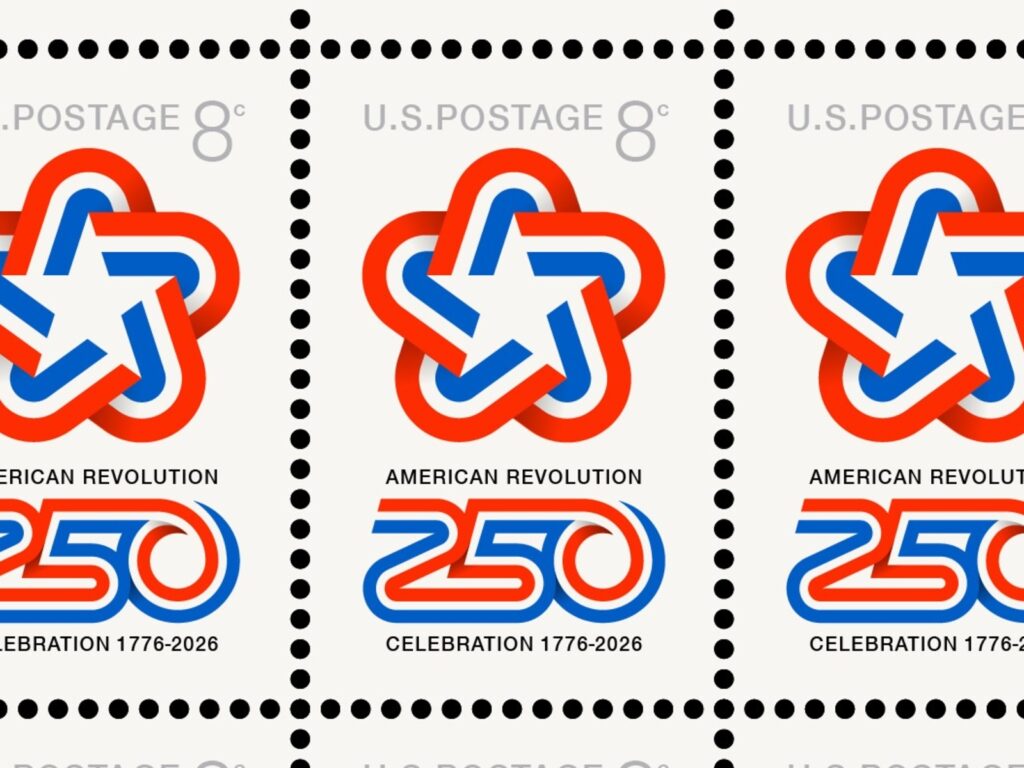
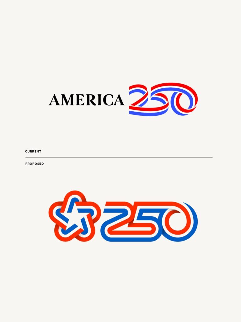
This is a project that reinterprets the America250 logo, a brand commemorating the 250th anniversary of the founding of the United States. Designed by Allan Peters, this project critically analyzes the official America250 logo currently in use and presents a new alternative based on the 1976 logo commemorating the 200th anniversary of the founding of the United States.
The designer raised several questions regarding the current America250 logo. Questions were asked such as why the iconic star logo used for the 200th anniversary celebration was not utilized, why the logo was not designed on a clear grid system, and why the number 5 looks like the letter S.
The starting point of the project is the 1976 logo commemorating the 200th anniversary of the nation's founding. This logo was designed by graphic designer Bruce Blackburn. The star symbol, composed of five lines, was used as the official symbol for the 200th anniversary celebrations of the United States at the time.
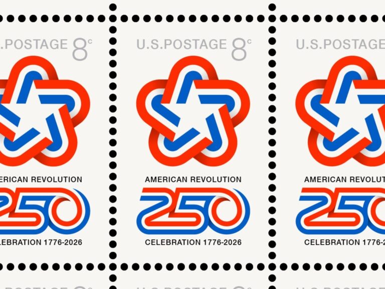
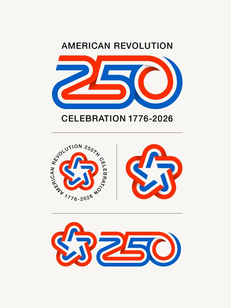
The new proposal proceeded by designing the number 250 using the original grid structure of this star logo. The designer created a new number signifying the 250th anniversary of the nation's founding while maintaining the geometric proportions and structure of the existing star.
The designer who unveiled the project explained, “We created a custom 250 using the original grid structure to respect Bruce Blackburn’s original work.” They also stated that the purpose was not simply to modify a single logo, but to propose a new logo system based on the brand assets of the nation’s 200th anniversary.


More and Sources