This is a brand design by 4Creative, the in-house creative agency for Channel 4 in the UK. The 4Creative internal team created the new identity in-house.
4Creative is an in-house organization that creates programs and campaigns for Channel 4. The Great British Bake Off, Peep Show, Educating Yorkshire I have undertaken various projects, ranging from the same program to the 2024 Paris Paralympic Games campaign. This rebranding project is a unified visual language that organizes the work and organizational culture we have built up over the years.
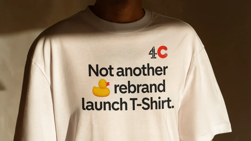
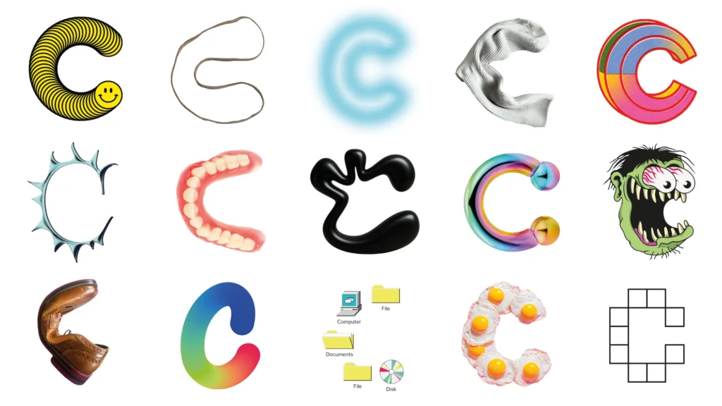
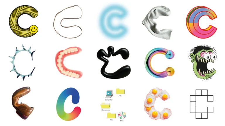
The key point is that they did not create a single fixed logo. 4Creative created a new 4C monogram by combining Channel 4's existing logo with the letter C. In this case, the C was not just a single form, but consisted of over 130 variations created individually by team members. The logo changes continuously depending on the situation, and new Cs can be added when a new team member joins.
This approach directly reflects the nature of 4Creative. It incorporates into the logo system the fact that it is not an organization organized by a single style, but one created by many people and constantly changing. 4Creative designed this to be closer to a "logo that is constantly being created" rather than a "finished logo.".
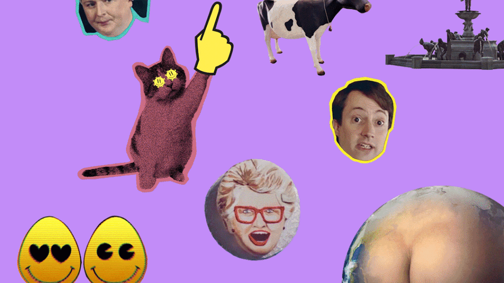
The graphics system also utilizes Channel 4's archives. The team created visual elements using images that look as if they were cut out of scenes and symbols from past programs and campaigns. Elements such as rubber ducks, rainbows, snow, underwear, and Claudia Winkleman's face are used as an image language to replace letters and words.
This cut-out method is not merely decoration. It is a way of retrieving traces of 4Creative's work and transforming them into brand assets. When scenes are detached from their original programs or campaigns, they function like icons, memes, or puzzles within a new context.