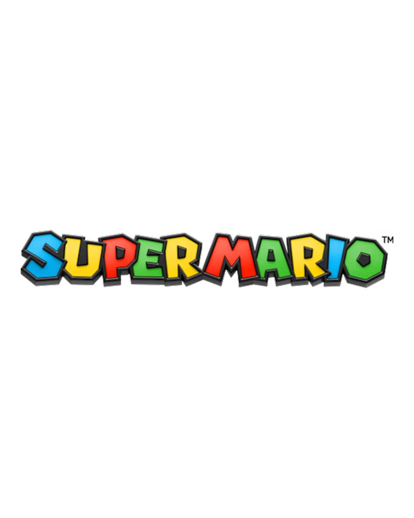
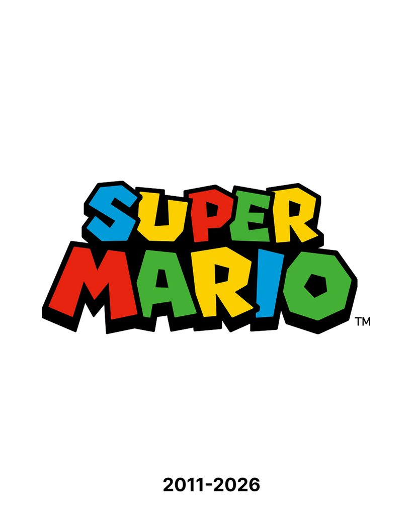
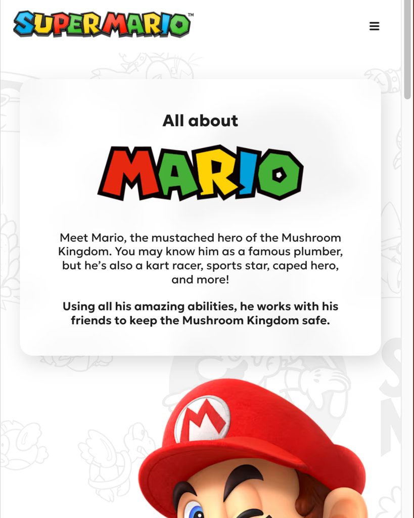
Nintendo has applied a new logo to its official Super Mario website. While maintaining the multi-colored lettering and familiar shape, a three-dimensional effect has been added to the surface and edges of the letters. From a distance, it looks like the Super Mario text of the existing logo, but up close, it resembles a thick object rather than a flat graphic.
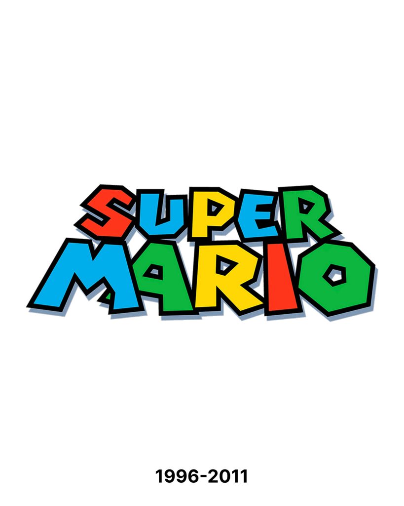
The most significant change is the outline of the letters. Instead of the black outlines that clearly distinguished the shapes in the previous logo, gray slanted surfaces have been introduced. Bright reflective details have been added to the front of the letters, making them appear like smooth surfaces. Color continues to serve the role of distinguishing each letter, while shading and angles add depth to the characters. In essence, the presentation method has been changed while retaining the familiar elements that make up the logo.
The new logo is currently visible on the official website in a horizontal layout. Thanks to its basic composition of interconnected multi-colored text, the distinctive rhythm of Super Mario remains even when scaled down. The added sides and gloss create a tangible impression, much like a block or toy from the game. This is where the logo reads as text on a screen while simultaneously appearing as a three-dimensional object that could be placed within the game world.
While there is speculation linking the three-dimensional representation to a new 3D game, Nintendo has not officially revealed any connection between the logo change and a new title. The change that can be confirmed at this time is that the text representing Super Mario has acquired a new surface while retaining its original color and shape.
See more and sources