OS that began to reveal its senses
An interface that expresses physical properties again
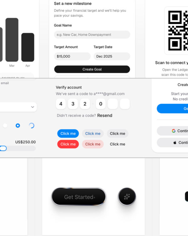
Recently, the interfaces of major operating systems are once again emphasizing materials and forms. Rather than the screen quietly receding into the background, the trend is shifting toward revealing its presence.
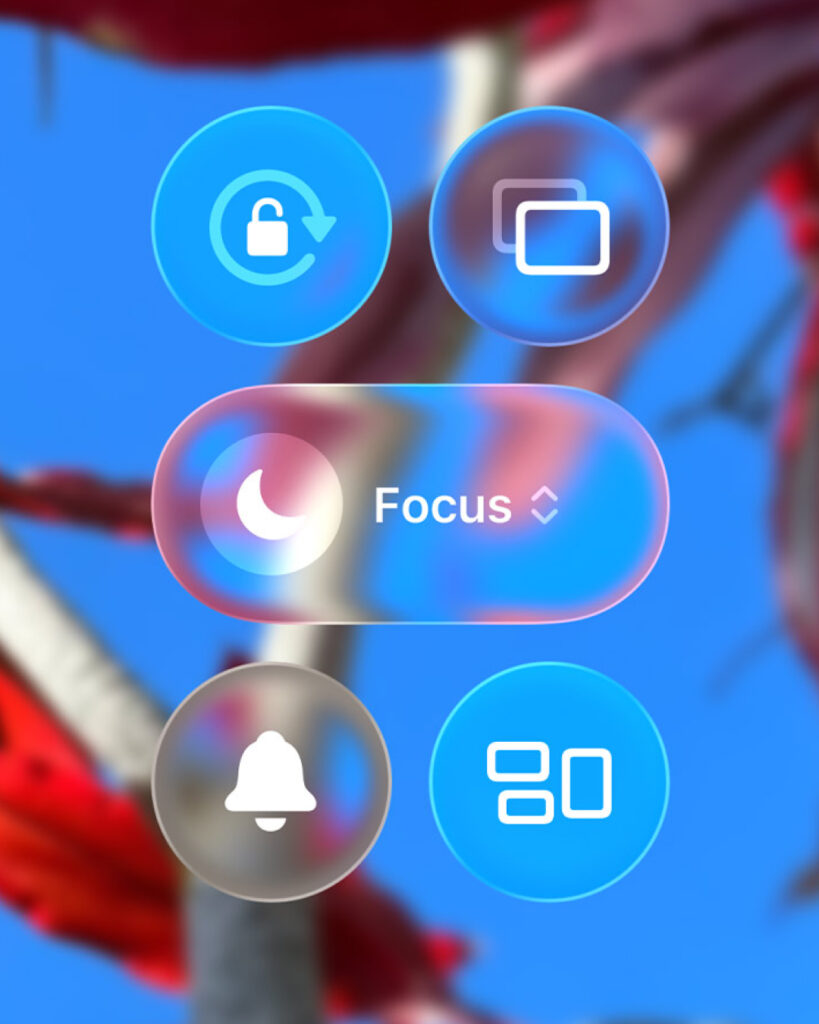
Apple has applied 'Liquid Glass' to iOS 26, iPadOS 26, macOS Tahoe 26, and others. Buttons, tab bars, sidebars, widgets, and icons appear like transparent glass. They also react to surrounding colors and movement. Apple explained that this material changes depending on the content and context, creating depth on the screen.
Google is also changing the visual language of Android and Wear OS. Material 3 Expressive makes more active use of color, shape, motion, and haptic feedback. Surrounding elements move along when you swipe a notification, and volume sliders and quick settings screens respond more fluidly. In Wear OS, lists and transition gestures move along the curves to fit the circular screen.
Making an unfamiliar screen familiar
It is difficult to view this change merely as a matter of making the screen flashy. Digital interfaces inherently lack physical properties. Buttons are not actual buttons, and windows are not actual spaces. Users must learn symbols and rules within a glowing screen.
Therefore, OS design has long borrowed sensations from the real world. By transferring familiar objects and movements onto the screen, it made users feel the digital environment less unfamiliar.
Windows' Aero style utilized transparent glass and bright light. Overlapping windows gave the computer screen a light texture. Since the Aqua interface era, Apple has favored using textures such as glass, gel, and plastic. Buttons looked like objects you wanted to press, and icons were depicted as objects reflecting light.
Google's Material Design organized paper, shadows, and depth into on-screen rules. It did not strictly replicate actual paper. Instead, it used physical metaphors to help users easily understand what is in front and behind, and which elements are moving.
‘Interface for 'Difference'
Friction drastically reduced by AI
Current mobile interfaces have become quite stable. Most smartphones look similar. The structures of apps are also alike. Bottom tabs, card-style lists, search bars, notifications, and settings screens have now become familiar conventions.
Users generally know where to tap even when opening a new app. This is a positive change. At the same time, it also means that it has become difficult to create distinct differences based solely on the interface.
With the advent of AI, the friction of operations is further decreasing. Tasks that previously required navigating through multiple menus can now be requested using natural language. Operations such as searching, organizing, writing, making recommendations, and booking are processed in increasingly fewer steps.
Then, the role of the interface changes as well. In the past, it was important to make it easy for users to operate directly. However, as the actual operation itself decreases, what remains is the impression of the system. It becomes more important what character the product possesses, what sensations it evokes, and why users want to stay in this environment.
Interface aiming to become a brand
Therefore, recent OS design is regaining its presence. While the goal of the past was to naturally hide the interface, the current goal is closer to making the interface itself feel like a brand experience.
Apple's Liquid Glass binds all Apple devices into a single visual world. Google's Material 3 Expressive emphasizes that Android can adapt to individual tastes and conditions. Samsung is defining how the Galaxy ecosystem is used, centering on AI and various device forms.
Ultimately, the reason for being chosen is core values
Differences have become smaller, and impressions have become important.
It is not yet known how significant an impact these changes will actually have. The growth of software has historically stemmed from better problem-solving experiences. Maps that enabled faster movement, messengers that facilitated easier conversations, and services that made payments more convenient have been chosen by users.
Visual style played a role in facilitating such an experience. However, style itself was rarely the primary reason for selection. Interface styles are also easily replicated. UI is difficult to protect strongly through copyright, and successful patterns spread rapidly.
The impression the service should leave
Individual services are inevitably affected by changes in the OS. If iOS emphasizes transparent materials and fluid structures, iOS apps must follow that order to some extent. If Android expands the expression of color and form, Android apps must also consider how to appear naturally within that environment.
However, not all services need to mimic the OS's surface effects. What is more important is whether the core value of one's service is clearly conveyed during the usage process.
The interface is now speaking of the senses again. However, the senses are closer to the material for building relationships than the goal itself. More important than a striking style is making it clear why the user needs to open this service again.