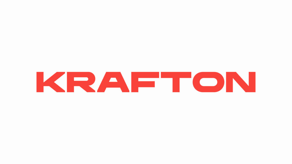
Krafton unveiled its new vision, slogan, and corporate logo on February 26. CEO Kim Chang-han presented organizational alignment and mid-to-long-term growth directions during the internal program, Krafton Live Talk. The new vision consists of a declaration to forge a path less traveled to realize the dreams of gamers.
The slogan is "Pioneer the Undiscovered." Translated into Korean, it means pioneering uncharted territory. The company explained that this embodies its determination to expand the boundaries of genres and technologies while focusing on the essence of the game business. Krafton has set securing major franchise IPs as a mid-to-long-term strategy, stating that it intends to verify potential through small, rapid challenges before growing the franchises through scaling up.
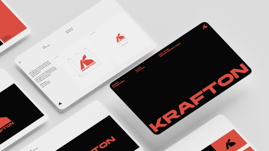
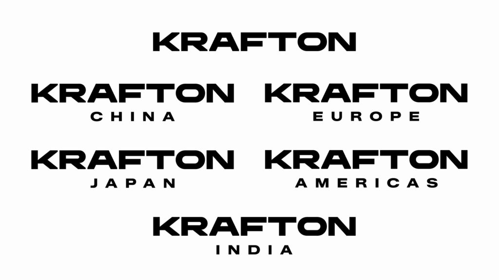
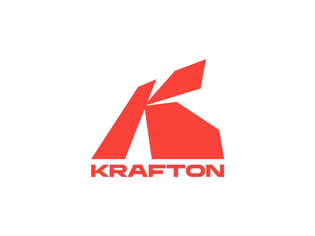
The key design aspect of this announcement is the replacement of the corporate identity (CI). The new logo prominently features the concept of a "shift in perspective." It was explained that the logo's form embodies the meaning of overturning familiar views to discover new possibilities. The brand color has also been redefined into a shade of red that emphasizes vibrancy and strength, aiming to strengthen global recognition.
Looking at the logo, the first letter K is designed not merely as a simple initial, but like a structure. Because it consists of thick surfaces folded and standing upright, it creates a three-dimensional illusion despite being a flat logo. This serves as a device to visually embody a shift in perspective. The shadow-like negative space created by the angles between the surfaces completes the skeleton of the K, and depending on the viewing angle, it can be interpreted as a single mass. The separated piece at the top resembles a cut line hinting at a moment of change in direction, leaving clues of movement even in a still image.