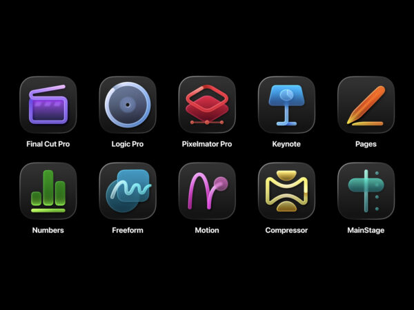
Apple's introduction of Liquid Glass, a transparent, textured design language, across its entire product line in the 2025 update cycle has met with mixed user reactions. While some say the look of iOS 26 has become familiar over time, Mac users are citing macOS Tahoe's menu icons as a bigger issue.
Niki Tonsky, a software engineer and designer, criticized Tahoe's menu icons in his blog post, "It's hard to justify Tahoe icons," calling them obnoxious, distracting, hard to read, and messy. Tonsky explained that the core function of icons is to distinguish and speed up navigation, and adding an icon to every item actually makes things less noticeable. He claimed that apps sometimes use more than 10 different icons for the same "New" action, with each icon representing multiple functions. He added that the excessive detail is difficult to read at small sizes and that the actual physical size feels smaller on a retina display.
On Reddit and elsewhere, even longtime Mac users are reporting that it feels like using a computer for the first time. Experts say that since menus are an area where quick scanning is key, it's better to use icons sparingly and strictly adhere to standards for each action, rather than applying them across the board. It remains to be seen whether Apple will adjust the iconography in the upcoming macOS 26 update.