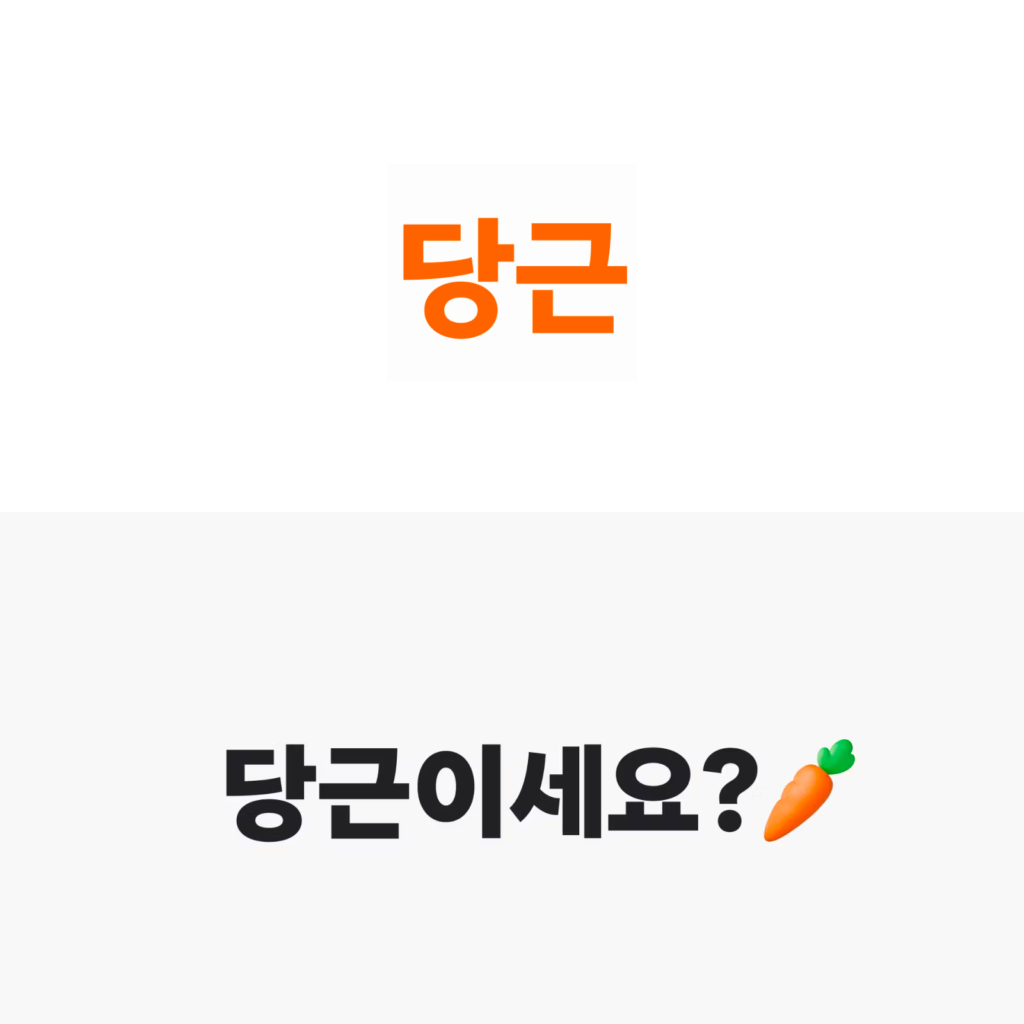
중고거래 서비스 당근마켓이 당근으로 리브랜딩했습니다. 지역 생활 커뮤니티로 변화하면서 하이퍼로컬 사업 로드맵을 완성하겠다는 계획입니다. 가까운 이웃을 발견하고 나눔의 기쁨을 느낀 당근마켓에서 ‘마켓’을 떼고 ‘당신 근처’로 나아가기 위한 여정을 시작한다고 밝혔습니다.
8년 전 처음 서비스를 만들 때 후보 중 하나였지만 시작하는 회사가 보통 명사를 사용하긴 어려웠기 때문에 ‘마켓’을 붙였다고 합니다. 시작부터 마켓보다 당신 근처를 중요하게 생각했고 돌고 돌아 이제 ‘당신 근처에’를 쓸 수 있게 되었다고 합니다.
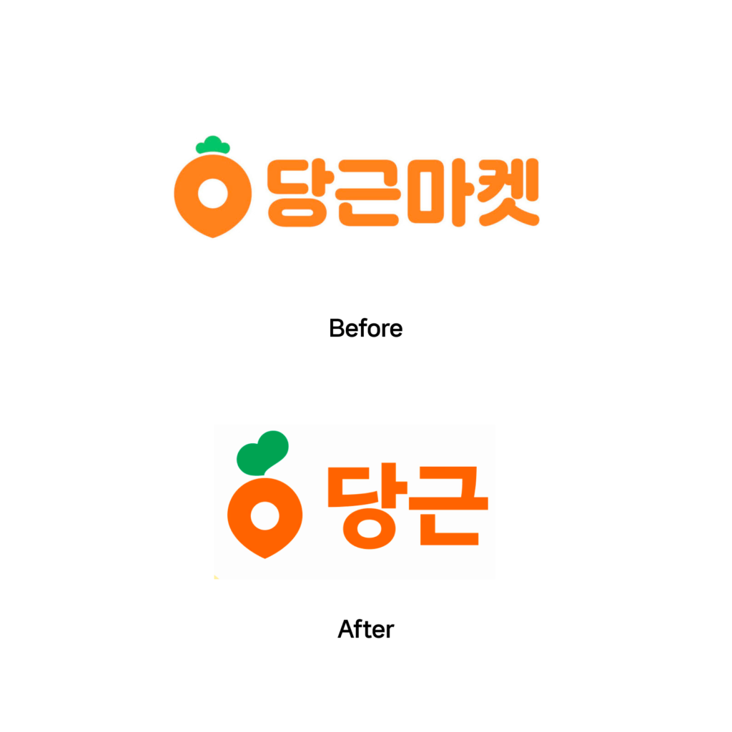
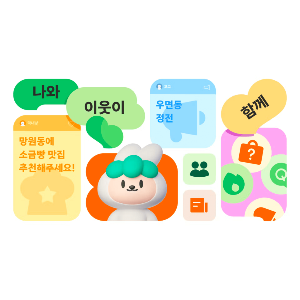
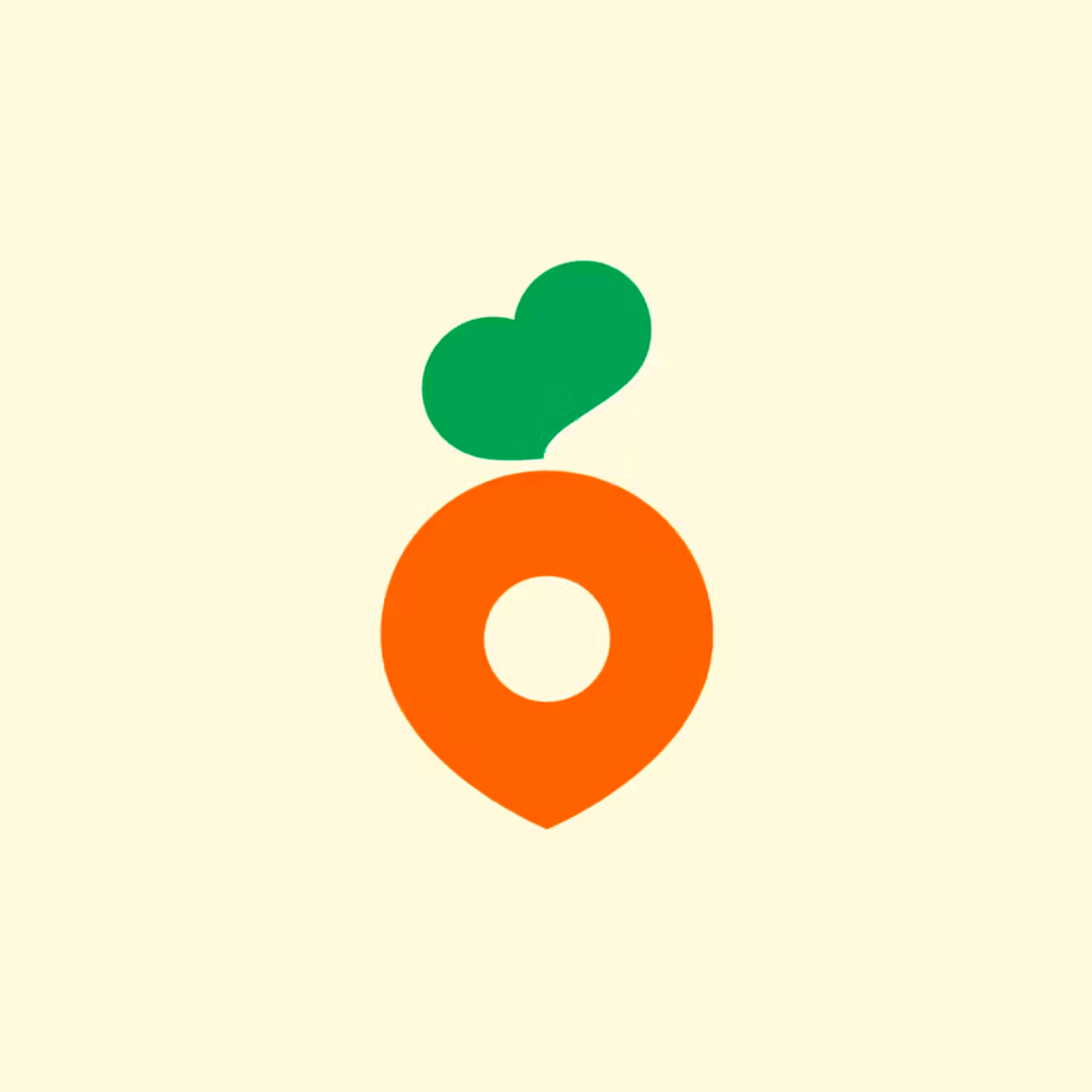
새로운 당근 모양 심볼에는 지역(Local), 연결(Connect), 삶(Life)세 가지 가치가 담겼습니다. 지역을 표현하는 주황색 ‘핀’ 위에 초록 잎은 이웃과 연결되는 순간의 감정을 표현한 ‘당근 하트’입니다. ‘함께 할 때 이로운 삶’을 상징합니다. 다양한 감정을 표현하는 팔레트도 다양해졌습니다.

새로운 서체인 캐롯 산스도 공개했습니다. 자세한 내용을 공유하진 않았지만 워드마크와 브랜드 소개에 서체가 사용되었습니다. 전체적으로 둥근 인상의 서체에서 각진 인상의 서체로 바뀌었습니다. 진하게 눌러 쓴 것처럼 굵고 힘 있게 뻗습니다. 자음의 크기가 모음에 비해 가로 세로로 납작합니다.
워드마크와 디스플레이에 쓰인 서체의 디테일도 차이가 있습니다. 워드마크는 어꺠가 올라가 으쓱한 느낌이 들고 ‘당’ 내부의 공간이 다소 긴장감 있게 느껴지네요. 디스플레이에 쓰인 문장에서는 ‘ㅅ’의 폭과 곡선이 눈에 띕니다. 자음이 납작한 편입니다. ‘켓’ 처럼 받침으로 쓰였을 때는 살짝 쏟아지는 느낌도 듭니다.
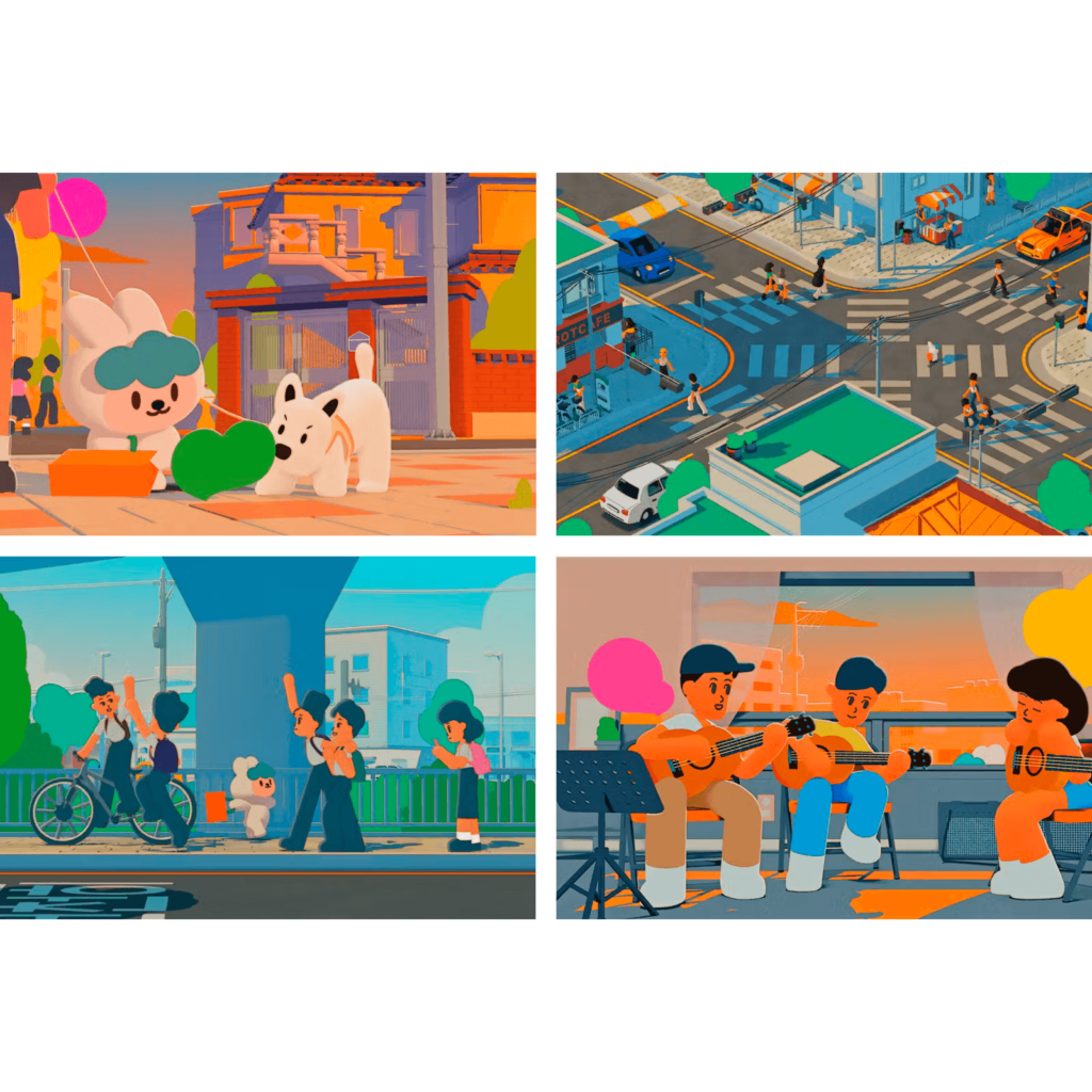
‘함께 사는 방법, 당근’ 제목의 브랜드 소개 영상도 공개했습니다. 동물의 숲 같은 애니메이션으로 이웃과 함께 사는 동네 생활을 표현했습니다. 당근을 대표하는 ‘당근이’ 캐릭터가 동네를 돌아다니면 마주하는 다양한 순간을 묘사합니다. 당근을 통해 만난 이웃 머리 위로 당근 하트가 뭉게뭉게 피어나는 것을 자연스럽게 표현합니다. 당근의 컬러인 주황빛 햇살이 동네 전체에 내려 쬐입니다.

당근 마켓의 정신과 표현을 계승하면서 더 멋진 포부를 담은 멋진 리브랜딩입니다. 리브랜딩이라고 하면 모든 것을 부정하고 싶은 유혹에 빠지기 쉬운데 균형을 잘 잡은 것 같습니다. 서비스가 고객에게 어떻게 기억되고 있는지 알고, 회사는 앞으로 어떻게 기억되길 바라는지가 뚜렷하게 드러난 디자인입니다. 네이버를 이어 새로운 시대의 사람들의 연결이 되길!