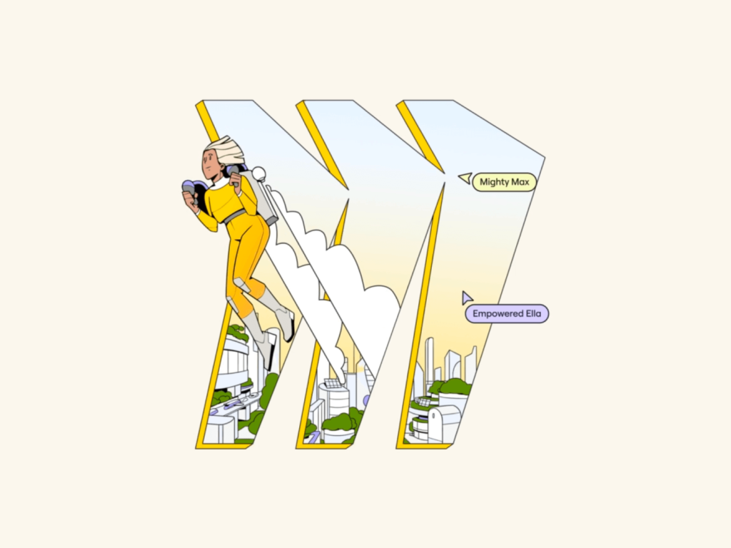
Miro Miro has rebranded. Four years ago, it rebranded with Dutch design agency Vruchtvlees and left a deep impression with its stunning visual grammar. In a short period of time, Miro has quickly grown into a collaboration tool used by people all over the world. This time, we collaborated with AKQA to create a more visually distinct brand identity. 👁️ Designer's Eye The most noticeable and unique change in Miroman is the illustrations. It warmly depicts concrete reality rather than abstract concepts. A robot that plants trees, […] ]
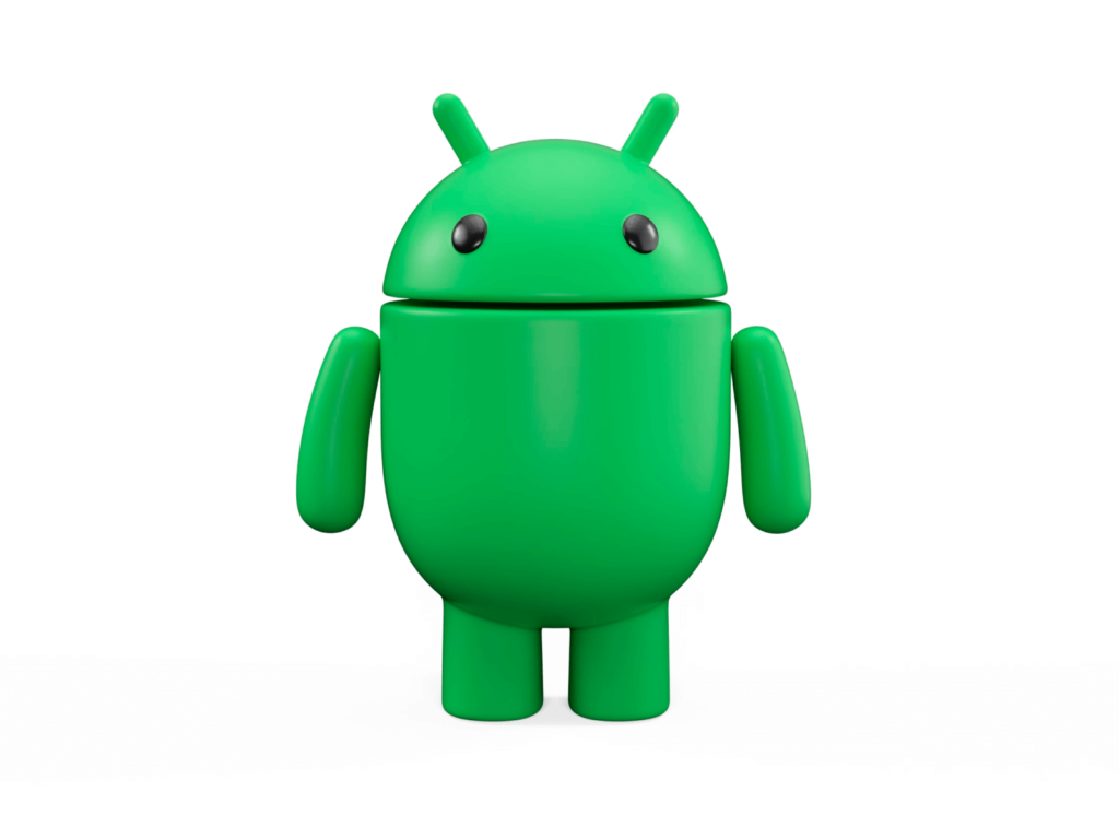
Android has undergone a rebrand. The world's most popular mobile operating system has updated its wordmark and mascot to coincide with the upcoming release of Android 14. The iconic Bugdroid has been transformed into a 3D icon with cute and playful animations. The wordmark has also been updated to reflect Android's personality and empower it. Android 14 is slated for release this fall, and Google's new Pixel 8 phone is also coming soon. 👁️ Designer's Eye 2019 […]
Dribbble, a service where the designer famous for the pink basketball logo shares his work, has updated its brand and service after 14 years. Dribbble, which has become a playground for countless designers since its founding in 2009, has changed its logo to pursue its mission to become the best place to meet creative talent anywhere in the world. Websites have also evolved into platforms for finding talented designers. 👁️ Designer's Eye Dribble is a favorite among designers with Behence […] ]
Following the new Sumaksae symbol, a website containing the changed LG brand was released. You can take a look at LG's newly refined brand story, brand expression containing LG Electronics' design philosophy and expression, and Life's Good in action, which contains LG's actions for a better life. Among them, the brand expression containing specific designs, Philiosophy containing LG Electronics' design philosophy, and […] ]
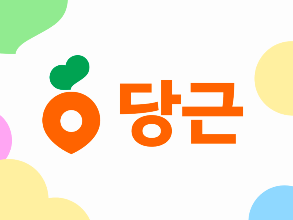
Carrot Market, a used goods trading service, has been rebranded as Carrot. The plan is to complete the hyperlocal business roadmap while transforming into a local living community. Carrot Market, which discovered close neighbors and felt the joy of sharing, announced that it is starting a journey to break away from 'market' and move to 'near you'. It was one of the candidates when the service was first created 8 years ago, but it was difficult for a starting company to use a common noun, so they added 'market'. From the beginning, we considered your neighborhood more important than the market […] ]
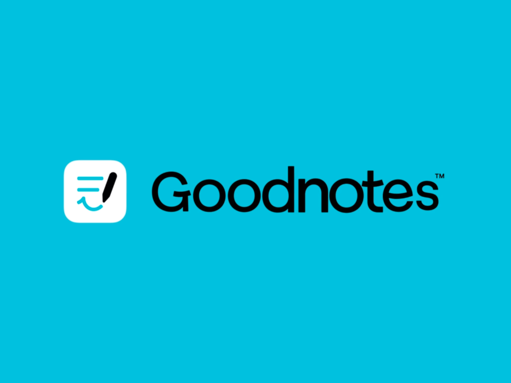
GoodNotes, the essential iPad app, has rebranded in collaboration with wearemotto. GoodNotes has rebranded and released Goodnotes 6, with a vision to transform the way people learn, write, and record. It will transition from a simple note-taking app to digital paper and pioneer generative AI. 👁️ Designer's Eye We designed a visual identity that is filled with fun while maintaining the classic teal of GoodNotes. Jonathan Mak's smiling doodles are used throughout the typography, illustrations, and motion. Paper […]
29CM, together with CFC, designed the brand identity of '29CM Seongsu', the first offline showroom. 29CM has created a two-story showroom in Seongsu to reinforce its brand identity as a guide for better choices. The 1st floor is a showroom and exhibition hall, and the 2nd floor is a multi-purpose space for each season. Called 'Lee Sung-soo', this space curates seasonal items like a magazine. Ha Tae-hee, senior manager of the 29CM branding team, said, “It is a space where people with their own tastes gather and infinite possibilities […] ]
The Premier League teamed up with brand agency Nomad to refine the iconic logo. The lion head design introduced with the rebranding of DesignStudio for the 2016/17 season has been kept and refined. Nomad's new brand design aims to recreate the match-day experience on the pitch, on the screen and on the air. All elements of the brand have been drastically simplified and clearly refined to create an impact. […] ]
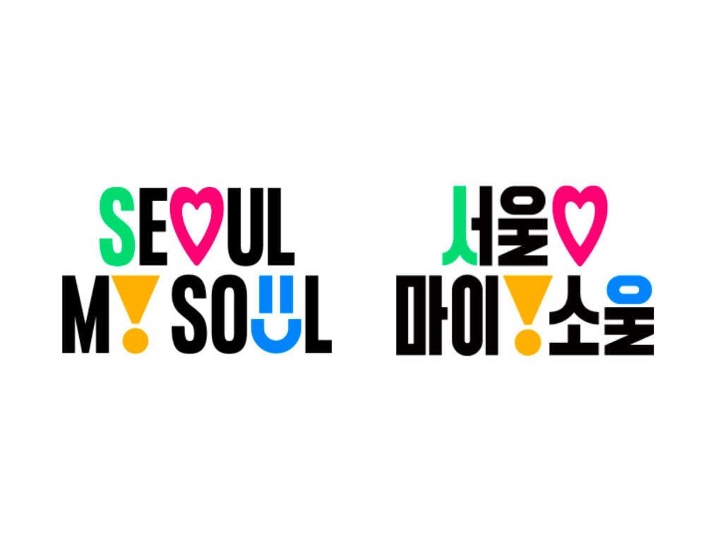
The brand of Seoul, which had many twists and turns, was selected as “Seoul, My Soul”. On the 16th, the Seoul Metropolitan Government announced Seoul's new city brand, 'Seoul, My Soul' (When hearts come together, it becomes Seoul). About 850,000 citizens participated in slogans, design preferences, and design contests. 1st and 2nd preference was investigated, and opinions were received in detail while categorizing both Koreans and foreigners. However, there were many opinions that it was not properly voted due to suspicion of plagiarism and quality issues. 👁️ Designer's […] ]
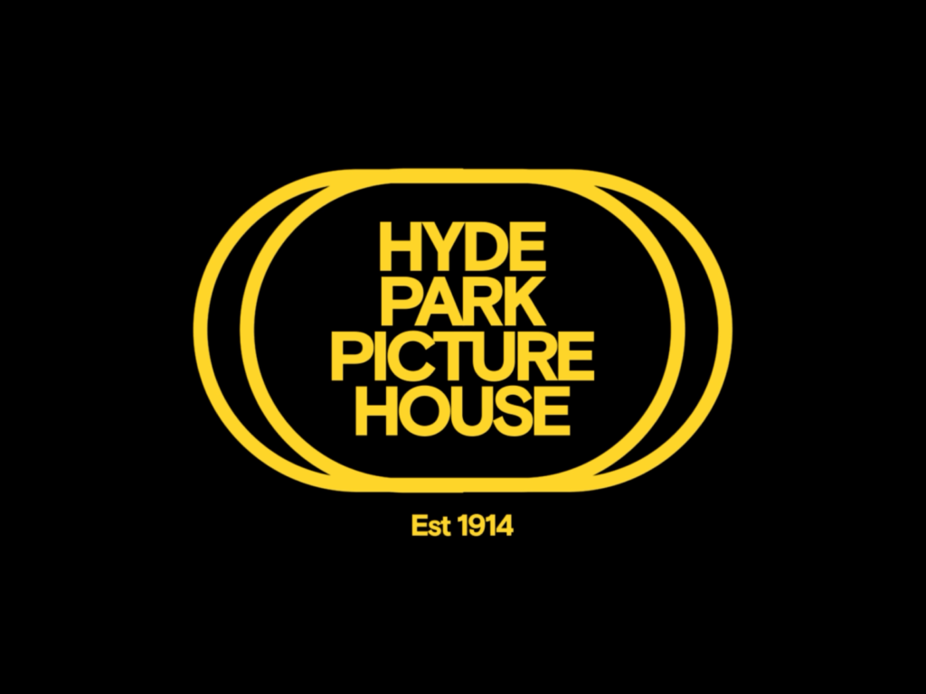
Hyde Park Picture House has been rebranded by Leeds-based design studio Rabbithole. Designed by architects Thomas Winn & Sons in 1906, it became a cinema in 1913. It is the oldest cinema in the UK, still using analogue projectors and gas lighting. It retains features from its early days, such as its ornate balconies and outside ticket booth. It reopened in 2016 after a restoration. 👁️ Designer’s Eye The distinctive logo is a reference to the early 20th-century Cineccanica […]
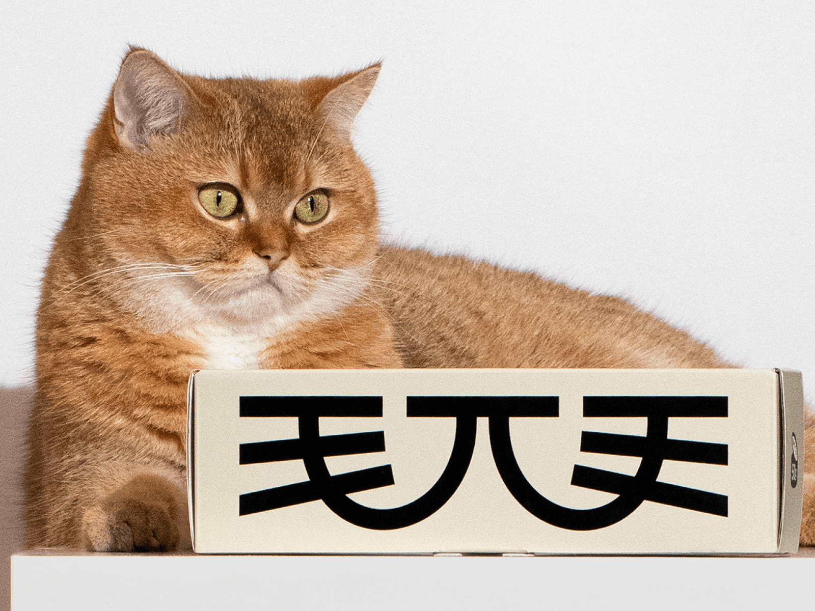
For cat food brand Maowoo, DXD Studio designed the brand experience. DXD Studio is a design studio based in Shenzhen, China. DXD partner Zhou Shengdian revealed that the goal was to combine a unique identity that could communicate with the younger generation of cat owners, with 'lifestyle aesthetics' and 'reliable scientific food'. “Intuitively, it looks more appetizing, takes the packaging design to the next level, and inside […] ]
My Real Trip has been rebranded. Established in 2012, My Real Trip is Korea's leading online travel platform that helps people travel abroad. We started with guided tours and expanded to attraction tickets, air tickets, lodging, travel insurance, and car rentals, providing everything about travel. This time My Real Trip changed its symbol and word mark. The changed logo has been applied to the entire app and web service. It has changed from a logo with a diagonal line penetrating the wordmark to a handwritten wordmark. The symbol changed from M to My. […] ]