Bike For Brain Health is an annual event that supports dementia research and patient care. Recently, designers Zoë Boudreau and Jesse Shaw brought it to life with a subtle yet powerful visual identity. They won Gold at Cannes Lions Young Lions for this project. The core graphic is a bicycle that distorts and changes shape. It visually symbolizes the state of confusion and cognitive changes experienced by dementia patients, while at the same time […]
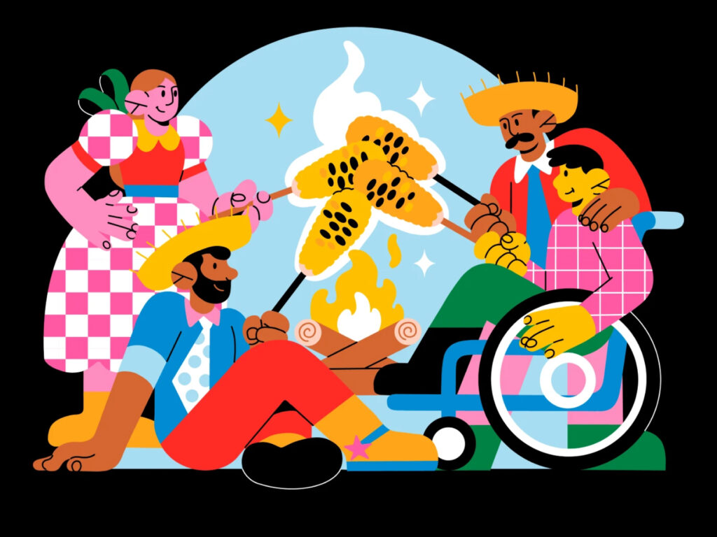
An illustration created for GoDaddy Studio to help create brand content for Brazil’s Festa Junina. Brazil’s Festa Junina is a traditional folk festival held throughout Brazil each June, centered around abundance, rural culture, and the faith of saints. It is a very unique national event that combines European (especially Portuguese) festival traditions with Brazil’s unique agricultural culture, and is considered the second largest national festival after Carnival. GoDaddy […]
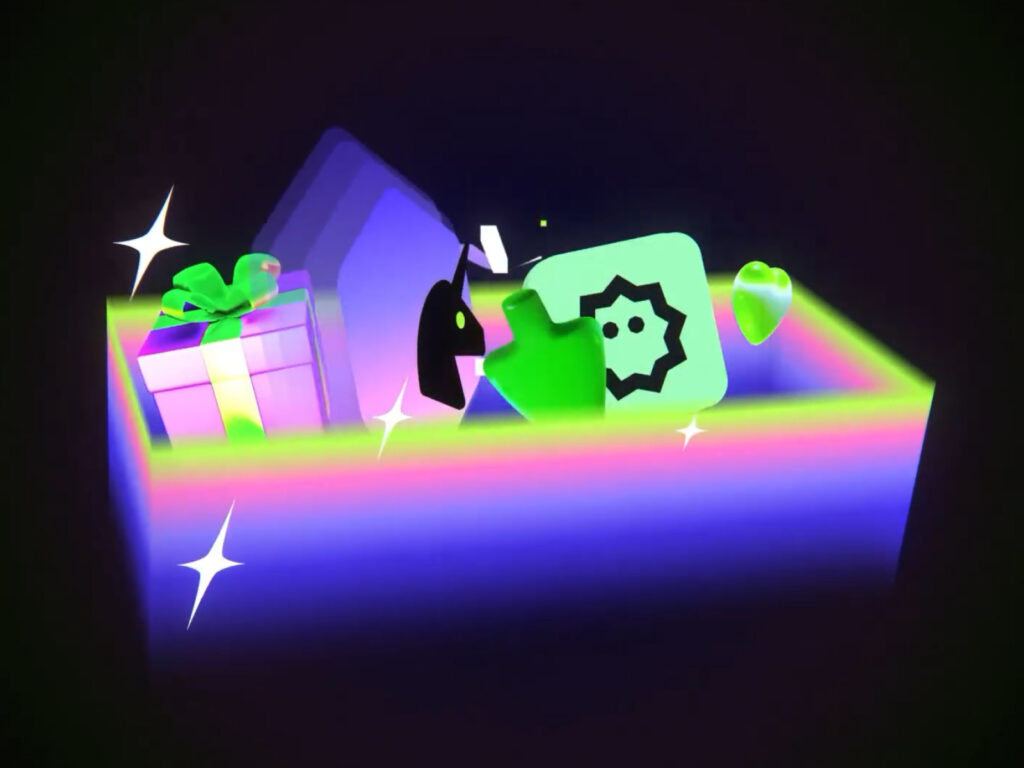
'Gift Exclusive' is a function that allows you to gift digital art from DeviantArt to your friends. Gradients are used to express the individuality of DeviantArt while adding a sense of touch. Or Drori, who created the motion graphics, is a freelance motion graphic designer, creative director, animation director/lead, and commercial artist. He has developed his own unique style and approach to design, motion, and visual storytelling through his extensive career. He has collaborated with studios such as Hornet, Lost York, and Koto, and […]
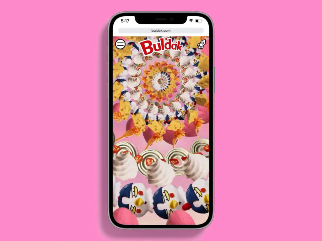
This is the global official website project of Samyang Foods. This project was carried out in an integrated manner from the development of the brand slogan and message to the design and development of the website, and the design studio 'Everyday Practice' was in charge of it. The core slogan, 'Spicy or Nothing', symbolically expresses Buldak's challenging attitude and confidence in its intense spicy flavor. This slogan goes beyond a simple marketing phrase and contains the brand philosophy of attempting to connect emotionally with global consumers. The expanded […]
Airbnb has officially launched "Airbnb Experiences," a program that allows travelers to authentically experience local culture. Beyond accommodations, this strategy aims to enrich travel experiences by offering diverse experiences led by local hosts. The campaign video, featuring the Beatles' "Magical Mystery Tour," serves as a soundtrack, emphasizing the excitement and mystery of travel. The captivating video, produced by animation studio Buck, visually captures the diversity of host-led urban experiences. Tours, […]
Founded in 2005, Big Cartel is an e-commerce platform focused on indie artists and creators. It is a 20th anniversary rebranding. We collaborated with London and LA-based design agency How&How. In a time of fierce competition in the e-commerce market, Big Cartel wanted to emphasize that it is a platform that helps creators put their ideas into action. The new slogan, ‘From day job to dream job’, is a way for the brand to go beyond a simple sales tool […]
This is a rebranding project for William Stout Architectural Books, located in San Francisco's Jackson Square. For the past 50 years, William Stout has been a leading provider of architectural books, design books, and even materials manuals. Acquired by the Eames Institute for Infinite Curiosity in 2022, the company is preparing for a fresh start. This prompted Jony Ive's design studio, LoveFrom, to develop a new graphic identity. Inspired by the bookstore's existing signage, LoveFrom created a custom "LF Washington" […]
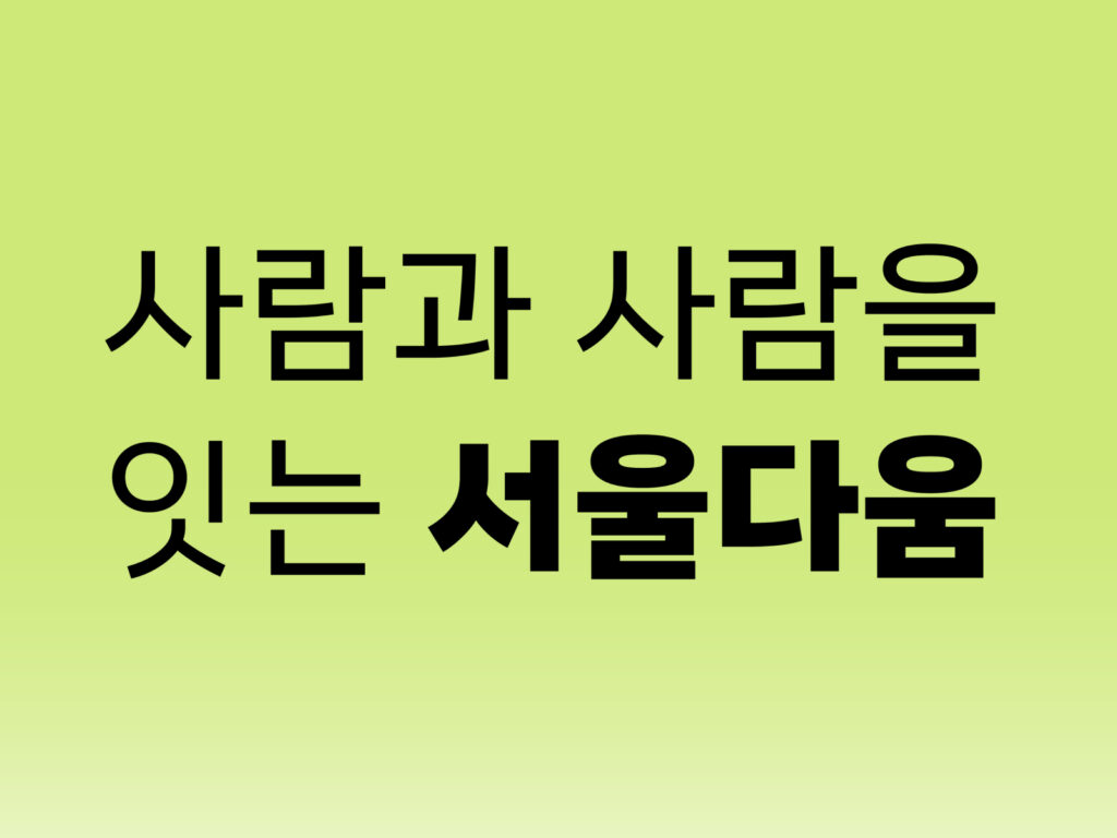
Seoul Allim is a public typeface developed in collaboration between the Seoul Metropolitan Government and T-Lab. It will be implemented in April 2025, when the Seoul Metropolitan Government will overhaul its subway map for the first time in 40 years since the opening of Line 1 in 1974. With its consistent width and square structure, it maintains a stable letter form, while its clean, uncluttered letterforms provide an easy-to-read composition. Furthermore, its natural handwriting and delicate, curved strokes convey a modern, humanistic aesthetic. The fan-shaped cap and curved horizontal strokes […]
This is a brand design project by designer Kyung-ye Shin. It is a lifestyle brand that pays tribute to nature. It expresses the two-sided nature with colors and names, and uses visual elements to contain artistic sense. It gives a rich feeling with strong and vivid colors and simple but characteristic shapes of the object. The feeling of paper cuts, the texture of rough printed matter, and the transparency realized in 3D, make you feel the existence of nature and the hands of the person handling it. See more and sources
This is the brand design for Pinky Swear, a lounge located in New York. Pinky Swear is a multi-purpose space that functions as a restaurant, bar, club, game space, and gallery. The branding work was done by creative agency The Working Assembly. The project was comprehensive, from establishing the brand strategy to visual and verbal identity and practical application. The core concept is 'Escape in your community', which means experiencing something different from everyday life through new stimulation within the local community […]
This project uses the B&O Beoplay H95 to graphically express sound. The Beoplay H95 is Bang & Olufsen's iconic premium over-ear headphone that combines finely tuned sound with sophisticated design. Reframe Studio developed 2D and 3D graphics using the headphones. It beautifully expressed the feeling of sound while naturally revealing the luxurious materials and delicate finish of the product. See more and sources
Italian pasta brand Marco has collaborated with Ben Xu and Wei Hou of Shanghai-based design studio B&W Graphic Lab for a rebrand. The new brand identity features a sleek, streamlined typography, with subtle playfulness and wit for a youthful sensibility. The graphic elements, centered around the initial "M," resemble pasta and are utilized across a variety of applications. The packaging design harmoniously blends vibrant illustrations with […]