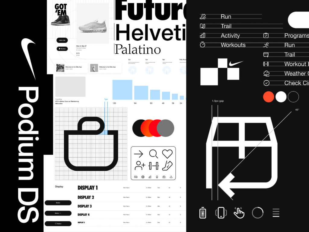
Nike's design system, "Podium," provides unity and scalability across its digital experience. Podium is more than just a design asset management tool; it serves as Nike's core digital infrastructure, encompassing consumer and core systems and applied across the entire company. Leading the design process is Senior Director Mariana Bukvic, with key leadership roles including Jimmy Soat, Hayley Hughes, and Eric Thompson. The brand name […]
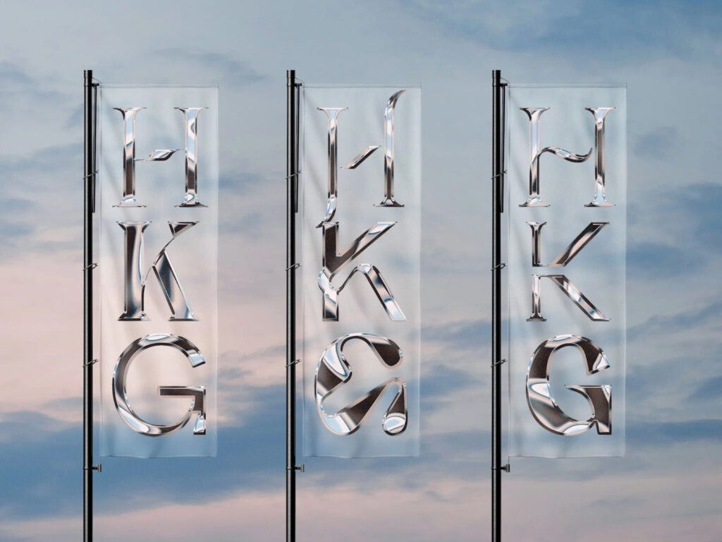
HKG Metals, a Singapore-based metalworking company with over 30 years of experience, has embarked on a new chapter with a complete brand identity overhaul. The rebrand was led by design studio House of Adjacent. "HKG Metals specializes in the fabrication of bespoke metal structures, a subcontractor that brings architectural blueprints to life," explains Jay Liu, founder and art director of House of Adjacent. He worked closely with the founder of HKG Metals to bring […]
This is a brand design collaboration between Spanish energy company Repsol and Saffron. Repsol has long been a leading supplier of gasoline and oil in Spain and throughout Latin America. Within Spain, it's an iconic brand, recognizable to almost everyone, and a part of everyday life. However, in recent years, Repsol has been reshaping its identity beyond simply being a fossil fuel supplier, becoming a "partner for all energy." This transformation has been effectively communicated to the public […]
Global e-commerce platform Cafe24 has unveiled a new identity through a brand renewal. This rebranding project was carried out in collaboration with design studio Ordinary People. Ordinary People focused on redefining the brand's core values based on Cafe24's brand essence of 'supporting and connecting possibilities' and visualizing them. The core of this rebranding is the delivery of a clear philosophy and vision centered around the slogan 'Idea is Business'. Creative ideas are put into practice […]
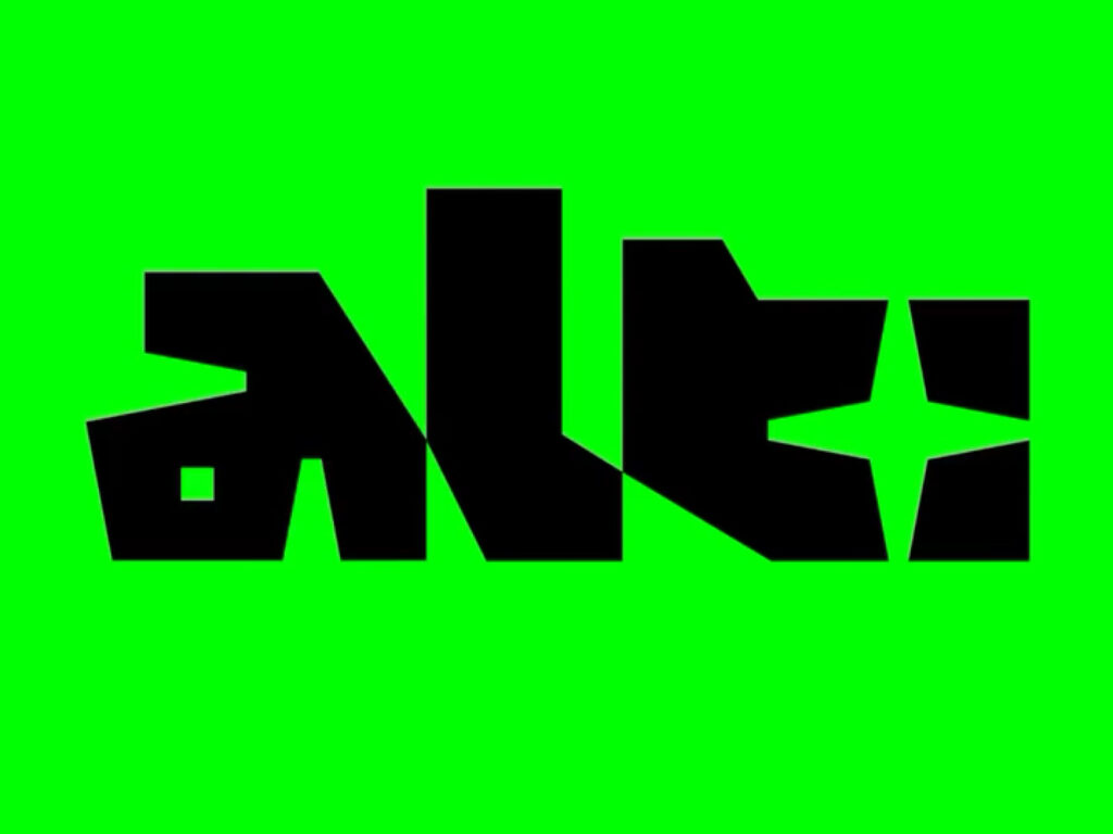
This is the brand design for ALT Games, a new festival celebrating independent game creators and indie game design culture in Sydney, Australia. Hosted at Sydney's powerhouse museum, PHIVE, the festival showcases creative and experimental interactive media. Design agency dia studio created a striking visual identity centered around a custom logotype inspired by game controller icons and a color palette of black and neon green. Capturing the energy and DIY spirit of the indie game community, the print […]
This is the brand design for the boutique hotel brand "Now Now," a collaboration with Canadian brand design studio Saint-Urbain. The project embodies the brand's philosophy of encouraging solo travelers to connect with the outside world by venturing out of their rooms. Alex Ostroff, founder and creative director of Saint-Urbain, explains, "Now Now is a hotel for people who want to get out of the city rather than stay in their rooms. Through our visual identity, we connect with the outside world and self […]
This is the Gemini brand design, created by Google in collaboration with Porto Rocha. Gemini is Google's generative AI service, previously known as "Bard." However, as AI technology became more widespread, the original language and symbols became increasingly common, and Google felt the need to redefine its brand identity. Accordingly, Google positioned Gemini as "Google Magic" for a new generation, rather than simply a technology brand. At the heart of this redesign was "Spark," which embodies Gemini's magic […]
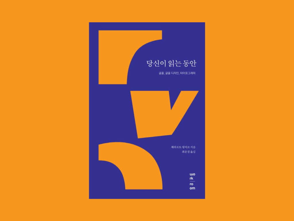
The author, Dutch designer Gerard Winger, created the ANWB font for road signs and has devoted his life to font design. His book, While You Read, offers a glimpse into his deep thoughts and insights into font design. The book traces the major changes font design has experienced over time, and discusses which fonts are easier to read between serif and sans serif, whether it is better to use standardized fonts, or whether it is better to have individuality. […]
Church, a Los Angeles-based film post-production studio, has unveiled a new brand identity in collaboration with Brooklyn-based design studio Porto Rocha. Church, founded by Brazilian award-winning editor Ma Ferraz, has made a name for itself by working with global brands like Nike, Spotify, Calvin Klein, KFC, and Puma, as well as artists like Megan Thee Stallion and Peggy Gou. The redesign, as the name suggests, is reminiscent of a cathedral […]
The Cathedral of St. John the Divine, the world’s largest Gothic cathedral located in Manhattan, New York City, has unveiled a new brand identity in collaboration with design studio Selman. The refresh, presented with the campaign slogan “It’s Your Cathedral,” visualizes the cathedral’s spirit as a space open to all. The project began in close collaboration with brand strategy specialist Brand Federation, and was brought to life by design studio Selman. The typeface was developed by […]
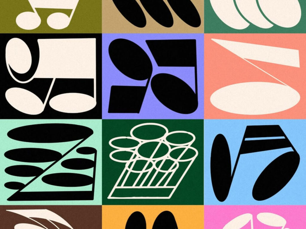
Megaron The Athens Concert Hall in Athens, Greece, has unveiled a new visual identity for the 2024-2025 season. The clean, geometric shapes are used to visually express the power and rhythm of music, visualizing the movement of notes and rhythm. As part of a branding project that K2 Design Studio carried out from 2022 to 2025, the Athens Concert Hall was responsible for the overall visual communication of the concert hall, including campaign design, production, editorial, and website development. The Athens Concert Hall […]
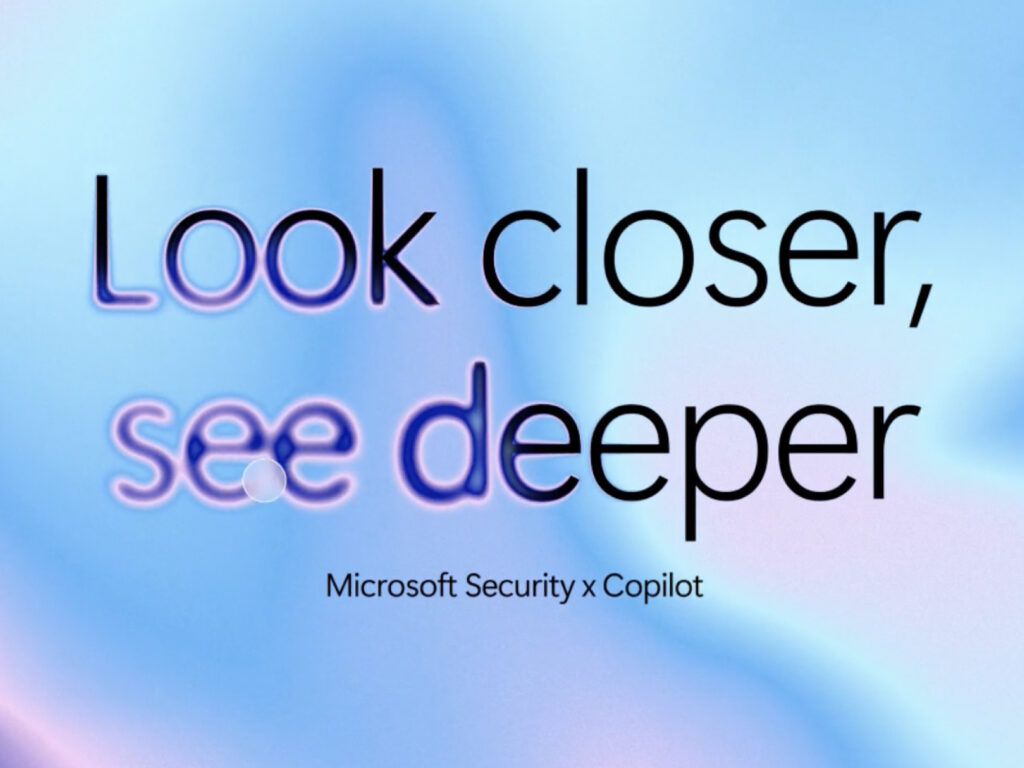
This is the new brand identity for Microsoft Security, the cybersecurity brand Microsoft collaborated with Koto on. This rebranding focuses on visually embodying a forward-looking philosophy that goes beyond simple threat response to proactively detecting and preventing threats. This identity boldly shifts away from traditional security symbols—locks, shields, and dark colors—in favor of a clear, confident, and vibrant visual language. Through this, Microsoft emphasizes that security should be an experience users can trust and feel secure in. […]