콘텐츠로 건너뛰기
₩
0
0
Cart
매거진
아카이브
아티클
더 보기
브랜드
아카데미
스토어
라이브러리
컨설팅
매거진
아카이브
아티클
더 보기
브랜드
아카데미
스토어
라이브러리
컨설팅
Plus
로그인
로그인
₩
0
0
Cart
아카이브
디자인·예술
라이프스타일
F&B
데이터·통신
금융
모빌리티
엔터테인먼트
스포츠
미디어·콘텐츠
생산성
연구·교육
공공·유산
커머스
전체
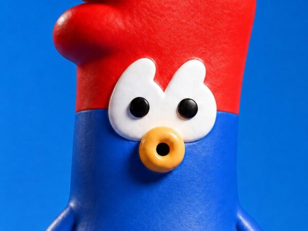
Chiky&Cheky, 프랑스 수탉과 한국 치킨
램브란트 오일 파스텔, 클래식한 재료의 현대화
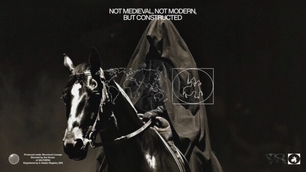
Valthera, 테크노 봉건주의
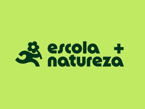
Escola + Natureza, 장식이 아닌 자연
KISS, 영국 해적 라디오
Mon Takanawa, 차원적 시간
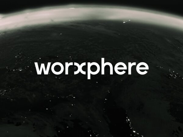
웍스피어, 일의 경험
Think Agency, 디지털 리퀴드
최고만 엄선한 큐레이션
플러스 멤버십을 구독하고
전체 큐레이션과 전용 아티클을 잠금 해제하세요.
시작하기
언제든 취소 가능
매거진
아카이브
N
아티클
N
아카데미
스토어
컨설팅
매거진
아카이브
N
아티클
N
아카데미
스토어
컨설팅
로그인
플러스 멤버십 가입
Design for Business
비즈니스 임팩트를 위한 디자인 인사이트
최고의 디자인으로 성공한 기업 분석
브랜드, 프로덕트 산업 동향 분석
로그인
무료 체험하기