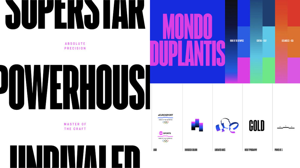
Warner Bros. Discovery Sports and design studio Dixon Boxy have unveiled the identity for the Olympic broadcast brand, Home of the Olympics. The podium is the central element. The Olympic podium is the final step of an athlete's lifelong journey, a symbol encapsulating sacrifice, ambition, and conviction. Rather than altering its meaning, the project sought to connect the journey and its symbolism into a single visual concept, conveying a deeper meaning.
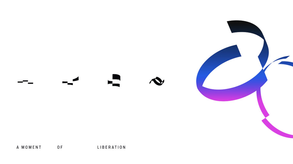
The new identity doesn't rely on the podium as a fixed logo. Dixon-Baxy explained that the podium, which became a symbol of the Games nearly a decade ago, has been expanded into a living system. He explained that the anticipation, energy, and momentum are captured in motion, creating a unique symbol of the Olympics. Its form expands and adapts to the scale of the scene, adapting to a wide range of situations, from individual moments to global spectacles.
Motion design translates the movement of an event into visual language. Citing the spins of figure skating and the sharp turns of direction in alpine skiing, the three-tiered structure, combined with intelligent data, reveals records or guides the eye to key moments. Based on the principles of ascent, depth, and liberation, the design creates stepped, arching, and trajectory-like movements to express the pinnacle of sporting achievement.
The operational approach even considers platform transitions. We aim for a choreographed connection between the platform brand and the match time, seamlessly transitioning between live broadcasts, promotions, titles, programming announcements, and advertising. The expanded podium design signals moments of heightened tension and acts as a gear shift to reinforce focus.
Within the global system, localization for each host city is also included. The contrast between the cool, contrasting tones of Cortina and the warm tones of Los Angeles is presented as an example, and the palette and image processing reflect the atmosphere of each city. Medal status is used as a device to commemorate victory, and color control supports technical moments and highlight scenes that require information to be conveyed. Ultimately, the system aims to be structured so that it can be naturally adapted for each competition.