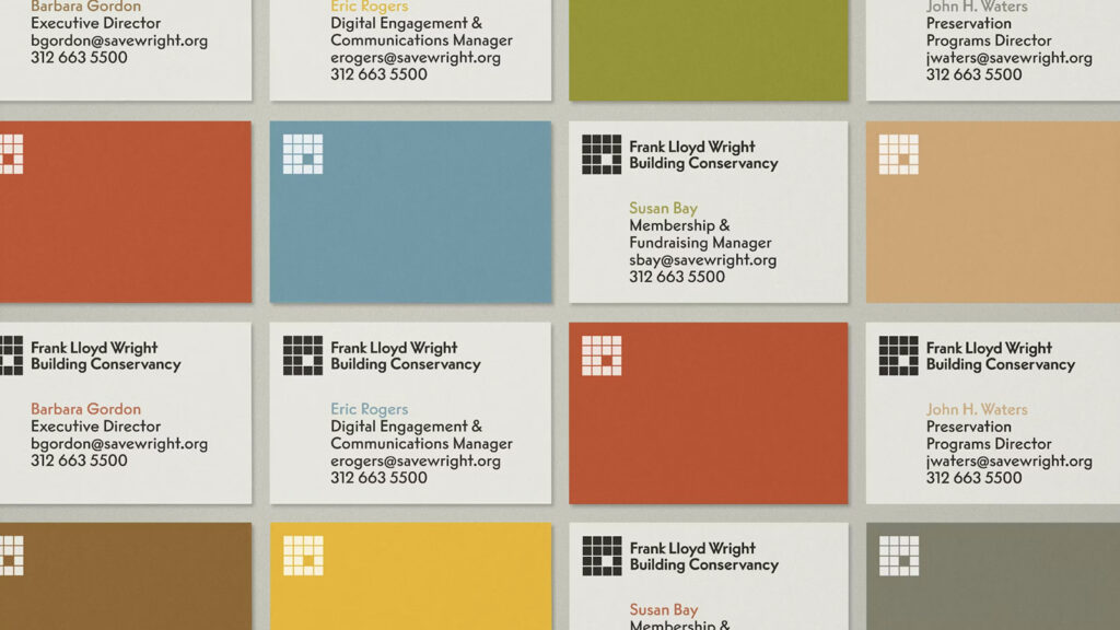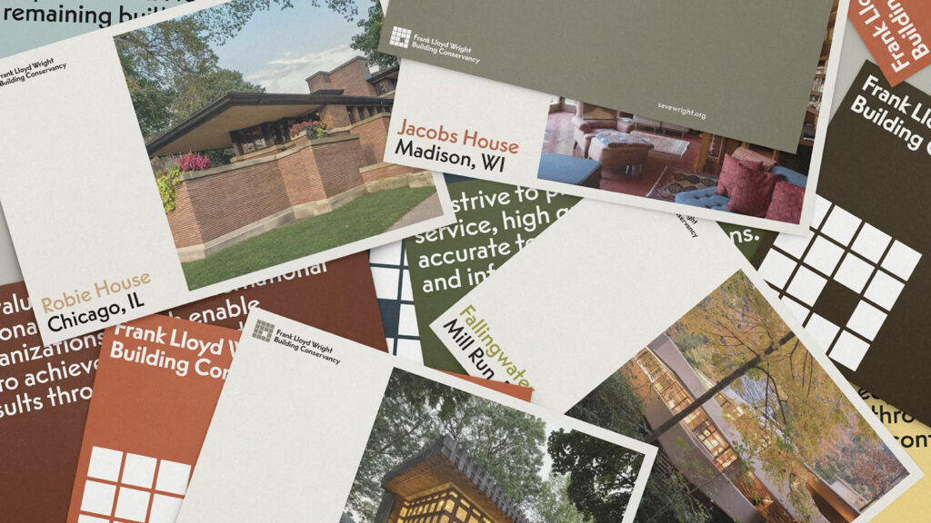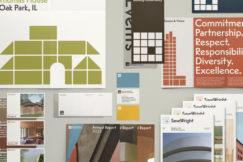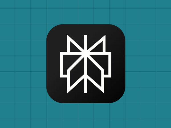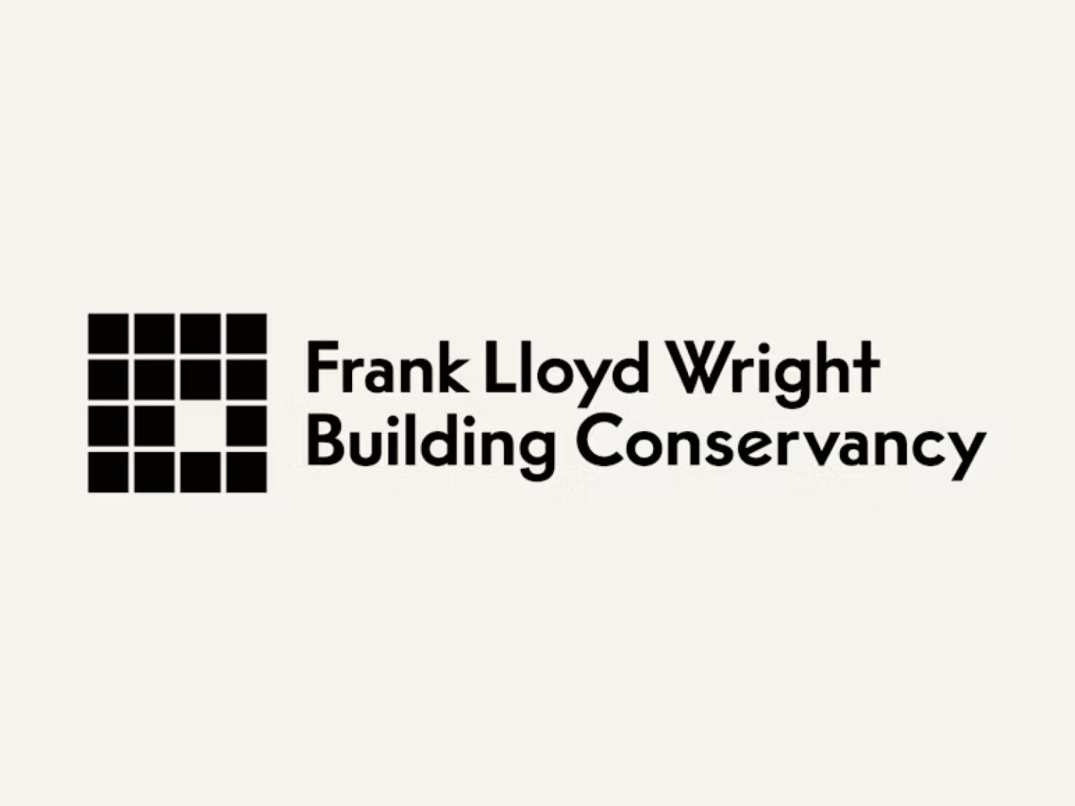
프랭크 로이드 라이트 빌딩 컨서번시는 새로운 웹사이트와 함께 통합적인 시각 정체성 시스템을 공개했습니다. 이번 아이덴티티는 단순한 형태의 심볼을 중심으로 컨서번시의 철학과 활동을 전반적인 시스템 안에서 서사적으로 전달하도록 설계됐습니다. 심볼은 로고와 애플리케이션 전반에서 반복적으로 활용되며 개별 매체에서도 일관된 인상을 형성합니다.
심볼과 워드마크는 함께 사용되거나 독립적으로 적용될 수 있도록 설계돼 유연한 아이덴티티 도구로 기능합니다. 이를 통해 웹 소셜 미디어 인쇄물 등 다양한 접점에서 동일한 언어를 유지할 수 있습니다. 색상 시스템은 라이트 건축에서 나타나는 공간의 폭과 깊이를 반영하며 빛과 재료가 상호작용하는 방식을 시각적으로 표현합니다.
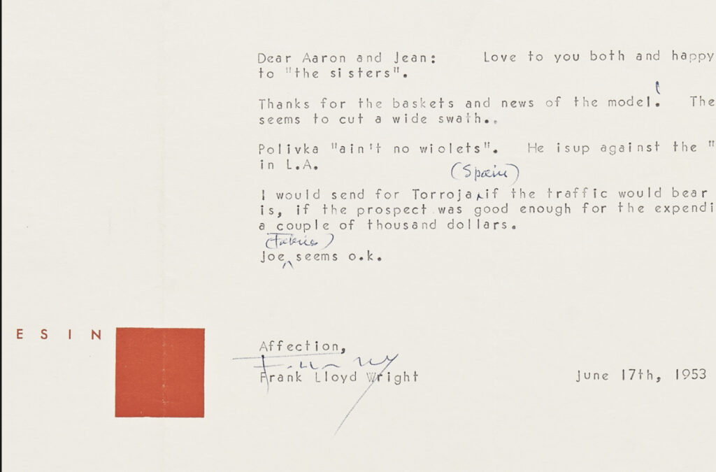
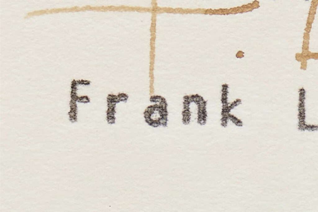
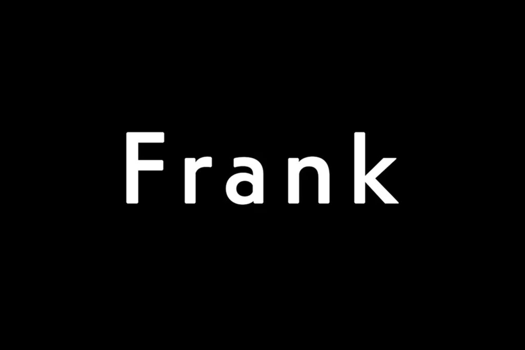
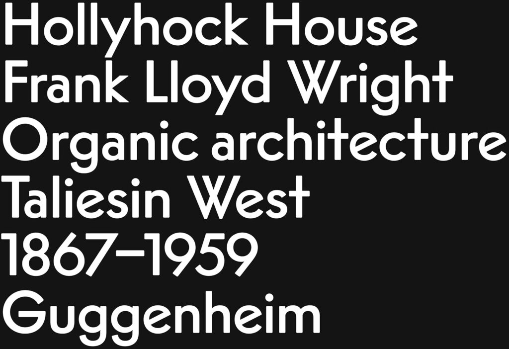
타이포그래피는 라이트가 서신에서 즐겨 사용하던 보그 인터타입 타자기 서체에서 출발했습니다. 이 역사적 맥락은 프랑수아 라포가 디자인한 서체 리플라이로 이어졌으며 미국 모더니즘 디자인이 형성되던 결정적 시기를 현대적으로 재해석합니다. 옵티모 타입 파운드리에서 커스터마이징된 리플라이는 전체 아이덴티티의 주요 목소리로 활용됩니다.
서체의 기하학적 구조와 각진 형태는 확장 그래픽 언어의 기반이 됩니다. 이 시스템은 컨서번시의 다양한 활동과 건축 자산을 효과적으로 전달하는 도구로 작동합니다. 심볼은 모든 매체에서 시각적 기준점 역할을 하며 일관성을 강화합니다.
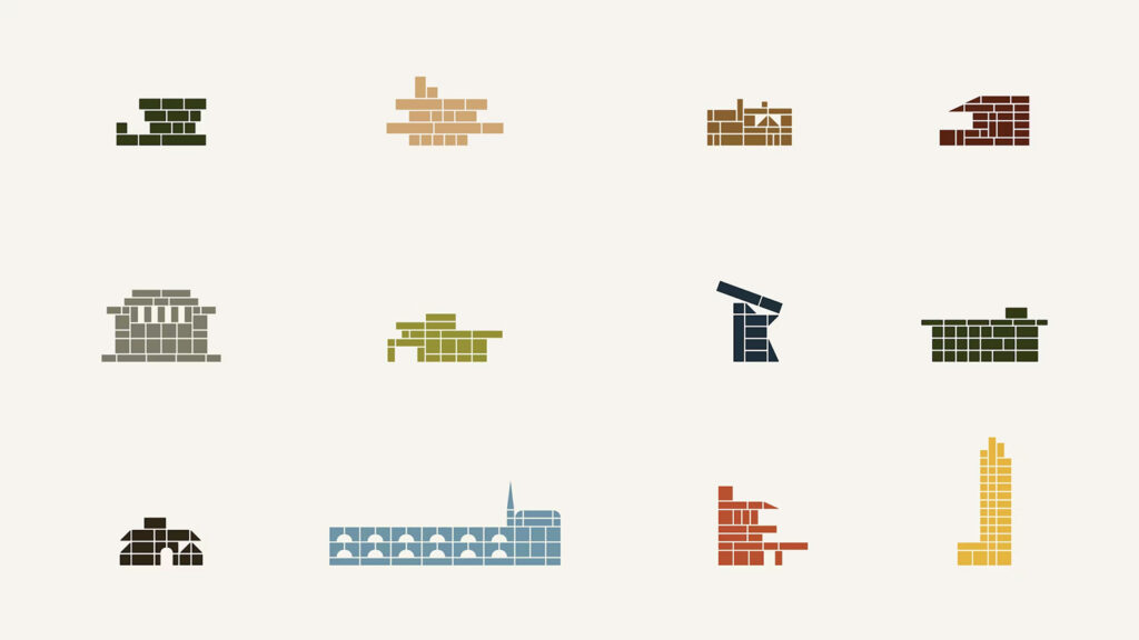
일러스트레이션 시스템은 라이트가 어린 시절 접했던 프뢰벨 블록에서 영감을 받았습니다. 심볼의 그래픽 언어를 확장해 각 건축물에 맞게 조형이 변화하도록 구성했습니다. 이 접근은 건축물 고유의 성격을 존중하면서도 하나의 체계 안에 묶습니다.
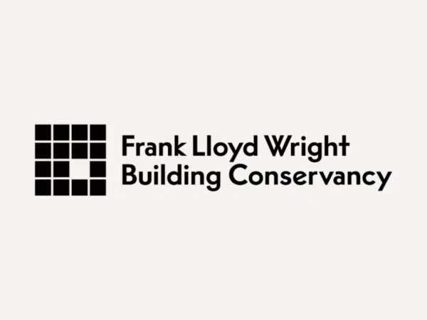
이번 아이덴티티는 컨서번시의 매거진 세이브 라이트에도 적용됐습니다. 빠져 있는 정사각형을 강조한 심볼은 보존의 의미를 직관적으로 드러냅니다. 컨서번시는 향후 활용을 위해 포괄적인 가이드라인을 구축했으며 팀 내부에서 지속적으로 확장 가능한 시스템을 마련했습니다.