뉴욕에서 한국식 프라이드치킨을 파인 다이닝으로 재해석한 레스토랑 코코닭이 브랜드 아이덴티티로 주목받고 있습니다. 미쉐린 스타를 받은 코트 코리안 스테이크하우스의 창립자 사이먼 김과 그레이셔스 호스피탈리티 매니지먼트가 선보인 치킨 레스토랑입니다. 브랜드 디자인은 펜타그램 뉴욕의 에밀리 오버먼 팀이 맡아 한국과 미국 치킨집의 시각 언어를 끌어오되 격상된 톤으로 정리했습니다.
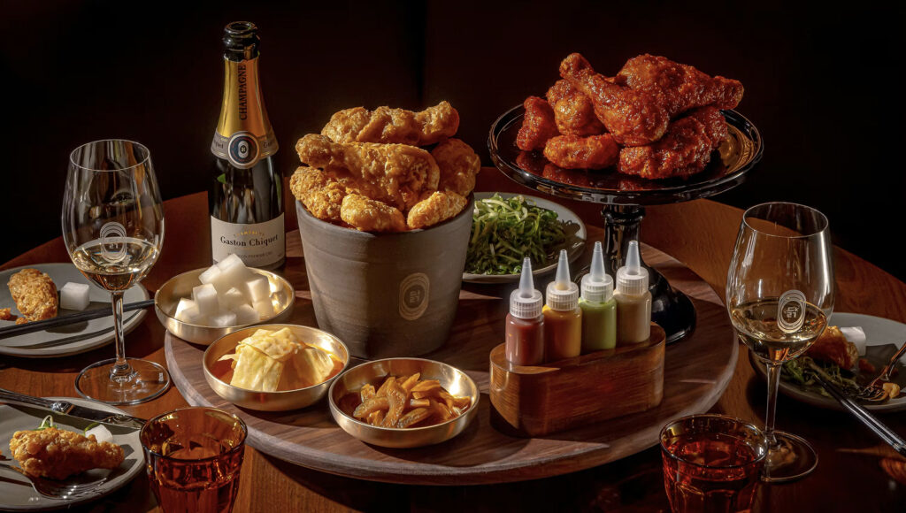
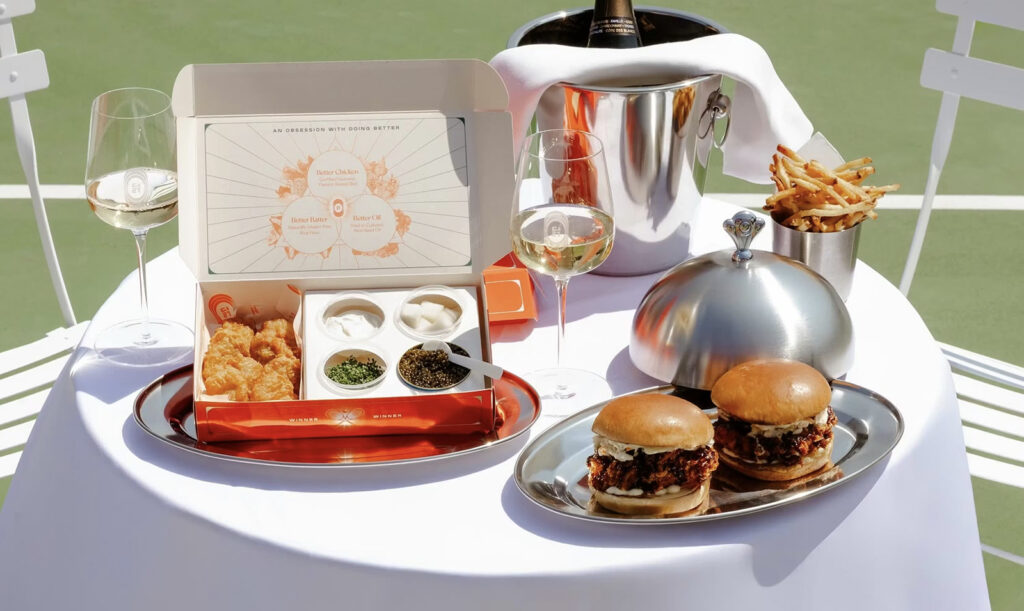
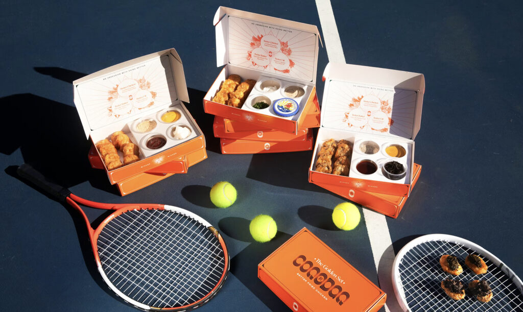
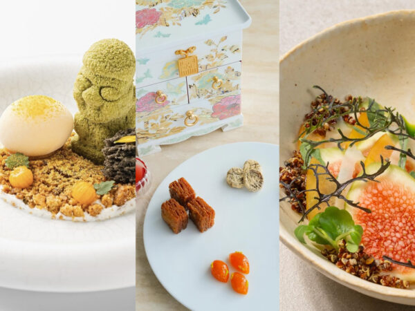
코코닭은 캐비아를 올린 너겟과 칵테일을 비튼 코크테일 메뉴를 내세우며 미국 최대 규모의 샴페인 리스트를 갖춘 것으로 알려졌습니다. 주방은 더 좋은 오일 더 좋은 반죽 더 좋은 치킨이라는 기준을 전면에 내걸고 유기농과 엄선된 재료를 강조했습니다. 이런 콘셉트는 미쉐린 빕 구르망 선정으로도 이어졌습니다.
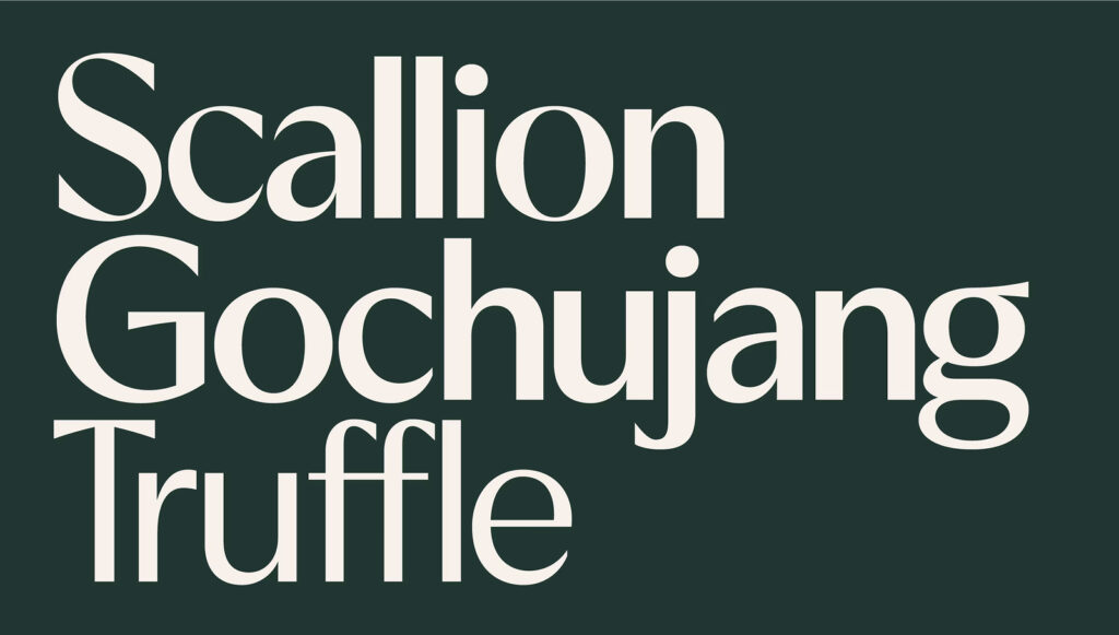
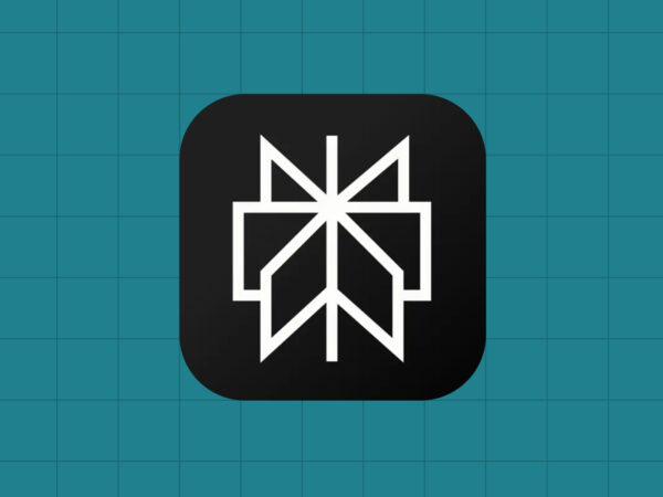
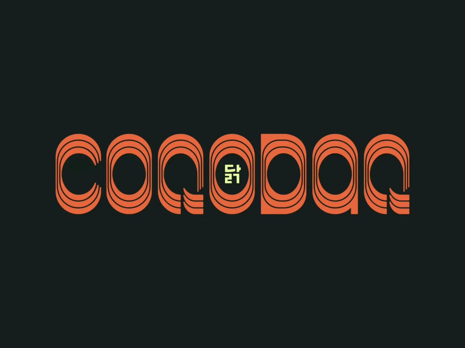
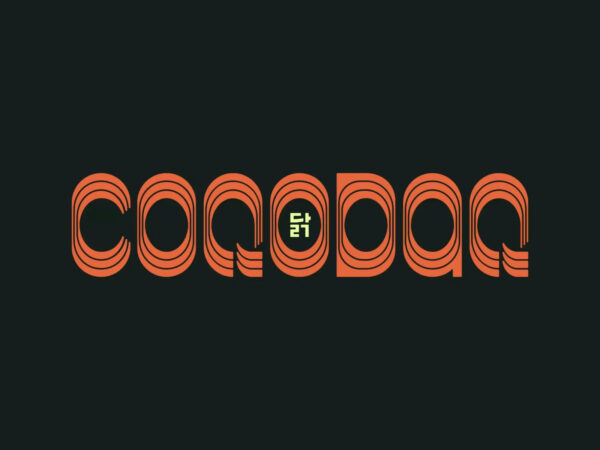
로고타입은 대담하면서도 세련된 커스텀 레터링을 사용했습니다. 핵심 장치는 알파벳 O 안에 한글 닭을 넣은 구조입니다. 코트의 O에 꽃을 담았던 방식과 연결되며 코코닭에서는 알처럼 보이는 원형 구조로 확장했습니다. 이 심볼은 간판과 웹사이트와 공간 그래픽까지 일관되게 적용됐습니다.
이름 코코닭은 닭 울음소리를 떠올리게 하는 한국식 의성어에서 출발했습니다. 프랑스어로 닭을 뜻하는 코크와 한국어 단어 닭을 결합해 발음과 의미를 동시에 잡았습니다. 오픈 초기에는 소셜 채널에서 발음을 안내하는 티저 애니메이션도 활용했습니다. 브랜드 메시지는 베터 프라이드 치킨이라는 문장으로 압축됐습니다. 달걀이 먼저냐 닭이 먼저냐 같은 질문을 재치 있게 변주하며 고급 치킨집이라는 포지션을 강화했습니다.
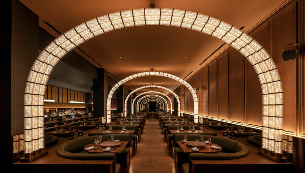
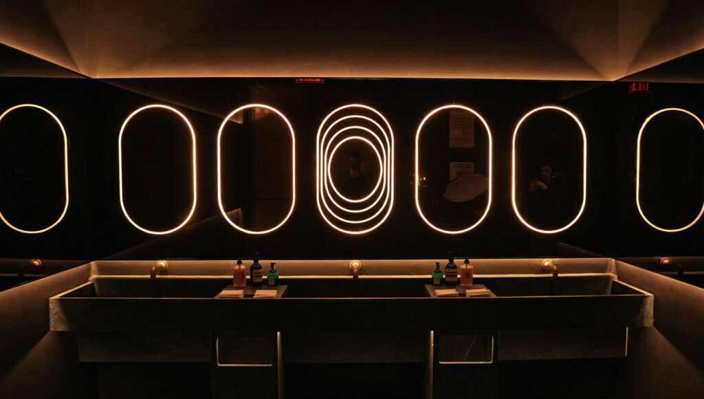
인테리어는 록웰 그룹이 맡아 어둡고 무드 있는 공간에 따뜻한 조명으로 몰입감을 만들었습니다. 유리 아치와 무한 거울을 활용해 성당의 신랑처럼 긴 깊이를 강조했고 후면에는 비밀 노래방 공간 고고싱을 숨겨 경험을 분기했습니다. 로고의 타원형은 거울과 벽등과 좌석 곡선 등 실내 곳곳에 반복됐습니다.