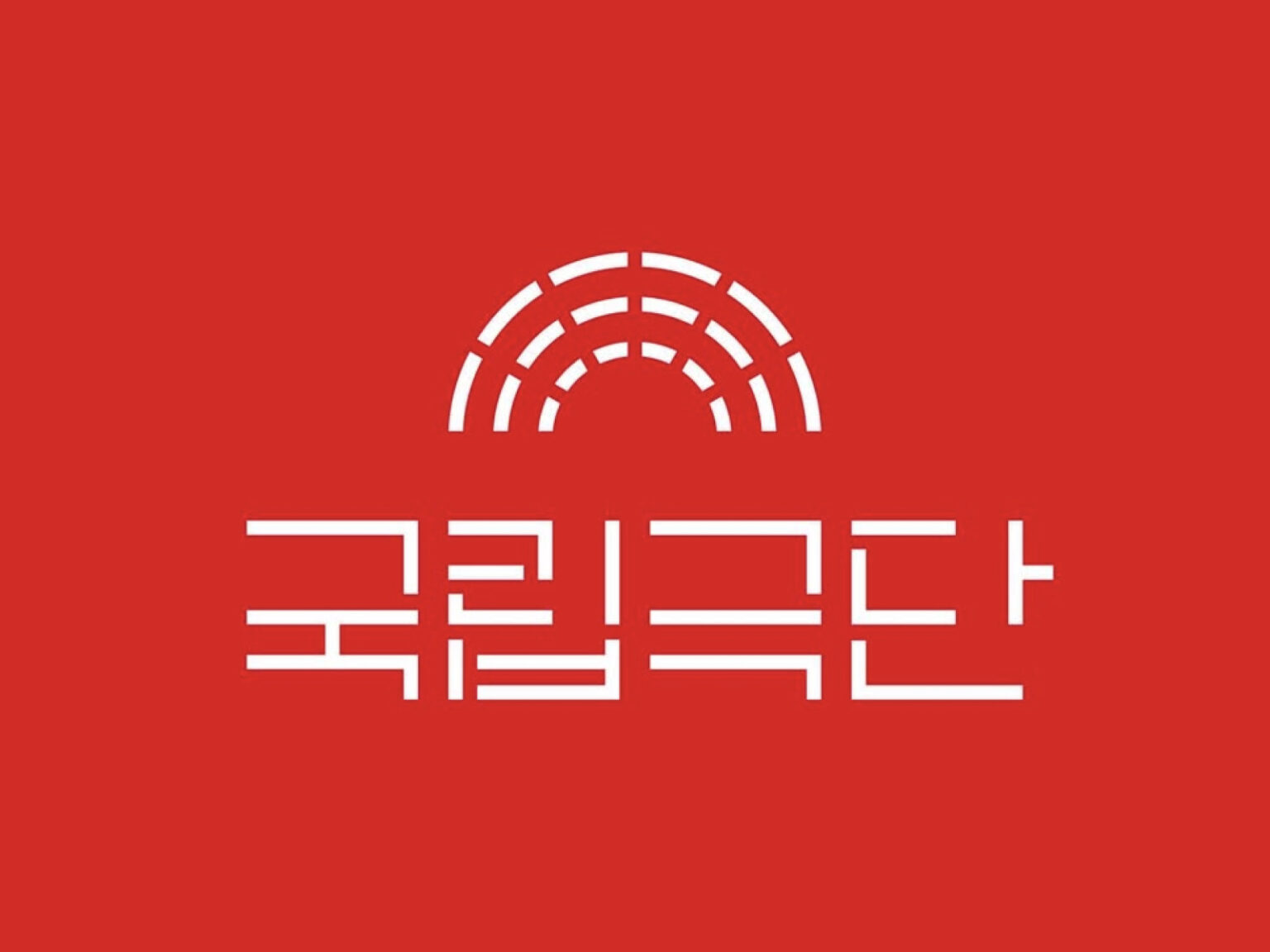

국립극단이 새 CI 디자인입니다. 국립극단은 공식 채널을 통해 새 CI와 전용서체를 함께 선보이며 향후 홍보물과 디지털 접점 전반에 적용하겠다는 방향을 내비쳤습니다. 
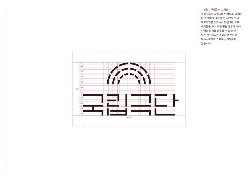
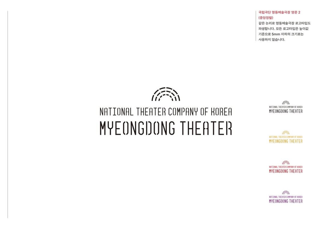
이번 리뉴얼에서 CI 디자인은 스튜디오 신신이 맡았고 전용서체 디자인은 양장점이 담당했습니다. 두 팀은 기존에 텍스트 기반으로 작업했던 심볼의 기하학적 세부를 눈치채기 어려울 정도로 미세 조정한 뒤 그 결과를 체계화해 그리드를 만들었습니다. 이후 이 그리드를 기준으로 국립극단 국문 워드마크와 영문 워드마크를 새로 설계해 심볼과 로고타입의 결을 정교하게 맞췄습니다. 
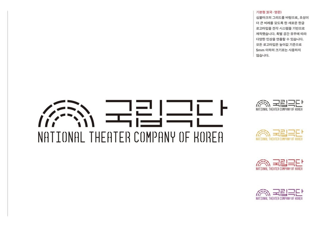
국립극단은 새 아이덴티티의 핵심 모티프로 원형극장의 형태를 제시했습니다. 전통과 현대성의 만남과 확장이라는 서사를 원형극장과 확장되는 객석의 시각적 장치로 구현했다는 설명입니다. 관객을 중심에 두고 더 많은 만남을 목표로 전통극과 현대극을 넘나드는 기관의 지향을 시각 시스템에 담았다는 의미입니다. 
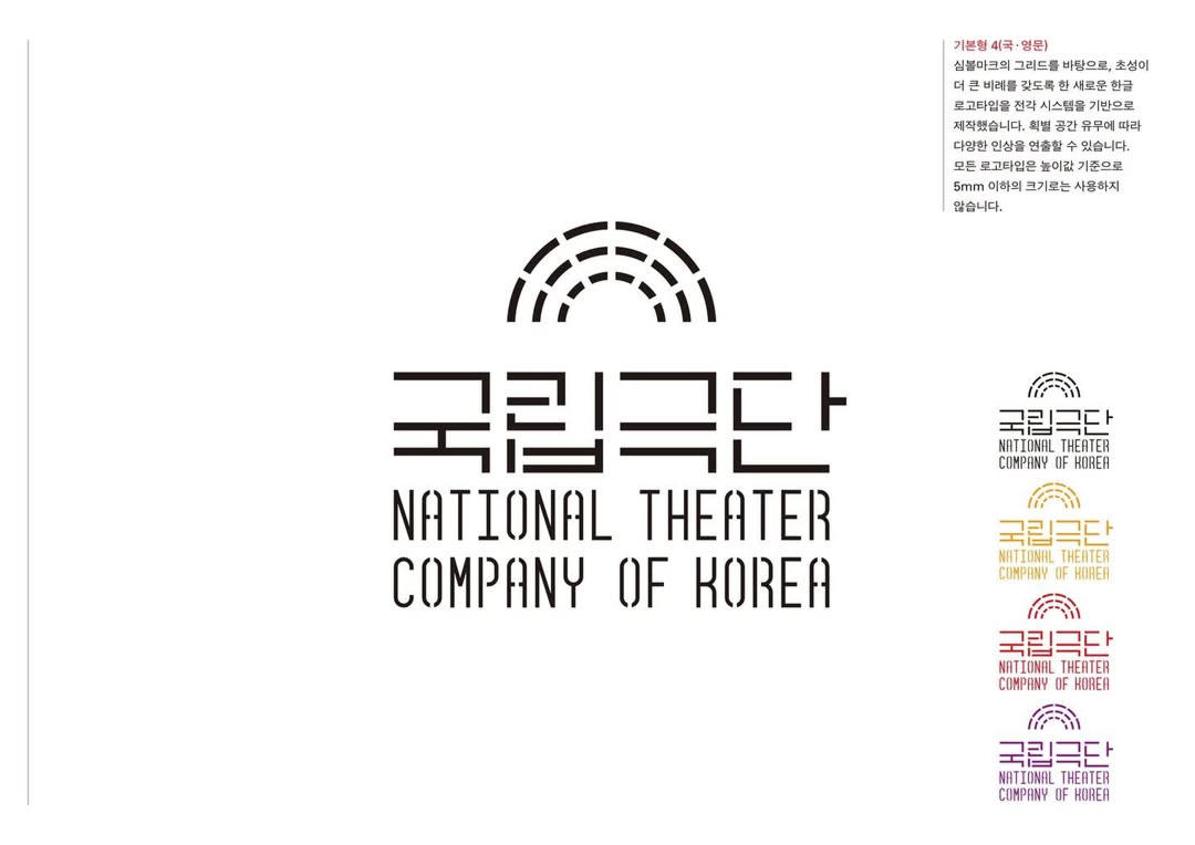
전용서체의 개발은 이러한 통합 운용을 뒷받침하는 장치로 제시됐습니다. 국립극단은 시각적 정체성을 일관되게 운영하기 위해 전용 서체를 함께 마련했다고 밝혔습니다. CI와 서체를 동시에 재정렬한 점은 시즌 키비주얼과 인쇄물 안내물 웹 화면 등 다양한 매체에서 동일한 톤을 유지하기 위한 선택으로 해석됩니다.