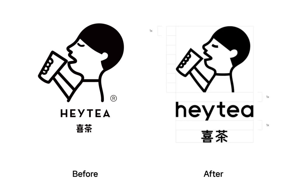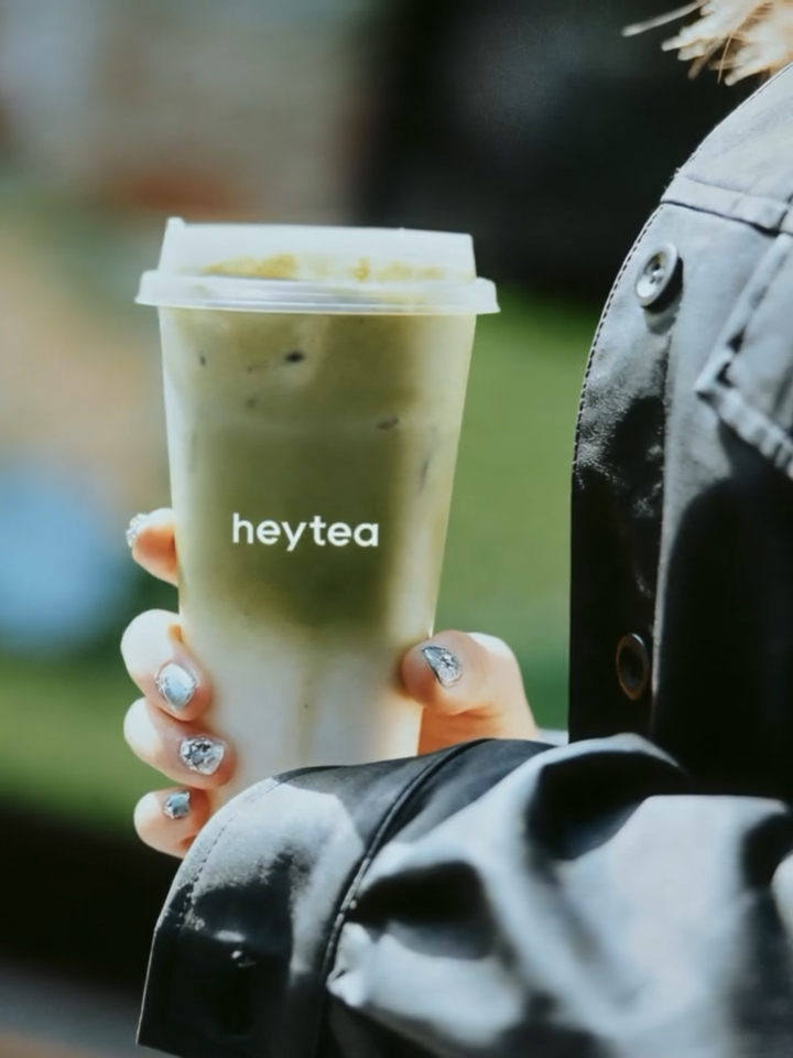

HEYTEA가 글로벌 확장을 겨냥한 비주얼 아이덴티티 리뉴얼을 공개했습니다. 이번 리뉴얼의 중심은 새 로고와 패키지 시스템입니다. 프로젝트를 공개한 제작 스튜디오는 창업자와 디자인 리드들과 긴 시간 정교한 다듬기 과정을 거쳐 결과물을 확정했다고 밝혔습니다. 새 로고는 두 언어를 병기하는 형태로 설계됐으며 하나의 일관된 디자인 언어로 전 세계 전개를 전제로 했습니다. 
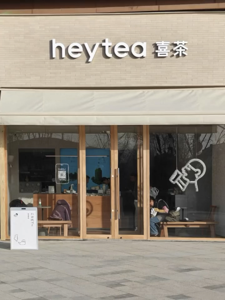
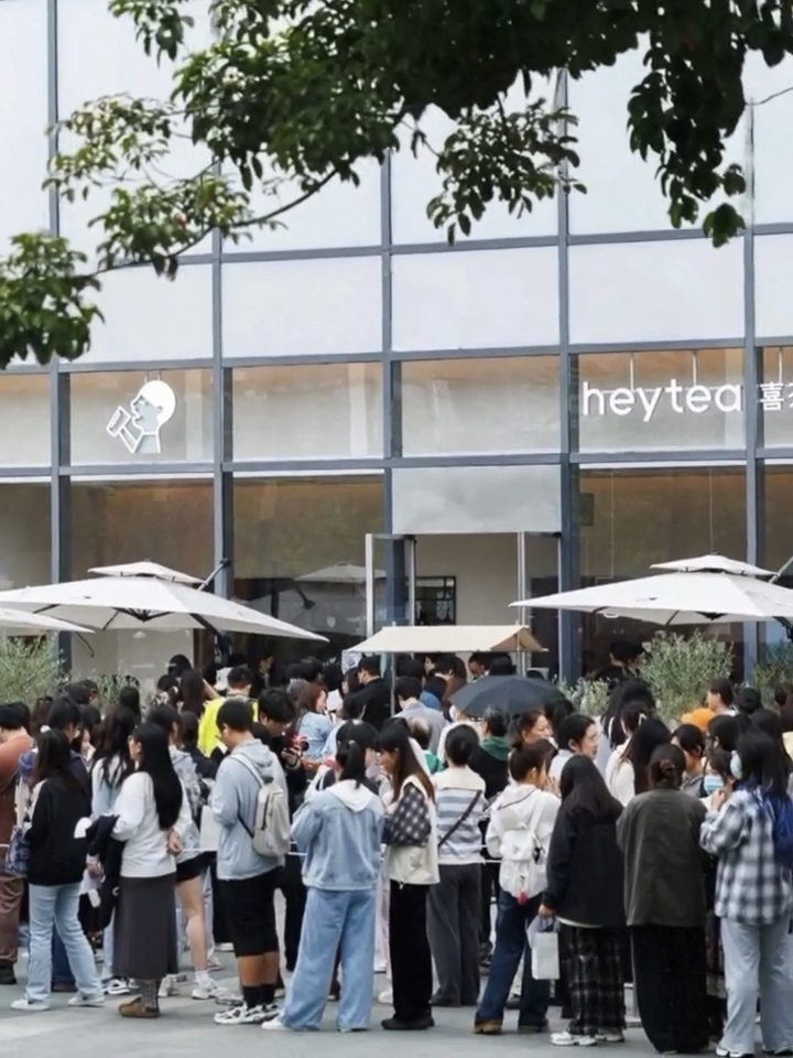
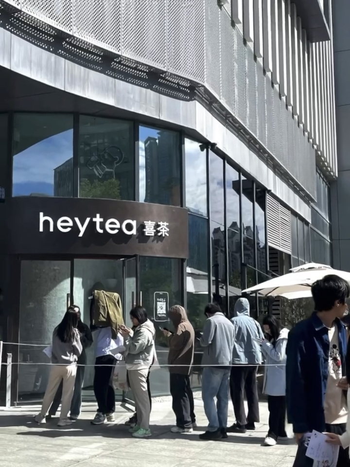
새 로고는 이미 글로벌 매장에 순차 적용되고 있습니다. 현재 패키지에는 HEYTEA 내부 디자인 팀이 제작한 기존 패키지 위에 새 로고가 먼저 반영되는 방식으로 운영되고 있습니다. 제작 스튜디오는 올해 안에 자사가 개발한 완성형 패키지 시스템 전체를 공개하겠다고 예고했습니다. 심볼은 work by works가 맡았고 로고타입은 Makkaihang Design이 개발한 것으로 정리됐습니다. 로고 디자인 크레딧에는 Mak Kai Hang 이름이 함께 표기됐습니다. 
HEYTEA는 중국 신차 음료 문화를 대표하는 브랜드로 성장해 왔습니다. 이번 브랜드 리프레쉬는 다양한 국가 계정 운영과 매장 확장을 이어가는 흐름 속에서 시각 언어의 기준점을 다시 세우는 작업으로 읽힙니다. 로고와 패키지는 매장에서 가장 먼저 만나는 접점인 만큼 글로벌 일관성과 현지 적용의 균형이 관건이 될 전망입니다.