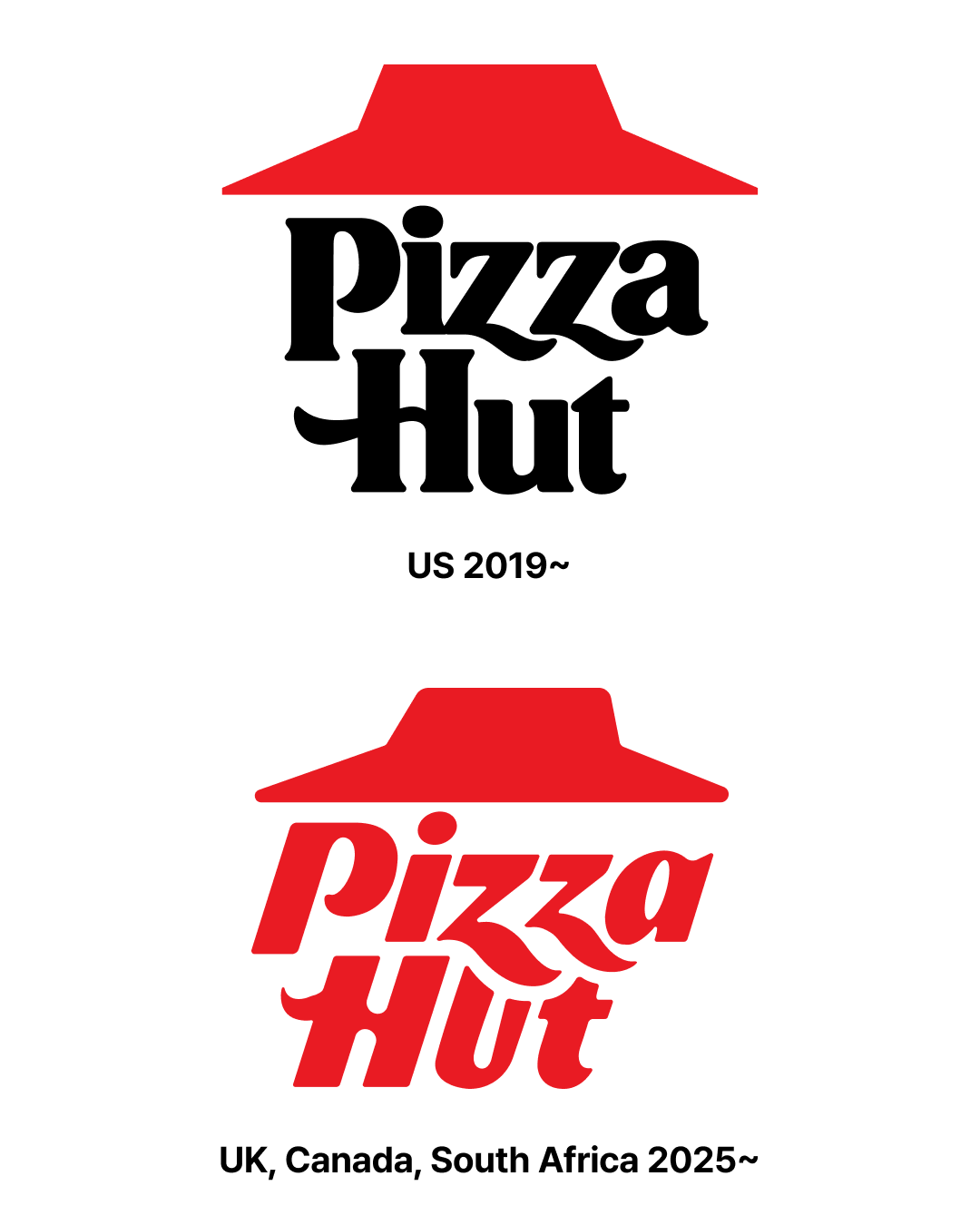
Pizza Hut Unveils US and International Logos

Pizza Hut has unveiled a new logo for its international markets, including the UK, Canada, and Australia. These countries were excluded from the US brand refresh in 2019 and were still using the 2014 version. This update shares the same aesthetic as the US version, but with subtle differences. The red roof remains, but the overall shape is slightly slanted and the font is italicized. Sharper edges and the "zz" letters overlap the roof, creating a more visual connection.

Some have praised the modernized, refreshing take on the iconic red roof, a long-standing symbol. Some analysts say it's a strategy to present the brand unified in the global market while still maintaining subtle differentiation. However, some have criticized the brand's readability. Specifically, some argue that the awkward "u" and "t" structure in "Hut" translates to "Hot."

There's also been debate about whether a separate version is needed for international markets. Some argue that, given Pizza Hut's long history of strong brand recognition in various regions, simply adopting the American version would be more effective. Conversely, there's also a more positive interpretation: a customized visual identity that takes into account the cultural context and consumer sensibilities of each region.

(C)Pizza Hut
(C)Pizza Hut
(C)Pizza Hut
(C)Pizza Hut
(C)Pizza Hut
(C)Pizza Hut

More and Sources

Open KakaoTalk room without ads
Plus
25. 12. 12
Plus
25. 12. 12
Plus
25. 12. 11
Plus
25. 12. 11

Latest news

DesignCompass Newsletter

Design for Business. We deliver daily news about AI, Products, Brands

By submitting your email, you are deemed to have agreed to our Terms of Use and Privacy Policy .
Design for Business