This is a brand design for Spanish energy company Repsol in collaboration with Saffron. Repsol has long been a leading supplier of gasoline and oil in Spain and throughout Latin America. In Spain, it is an iconic brand known to almost everyone and is considered a part of everyday life. However, in recent years, Repsol has been building a new identity as a ‘partner for all energy’, going beyond being a simple fossil fuel supplier.
To effectively communicate these changes to the public, Repsol, together with its design partners, began a project to re-establish the entire brand. This rebranding visualized the continuous flow of energy and human-centered communication under the core concept of ‘Confluence of Energy.’
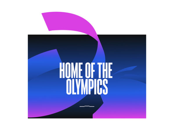
The new logo has been reinterpreted with a more three-dimensional and fluid shape while maintaining the iconic silhouette of the existing logo. The brand has been reborn with more vitality through a warm gradient from orange to magenta, a new iconic color, ivory, and a redefinition of the existing Repsol Blue.
This rebranding is not just a visual change, but also explains the transformation Repsol has made so far. Repsol is the first company in Spain to produce and supply 100% renewable fuels, and offers a variety of energy options through more than 3,500 service stations. It is also actively building an electric mobility infrastructure, operating 2,500 of its own electric vehicle charging stations and 6,500 affiliated charging stations.