
Figma has unveiled a new visual identity. Figma has exploded in popularity, becoming more than just a design tool for building products; it’s now the go-to tool for anyone who needs to design—developers, product managers, marketers, and more. Figma needed a new visual identity to change the perception of itself as a vector tool for building UIs.
In this refresh, the Figma team took inspiration from the playground as a metaphor for the Figma canvas where people come together to create and experiment. It’s a great refresh that captures the essence of Figma. It’s a compelling way to express the graphics and motion.

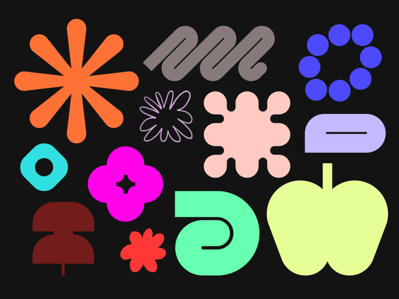
First of all, the black outline that comes to mind when you think of Figma disappears. Instead, a primitive form made up of thick surfaces was created. Overall, it is a form of similar rules, but it is not strict, so it feels free. I agree with the saying that a system is a set of strict rules that can be predicted, but visual identity should be a language.


When selecting a layer, we actively use the 'Jumbo Node', which represents the point of the vertex that adjusts the size. This node, which means the action of selecting an object in Figma, intuitively reveals the difference from other brands. In particular, the motion with a time difference immediately conveys the feeling of collaborating with others.


While maintaining the signature purple, earth tones are used as the main background color. Previously, because the black outline was strong, various colors with low saturation were used, but now the color contrast is actively utilized. From neon-like colors to calm colors with low saturation and brightness, they are used together. They create a strong visual impact by using differences in brightness, saturation, and complementary colors.


We collaborated with Grilli Type to create Figma Sans, which includes the tall, Condensed font, the fixed-width Mono font that's great for development, and the handwritten-looking Hand font.