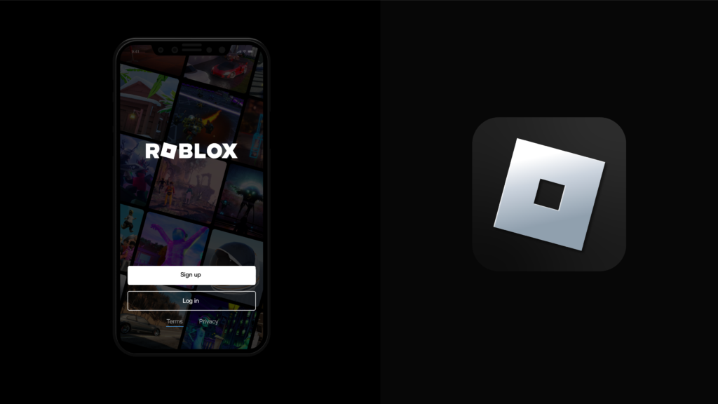

At the end of August, Roblox refreshed its logo. The direction towards a 3D immersive experience platform was expressed. The slanted rectangle representing the 'O', a symbol used since 2017, is maintained. This square symbolizes buildings and movements used in Roblox. The new wordmark is modern and easy to read. Since there is little inner space, the area eaten by white has been greatly reduced, and the font that looks swollen and filled with squares is also arranged to fit the horizontal line.


It is interesting to look at the evolution from the first Roblox word mark to the present. It has evolved from a typeface that could be used in a sci-fi movie, through a graffiti style, to the current style. The graffiti style had a strong impression of offline, and it was impressive that ㅇ was expressed as ㅁ, revealing the service identity of Roblox, and creating a memorable clasp. It is a bonus to give the impression that it is a forward-looking modern IT company.

It seems that Roblox is also trying to become a next-generation platform. However, compared to Facebook, which changed its company name to Meta, the impact does not seem to be large. Reimagining the way people come together. We put forward a slogan of reimagining the way people gather, but will there ever come a day when people will say, “See you on Roblox?”

