Establishing fundamental roots without fearing AI or recession
Product designer
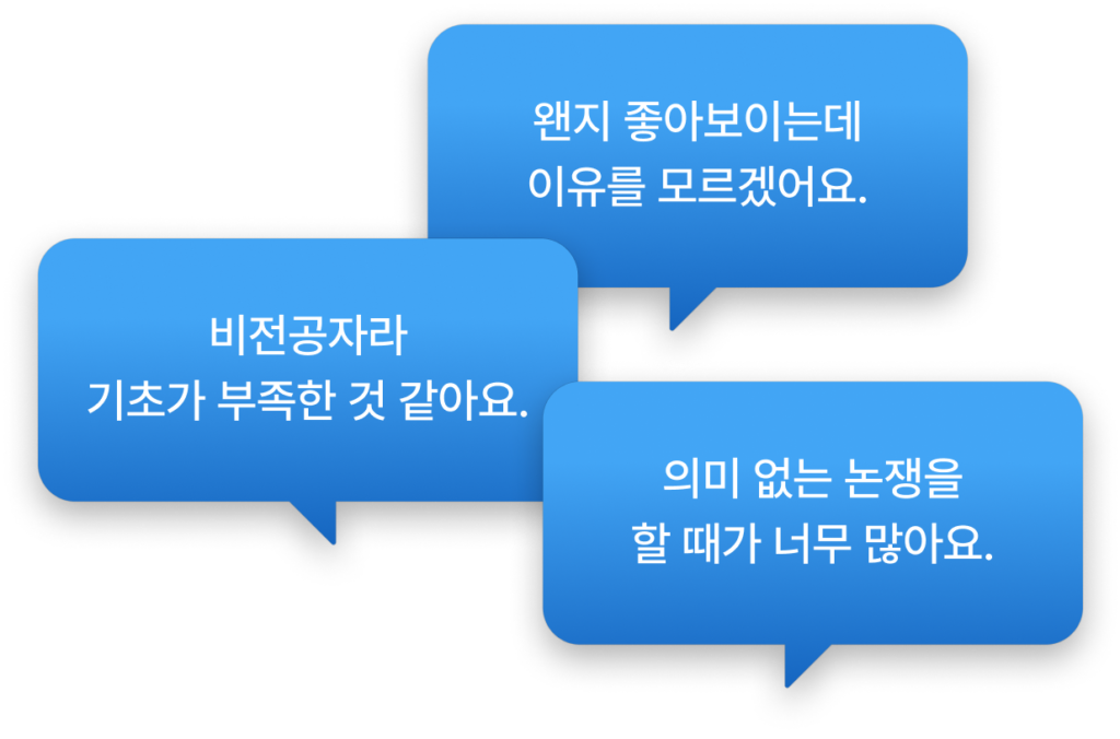
Most frequently asked questions
When you need solid design knowledge
Ambiguous design
Decide clearly
Based on cognitive psychology and behavioral economics
Learn to design for your users' eyes and hands.
Expert's
Learn UI planning
To develop services
From essential planning elements to the basis of design
Proven in the field
With designer Jongmin Park
From the first designer at a startup to the 200+ unicorn head of design
UI/UX Designer @Lineable 2014
UI/UX Designer @Our Table 2016
Product Designer/Design Team Leader @My Real Trip 2018
Head of Design @Gangnam Sister
learning design the most effective way
1. Read the notes
After reading books, papers, and reports for 16 years, We have condensed knowledge useful in the field.
2. After taking the test
Solve problems based on key notes I make sure it is completely my knowledge.
3. Create an assignment
Create tasks that apply the knowledge you have learned. We provide detailed feedback from experts on diligent assignments.
Anytime you get stuck
Ask an expert.
Conveniently through chat, comments, and email
Lifelong collection lifetime updates
Until we have everything about UI design
curriculum
LV1. user interface
Definition, what is UI design?
How do we use smartphones, computers, and TVs? The user interface is what defines ‘how’ the ‘user’ uses the tool.
History, how has the way of using tools changed?
Humanity had more weaknesses than other creatures. As time passed, various problems arose that the body alone could not solve. We've constantly developed tools to better solve problems, and naturally, the way we use them has also constantly changed.
The body, a human tool that will never change
People use machines to achieve their goals. It is mainly seen with the eyes and manipulated with the hands. The effort a person takes to achieve a goal is called interaction cost. This cost is broadly divided into cognitive load and physical load.
Tools, what can be grasped and what cannot be grasped
Interfaces are divided into hardware and software. Hardware is a physical tool that can be touched by hand, and software is a virtual tool that moves hardware. In human terms, hardware is like arms, legs, hands, and feet, and software is thought and mind.
LV1 exam
Solve test questions to check if what you have learned has become your knowledge.
LV1 Assignment
Create assignments that put your knowledge to practical use. Give and receive feedback until the level is sufficient.
LV2. Graphics for good UI
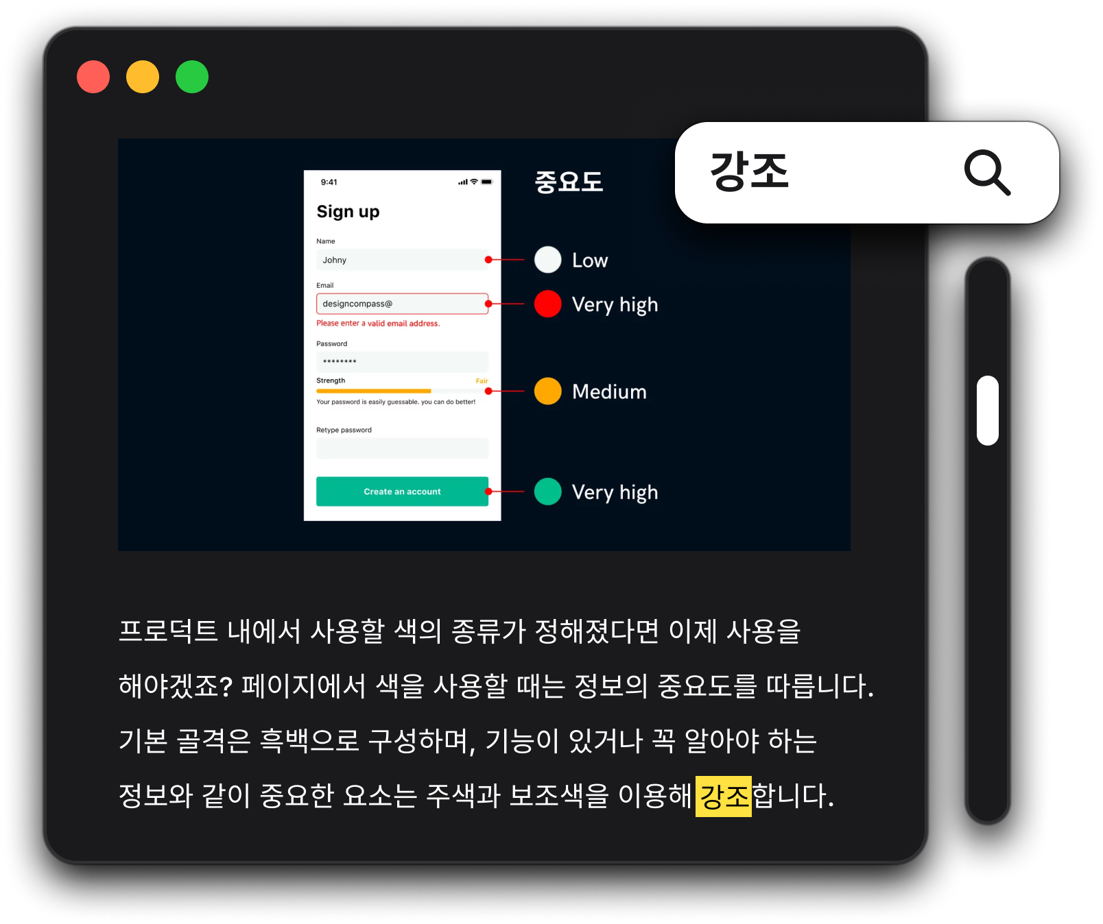
Color, a colorful visual experience
The color is like fire. Used appropriately, it can get you the results you want, but overused can ruin your design. Color must be used very carefully in product design, as it should help users quickly act on their priorities.
Text, record of language heard by ear
To exaggerate, it would be no exaggeration to say that 80% in app design is typography. Because it is the most used element, it has a great impact on the overall atmosphere and also has a significant impact on the user's ability to understand the content and act quickly.
Icon, the world's common language that can be read with your eyes
Icons are symbols that emphasize the characteristics of an object and are a visual language that is more universally understandable than other languages. It is represented by UI icons, pictograms, signs, etc. and is used in a variety of areas because it can convey meaning while occupying a small area.
writing, human-to-human conversation
UX Writing designs conversations between products and customers. We write functional text that is used in various digital environments such as websites and apps. We write articles that help users achieve their goals, and further play a role in conveying a unified voice.
LV2 exam
Solve test questions to check if what you have learned has become your knowledge.
LV2 Assignment
Create assignments that put your knowledge to practical use. Give and receive feedback until the level is sufficient.
LV3. Composition for good UI
Layered, reversible origami
Layers are one of the characteristics of computer graphics tools. You can freely composite and revert multiple elements. This allows for a variety of attempts and expressions that could never be made by hand.
Organization, the sum of the parts is not the whole.
Designers must help users navigate seamlessly according to the amount and nature of information they want to convey. Layers are arranged so that the eyes naturally flow with minimal cognitive load and no unnecessary waste.
Layout, as if it was there from the beginning
Layout is the arrangement of elements within a specific area. The screen layout must not only provide static screen balance but also appropriately express the structure of the abstract space of the service.
Naturalness that creates movement and vitality
Like auditory language and visual language, movement is also a type of language. A variety of information can be conveyed in a limited space, making it easy to convey content that is difficult to convey with static elements and adding a touch of naturalness.
LV3 exam
Solve test questions to check if what you have learned has become your knowledge.
LV3 Assignment
Create assignments that put your knowledge to practical use. Give and receive feedback until the level is sufficient.
LV4. Interaction for good UI
information structure, finding books in the library
It is a concept about the structure that organizes information. In a library, information structure determines how to divide bookshelves and what standards to place books. The goal is to allow users to easily and conveniently access the information they want, just like finding a book.
Input and output, dialogue with machine
The designer designs the user's path by carefully examining the current user status, the information the user provides to the system, and the information the system provides to the user.
Components, Efficient Puzzle Pieces
We don't make everything from scratch. There is always a better framework or tool that has been created before. Tools that can be used like Lego pieces or puzzles that can be used repeatedly without always having to create something new are called components.
Patterns, familiarity without the need to learn
We design pages using components and various visual elements, and design the process of interacting with users on each page to reach the final result.
LV4 exam
Solve test questions to check if what you have learned has become your knowledge.
LV4 Assignment
Create assignments that put your knowledge to practical use. Give and receive feedback until the level is sufficient.
LV5. Components for good UI
Create a button
Buttons are the most basic interaction in UI. It is no exaggeration to say that all UI starts from buttons. It is the simplest element through which a user communicates to a machine.
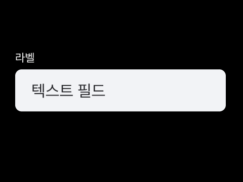
Create a text field
Text fields are fundamental to conveying information to users that buttons cannot provide. This is a component that mainly uses the keyboard or voice to input information.
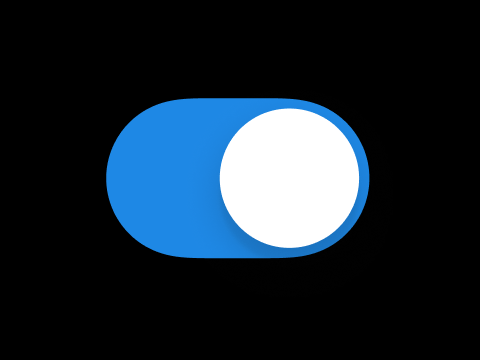
Make a selection
Select is one of the fundamental UI elements. It is a basic interface that selects information and transmits it to the machine. You can also enter the On/Off status in a toggle form or enter information by pressing multiple buttons.
Create a slider
A slider is an input component used to select a specific value within a given range. It is also called a slider or range input.
Create a card
Cards are one of the most powerful components used to convey complex and large amounts of information to users. They expose a variety of information and help users explore the information as intended.
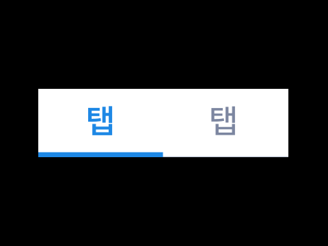
Create a tab
Tabs help users understand large amounts of information by breaking it up into larger chunks. They are modeled after devices that used to group and categorize large amounts of documents or address books by common characteristics in the past.
Create a filter
Filters are components for filtering large amounts of information. They are mainly used in digital products to sort products or content that meet criteria based on desired criteria. Filters are an essential element in IT services, especially since there is a limit to the amount of information that can be shown to users on the small screens of smartphones.
Creating Pagination
Pagination is a component that controls pages. It is used when showing multiple pages in a limited space. Unlike tabs or filters that change the context of the information being viewed, pagination is used when showing multiple pieces of information in the same context.
Create a course marker
Progress Indicator is a component that informs the progress of the system. It makes users feel like waiting times are shorter or they feel more motivated to complete a task.
Create a badge
Badges are components that convey information with minimal elements. It's like putting a small badge on your clothes. Unlike chips or tags that can be used like buttons, they focus on conveying current status and information.
Create a tag
Tags are components that display detailed information about the target element in words. Badges are mostly used to convey a single piece of information, while tags are mostly used to convey multiple pieces of information.
Create an Avatar
Avatars are components that represent users. They are mainly used in services where users frequently interact with each other, such as messengers, email, games, and video conferences.
Creating a Dialog
Dialogs are used to convey important information or require user action. It is like calling a customer to come into a store and sit down. So it is better not to use it unless it is absolutely necessary.
Making a Bottom Sheet
Bottom sheets are components used when you need to process a separate task in the middle of a task you are currently working on. Bottom sheets are used when more complex processing than a dialog is required.
containing everything UI design class package
Key notes compiled over 16 years
120+ Quizzes
4 assignment coaching sessions (worth 200,000 won per session)
Chat Q&A
Lifelong collection
lifetime updates
Once you pay, you can keep it for life. Now is the lowest price
The price increases each time a chapter is released.
The normal course period (paid course period) is the first year. Free access for later review.
start date
The course start date is calculated from the payment date, and once payment is complete, you can start taking courses directly through My Page.
If the start of the course is delayed due to the circumstances of the design compass, the start date of the course will be delayed by the corresponding schedule.
100% can be refunded within 7 days from the start of the course, if less than 5 courses are taken.
If more than 7 days after the start of the course, or if you have taken more than 5 courses, the remaining days compared to the normal course period (paid course period) can be refunded as follows.
Based on the date of request for refund : Refund of 2/3 of the actual payment amount before 1/3 of the course starts : Refund of the amount corresponding to 1/2 of the actual payment amount before 1/2 of the course starts : No refund after 1/2 of course start
Device restriction policy Up to 3 devices per ID can be registered to watch the Design Compass online lecture, and the device registration is automatically registered when accessing the online lecture. If the maximum number is exceeded, it is necessary to cancel the registered device.
copyright policy All lectures of Design Compass are prohibited from copyright infringement, such as unauthorized distribution and processing, capture, recording and sharing, and unauthorized sales. If illegal use is detected, you may be subject to legal sanctions for violating copyright laws.


