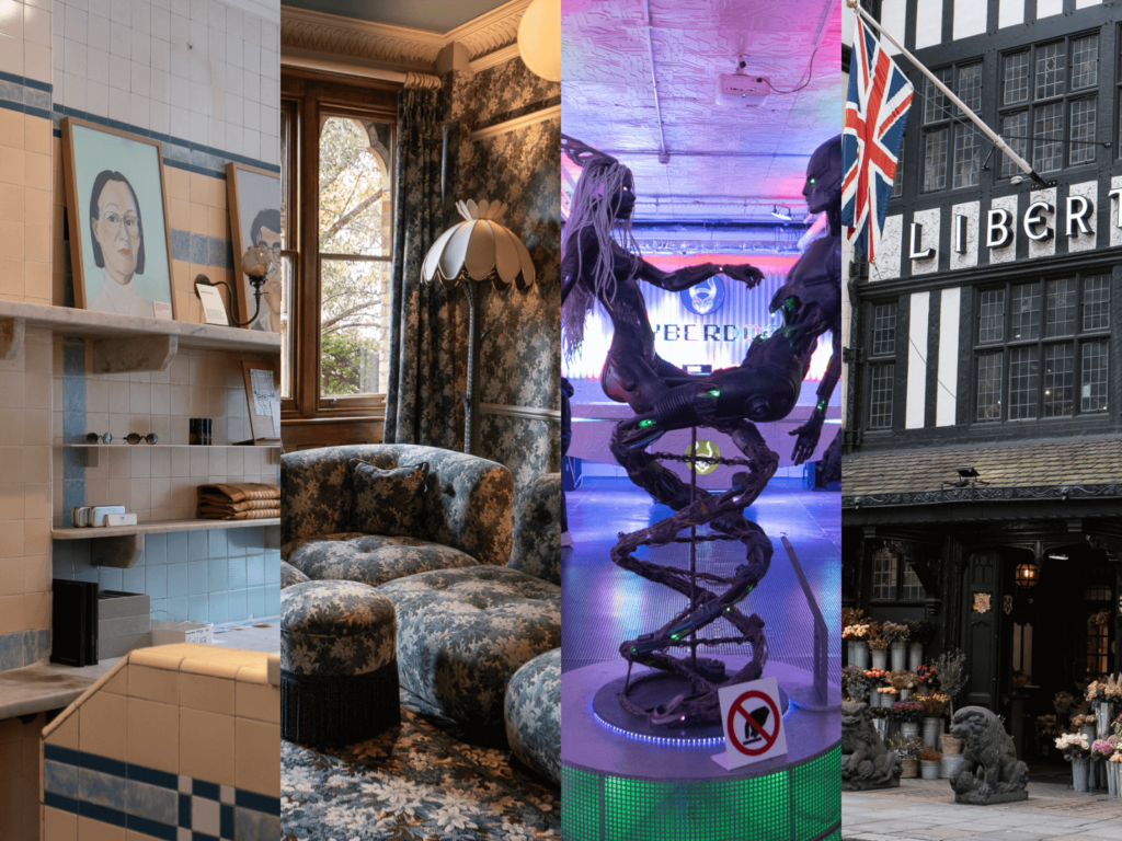
As a student, I only learned about the origins of design, William Morrison, and many graphic designs, but I never had the chance to experience the city firsthand. On this business trip, I was able to fully experience London’s aesthetics, from its heritage style, legendary urban graphic design, and restrained industrial design. I will share seven impressive London design spots on this business trip. House of HackneyHouse of Hackney St Michael’s, […]
This book was written by Yonsei University HCI Lab. It is a book that allows you to deeply explore human interaction beyond mobile devices. The author, Jinwoo Kim, is a professor at Yonsei University's College of Business and a professor in charge of Yonsei University's HCI Lab. He has an MBA from UCLA, a consulting firm KPMG, and a PhD in HCI from Carnegie Mellon University. He has been teaching at Yonsei University since 1994 and served as the president of the Korean HCI Society. It teaches you how to solve real problems based on conceptual models. Digital […]
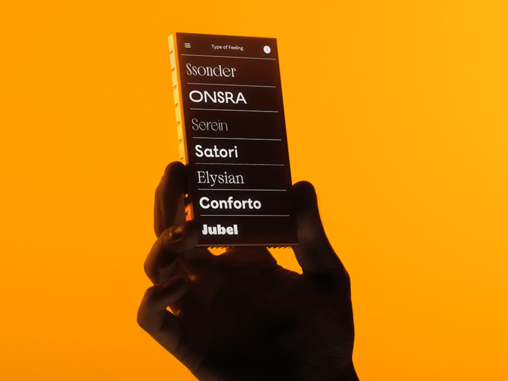
Jessica Walsh, based in New York City, has created her own type foundry focused on emotional typefaces. She offers custom typography services that speak to the soul of a brand on a deep and meaningful level, beyond pure functionality. Drawing on her experience in brand identity and strategy, she has created typefaces that evoke moods and emotions, including Jubel (Joy), Conforto (Coziness), Onsra (Aspiration), and Serein (Serenity). “Many foundries focus on creating typefaces for mass distribution,” says Jessica Walsh. “We […]
Crucible is a laboratory for experimenting with drinks and flavours. It has worked with a range of beverage brands, including Johnnie Walker, Belvedere, Lavazza and Fever Tree. Founder Stuart Vale collaborated with Chris Colicot of Maddalena Studio to create a unique visual identity. The new logo features a ‘C’ inspired by living bacteria. The pattern of bacteria was photographed from a variety of sources, including aged kombucha, lion’s mane fungus, skin and soil solutions. Experimentation, nature and flavour […]
This is an article by designer Whisain Gai Lan, who created over 800 icons while rebranding Webflow. It shows an effort to maintain unity while having individuality. The sizes were limited to 16, 24, and 64, and the outer edges were rounded and the inner edges were angular to clearly express the internal space. The process of expressing abstract concepts such as AI help, data binding, and variables as icons is impressive. In order to draw a new icon that does not depend on objects like Apple's Command, 50 […]
'Attaive' is a project of 'Araea', a small group created by Handong University design students to study Korean typography. It collects and evaluates books related to Korean typography in the Handong University library, starting with books on fonts/lettering. In addition to meta information, the neatly organized DB introduces books by one-line introduction and difficulty level, making it easy to understand the nature of the books. There are books related to Hangul, such as books that examine fonts, books that teach the process of creating fonts, and books that actually create fonts.
This is a book about 'strange books' written by Edward Brooke-Hitching, a British writer and documentary filmmaker. It is a collection of strange books such as books written in blood, books made of human skin, books filled with profanity, books that can be worn, books that are too small, books that are too big. It is a book that seems like a strange book, but it is a book that allows us to understand a perspective that is not seen because it is common in modern society. It lists provocative materials […]
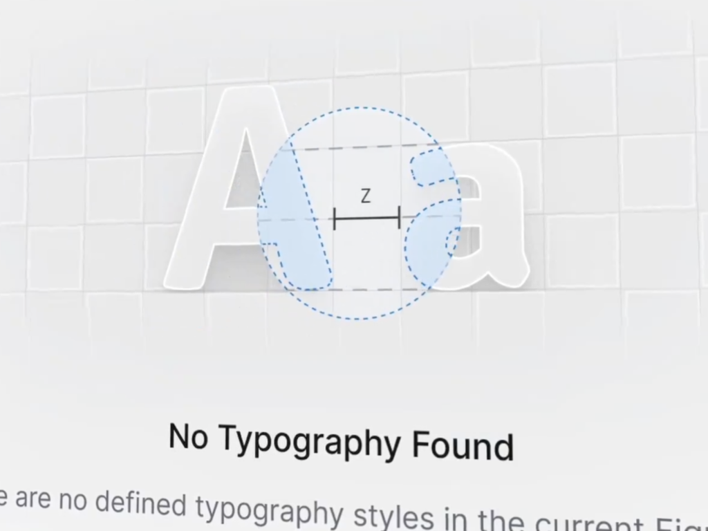
Natko is a UI/UX designer from Croatia. He has created various product designs and Figma plugins. He is impressive with his modern silver graphics and smooth motions. His passion for pursuing the ultimate aesthetic that only a designer can be responsible for is inspiring. The motion when accessing a page with no results is smooth and unfamiliar. He conveys a positive experience by explaining what is contained in the current page at the moment of disappointment when he cannot find the information he wants. He […]
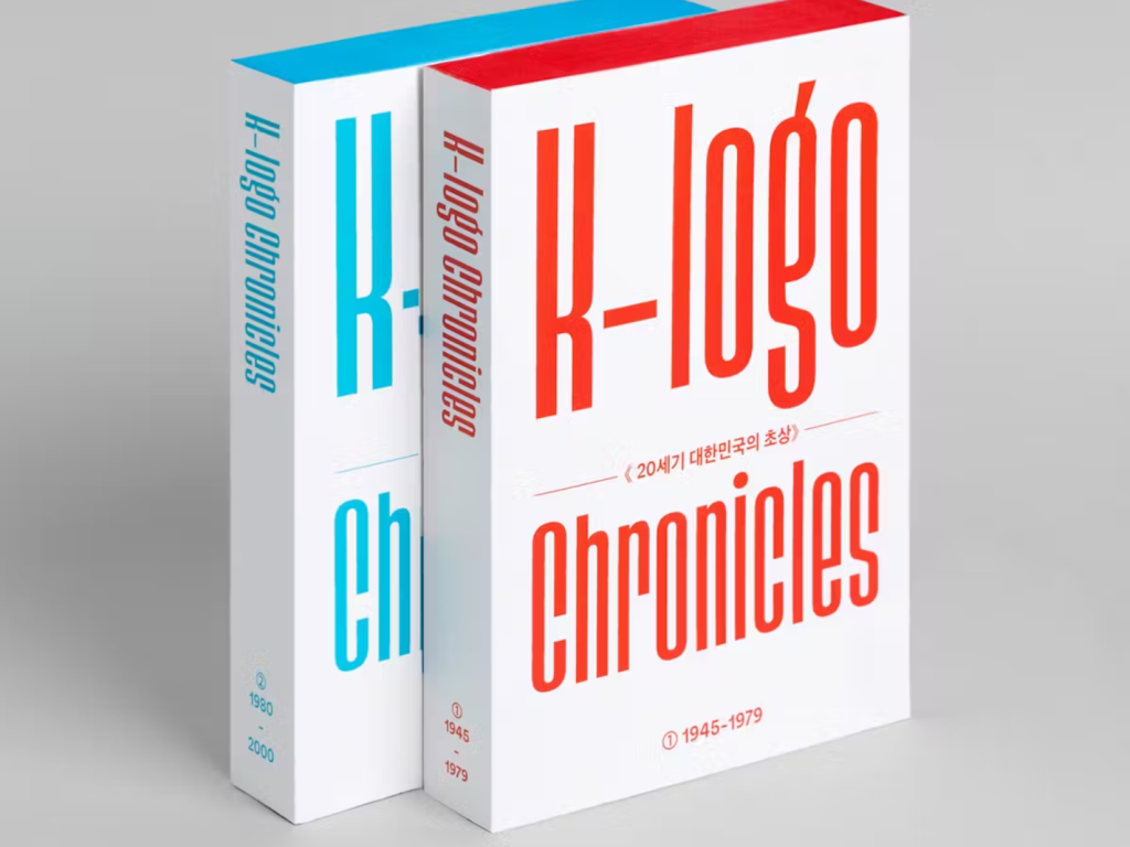
This is a book that compiles Korean logos from the 1940s to the late 1990s, right after liberation. It is a collaboration between South Korea's first brand identity company, 'CDR', and Monthly Design's imprint brand, 'Studio Final'. It consists of two books, 'K-Logo Chronicles: 1945-1979' and 'K-Logo Chronicles: 1980-1999'. It is a book that has collected about 3,000 logos by searching various historical materials and daily newspaper articles, and also contains interesting stories and articles. Funding began on Tumblbug on August 7th, and it is scheduled to be shipped on October 7th. […]
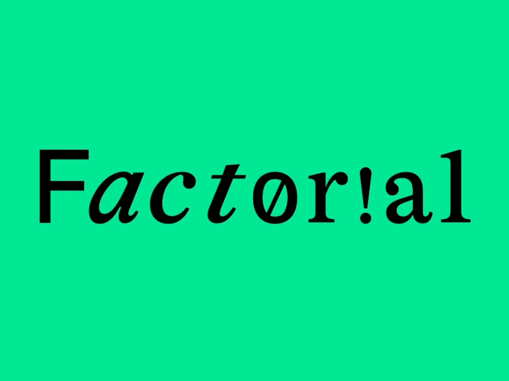
Aegis Asset Management has opened a smart office brand called Factorial. It collaborated with design agency CFC. It is said to contain the meaning of creating something new (1) by adding an idea (!) to possibility (0). The wordmark, which combines various styles, is unique. The alphabet O is replaced with the number 0, the alphabet i with !, and the alphabet l with 1. It uses a unique silhouette icon that looks like it is running excitedly. See more and sources
Microsoft's visual design team shared a visual experience showcase designed for Window 11. This year, Microsoft focused on AI and presented new changes to users. The design grammar that runs through Copilot, Surface, and Windows shows a clear difference from Apple and Google. You can feel the unique philosophy in the design applied to imprint services that do not have physical entities. The UI with delicate palettes and pleasant movements also played a big role in this. […]
The beta version of iOS 18 introduces a new flashlight interface. The True Tone flashlight, which is controlled using dynamic islands, is intuitively expressed. The light itself, emitted from the icon-shaped flashlight, is beautifully expressed. You can see the curve representing the width and brightness of the light and the dotted curve line representing the maximum intensity. It is intuitive to be able to control it as you see it. See more and sources