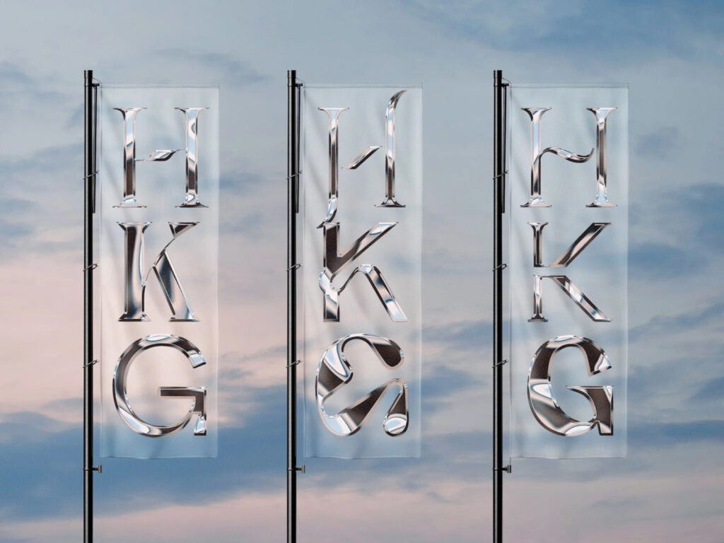
HKG Metals, a Singapore-based metalworking company with over 30 years of experience, has embarked on a new chapter with a complete brand identity overhaul. The rebrand was led by design studio House of Adjacent. "HKG Metals specializes in the fabrication of bespoke metal structures, a subcontractor that brings architectural blueprints to life," explains Jay Liu, founder and art director of House of Adjacent. He worked closely with the founder of HKG Metals to bring […]
This is a brand design collaboration between Spanish energy company Repsol and Saffron. Repsol has long been a leading supplier of gasoline and oil in Spain and throughout Latin America. Within Spain, it's an iconic brand, recognizable to almost everyone, and a part of everyday life. However, in recent years, Repsol has been reshaping its identity beyond simply being a fossil fuel supplier, becoming a "partner for all energy." This transformation has been effectively communicated to the public […]
Global e-commerce platform Cafe24 has unveiled a new identity through a brand renewal. This rebranding project was carried out in collaboration with design studio Ordinary People. Ordinary People focused on redefining the brand's core values based on Cafe24's brand essence of 'supporting and connecting possibilities' and visualizing them. The core of this rebranding is the delivery of a clear philosophy and vision centered around the slogan 'Idea is Business'. Creative ideas are put into practice […]
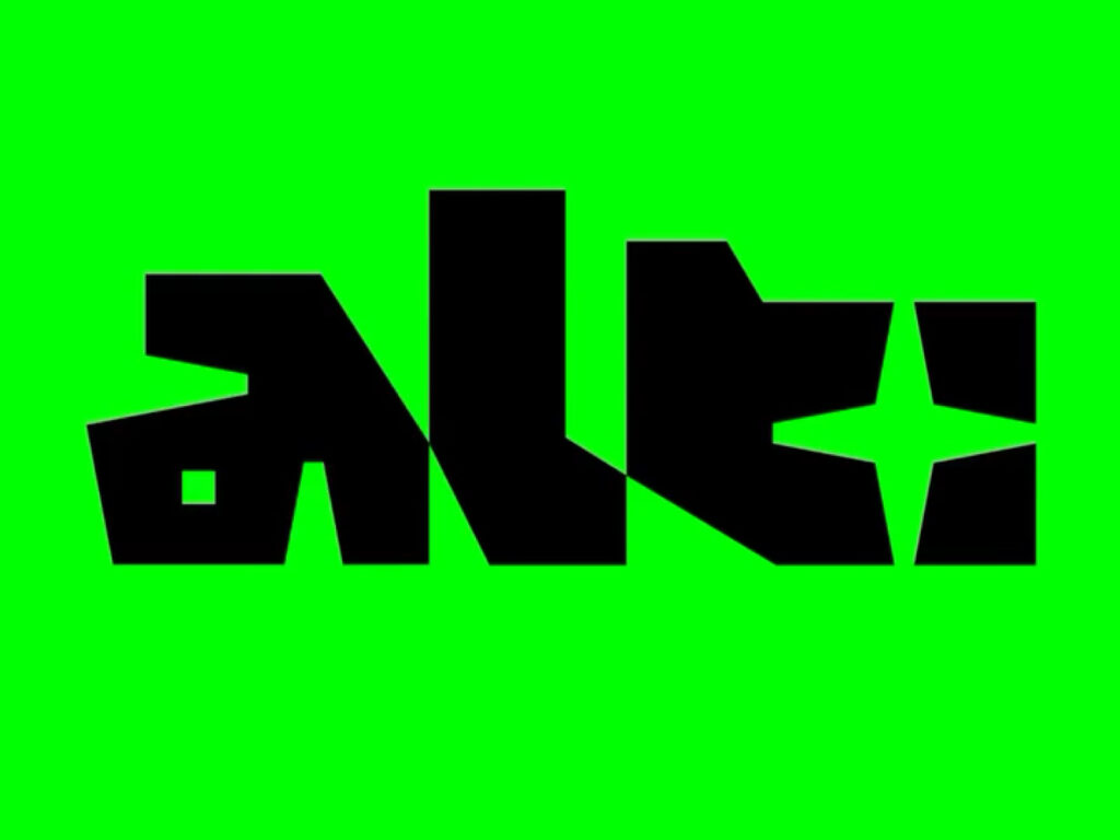
This is the brand design for ALT Games, a new festival celebrating independent game creators and indie game design culture in Sydney, Australia. Hosted at Sydney's powerhouse museum, PHIVE, the festival showcases creative and experimental interactive media. Design agency dia studio created a striking visual identity centered around a custom logotype inspired by game controller icons and a color palette of black and neon green. Capturing the energy and DIY spirit of the indie game community, the print […]
This is the brand design for the boutique hotel brand "Now Now," a collaboration with Canadian brand design studio Saint-Urbain. The project embodies the brand's philosophy of encouraging solo travelers to connect with the outside world by venturing out of their rooms. Alex Ostroff, founder and creative director of Saint-Urbain, explains, "Now Now is a hotel for people who want to get out of the city rather than stay in their rooms. Through our visual identity, we connect with the outside world and self […]
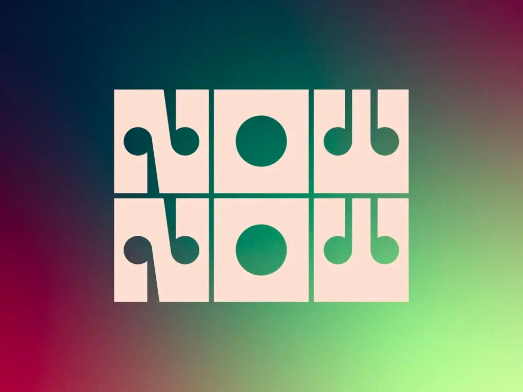
Megaron The Athens Concert Hall in Athens, Greece, has unveiled a new visual identity for the 2024-2025 season. The clean, geometric shapes are used to visually express the power and rhythm of music, visualizing the movement of notes and rhythm. As part of a branding project that K2 Design Studio carried out from 2022 to 2025, the Athens Concert Hall was responsible for the overall visual communication of the concert hall, including campaign design, production, editorial, and website development. The Athens Concert Hall […]
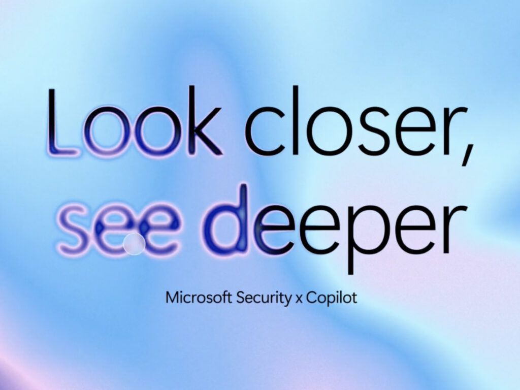
This is the new brand identity for Microsoft Security, the cybersecurity brand Microsoft collaborated with Koto on. This rebranding focuses on visually embodying a forward-looking philosophy that goes beyond simple threat response to proactively detecting and preventing threats. This identity boldly shifts away from traditional security symbols—locks, shields, and dark colors—in favor of a clear, confident, and vibrant visual language. Through this, Microsoft emphasizes that security should be an experience users can trust and feel secure in. […]
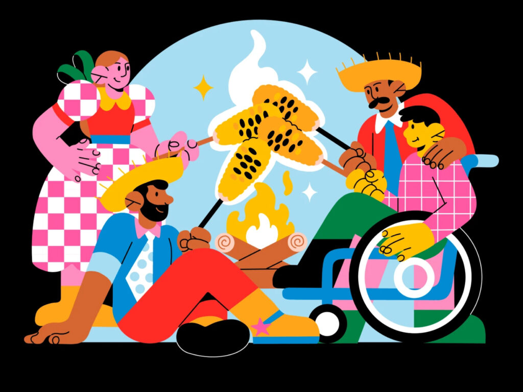
An illustration created for GoDaddy Studio to help create brand content for Brazil’s Festa Junina. Brazil’s Festa Junina is a traditional folk festival held throughout Brazil each June, centered around abundance, rural culture, and the faith of saints. It is a very unique national event that combines European (especially Portuguese) festival traditions with Brazil’s unique agricultural culture, and is considered the second largest national festival after Carnival. GoDaddy […]
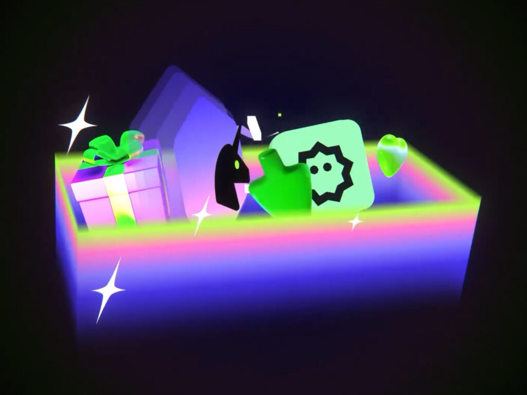
'Gift Exclusive' is a function that allows you to gift digital art from DeviantArt to your friends. Gradients are used to express the individuality of DeviantArt while adding a sense of touch. Or Drori, who created the motion graphics, is a freelance motion graphic designer, creative director, animation director/lead, and commercial artist. He has developed his own unique style and approach to design, motion, and visual storytelling through his extensive career. He has collaborated with studios such as Hornet, Lost York, and Koto, and […]
This is a brand design project by designer Kyung-ye Shin. It is a lifestyle brand that pays tribute to nature. It expresses the two-sided nature with colors and names, and uses visual elements to contain artistic sense. It gives a rich feeling with strong and vivid colors and simple but characteristic shapes of the object. The feeling of paper cuts, the texture of rough printed matter, and the transparency realized in 3D, make you feel the existence of nature and the hands of the person handling it. See more and sources
This is the brand design for Pinky Swear, a lounge located in New York. Pinky Swear is a multi-purpose space that functions as a restaurant, bar, club, game space, and gallery. The branding work was done by creative agency The Working Assembly. The project was comprehensive, from establishing the brand strategy to visual and verbal identity and practical application. The core concept is 'Escape in your community', which means experiencing something different from everyday life through new stimulation within the local community […]
This project uses the B&O Beoplay H95 to graphically express sound. The Beoplay H95 is Bang & Olufsen's iconic premium over-ear headphone that combines finely tuned sound with sophisticated design. Reframe Studio developed 2D and 3D graphics using the headphones. It beautifully expressed the feeling of sound while naturally revealing the luxurious materials and delicate finish of the product. See more and sources