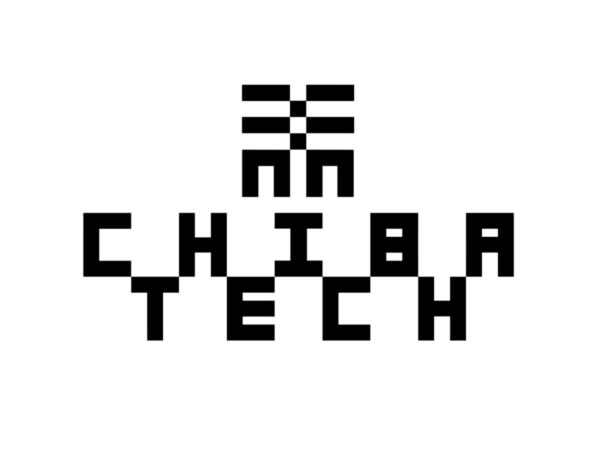
Chiba Institute of Technology, a long-established Japanese engineering university, has unveiled a new brand identity. The project focused on visually embodying the institution's forward-looking goals of strengthening global connections while honoring its long-standing heritage. The core design strategy revolved around the school's iconic letterforms. These were expanded into the logo, typography, and mascot, and became the central axis of a responsive design system.
The design team reinterpreted the geometric pattern, inspired by the traditional Japanese motif of Ichimatsu Moyo, into a sophisticated form. This pattern symbolizes uninterrupted prosperity and growth, and is deeply reflected in the visual language of this rebranding. The new logo revives the structural beauty of the past symbol with a contemporary sensibility. The layout of the page is also developed based on the symbolic characters. The grid system, which expands from the four corners, demonstrates formal consistency and meticulous craftsmanship, naturally adapting to a variety of content and scales. This modular structure visually conveys the university's international collaborations and scalability.
The colors were also defined in a unique way. The zigzag combination technique opened up diverse color combination possibilities and broadened the scope of brand application. Typography plays a major role in this identity. Pentagram developed a custom 3×4 font based on the Ichimatsu pattern and a monospace font based on the basic character structure. The structure where Japanese and Latin characters meet like students from different regions reflects the diversity and international perspective of Chiba Institute of Technology. The font goes beyond a simple title typeface and functions as a single graphic structure. A 5×5 font with a pixel-based digital sensibility was also developed for a wide range of uses.
The mascot, Cheeburger, has also been newly introduced. This character, with his drawing and jumping movements, dynamically moves through the brand system, adding warmth to the otherwise dry, technical image. He actively conveys emotion in admission announcements and campaign messages, broadening the scope of brand application. An expanded logotype containing the institution's full name is also provided as a graphic element, enhancing its usability in a variety of situations.
This rebranding focuses on a balance between tradition and innovation. It clearly demonstrates Chiba Institute of Technology's vision to maintain its roots while taking a new leap forward as an international educational institution. The new identity translates the identity of a technology-based educational institution into a contemporary language, while also serving as a visual foundation for future growth.


