
유튜브 비디오 UI가 대규모로 업데이트됩니다. 이번 변화는 단순한 인터페이스 조정이 아니라, 콘텐츠와 크리에이터의 생동감을 시각적으로 반영해 ‘더 몰입감 있고 직관적인 유튜브’를 만드는 데 초점을 맞췄습니다. 새 디자인은 10월 13일부터 전 세계적으로 순차 적용됩니다.
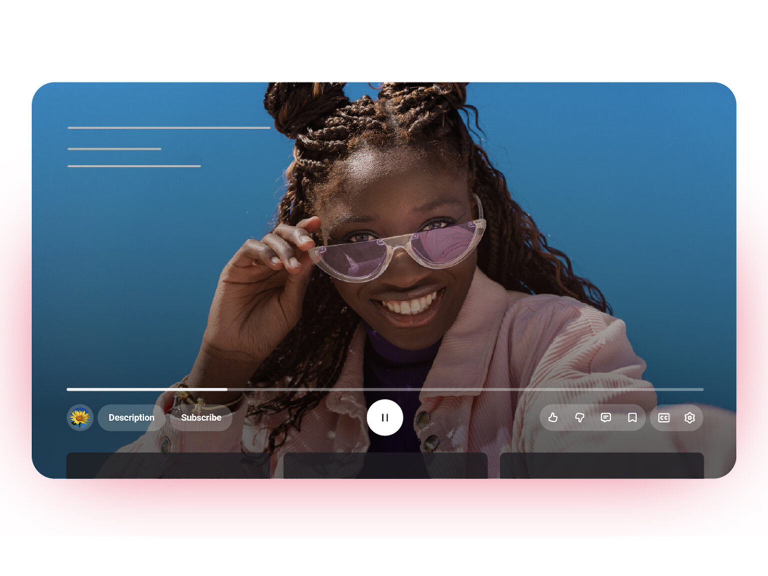
가장 눈에 띄는 변화는 영상 플레이어의 리뉴얼입니다. 모바일 웹 TV 등 모든 플랫폼에서 적용되며, 버튼과 아이콘이 반투명하게 다듬어져 영상 자체를 더 넓게 감상할 수 있게 했습니다. 영상 이동을 위한 ‘더블 탭 시크’ 기능도 덜 방해되는 방식으로 바뀌었습니다. 모바일에서는 탭 간 전환 애니메이션이 개선돼 자연스러운 이동이 가능해졌습니다.
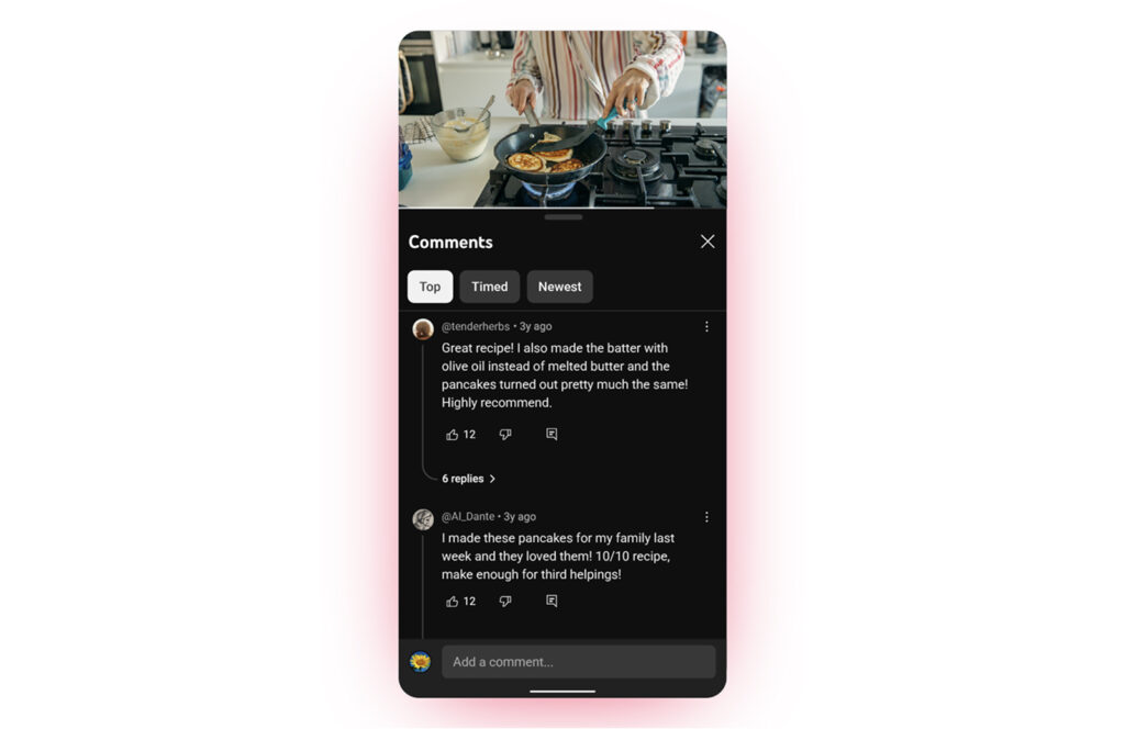
상호작용 기능도 새로워졌습니다. 콘텐츠 종류에 따라 ‘좋아요’ 버튼이 맞춤형 애니메이션으로 반응하며, 예를 들어 음악 영상에는 음표가, 스포츠 영상에는 경기 관련 그래픽이 나타납니다. ‘나중에 보기’나 재생목록 추가 과정도 더 시각적으로 단순화돼 직관적인 조작이 가능해졌습니다. 또 댓글은 스레드 구조로 재정비돼 답글 흐름을 보기 쉽게 했습니다.
다만 새 인터페이스를 먼저 경험한 일부 사용자들은 화면 정보가 지나치게 압축돼 보인다는 불만을 제기했습니다. 특히 채널 이름이 사라지고 사용자명만 표시되는 구조가 낯설다는 반응이 많습니다. 그럼에도 불구하고 전문가들은 아이콘 배치 조정과 투명도 향상 등 세부적인 개선이 장기적으로는 콘텐츠 집중도를 높일 것으로 보고 있습니다.