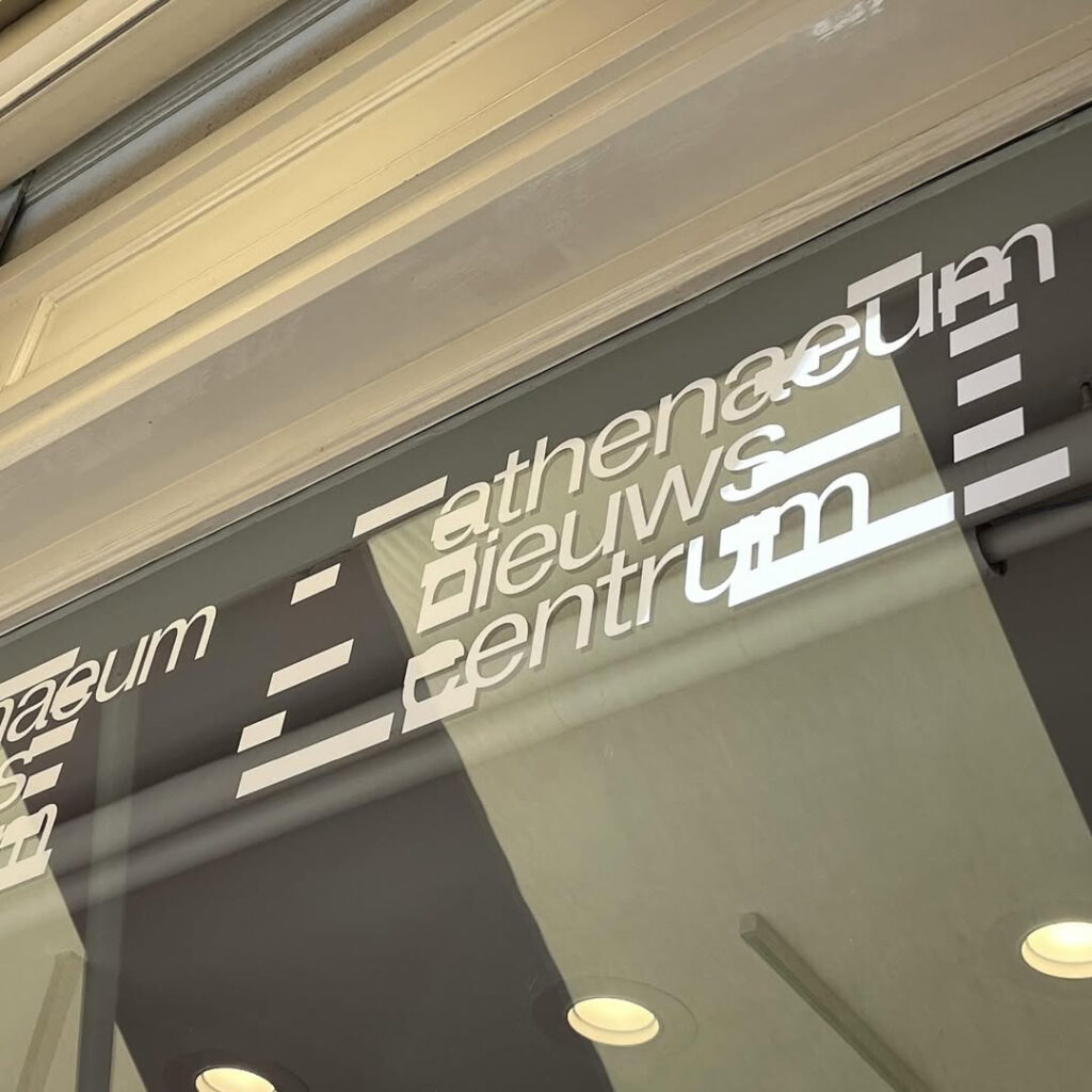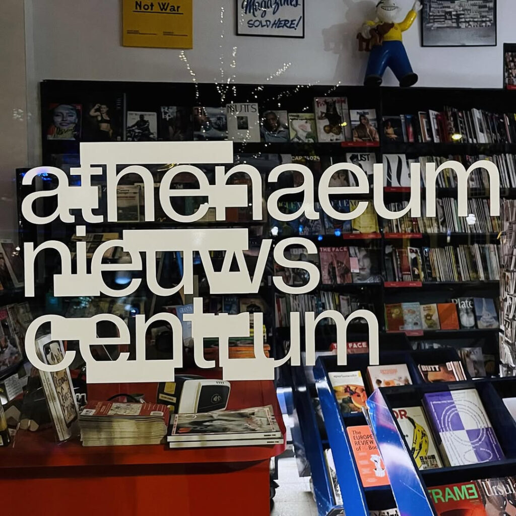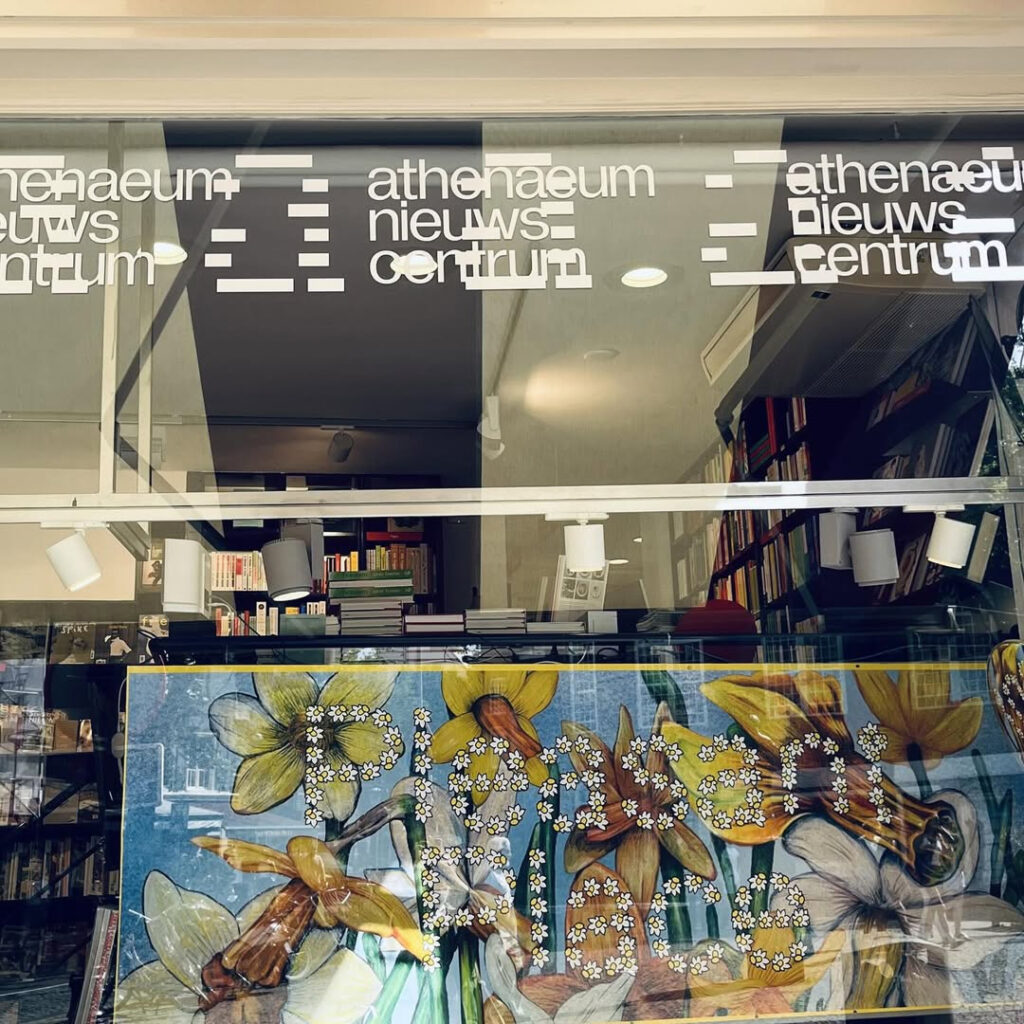

암스테르담의 전설적인 공간 아테네움 뉴스센터(athenaeum nieuwscentrum)가 새로운 시각 언어를 실험하고 있습니다. 최근 디자인 스튜디오 jetset_experimental은 인스타그램을 통해 여름 동안 소프트 런칭된 임시 윈도 레터링 프로젝트를 공개했습니다.
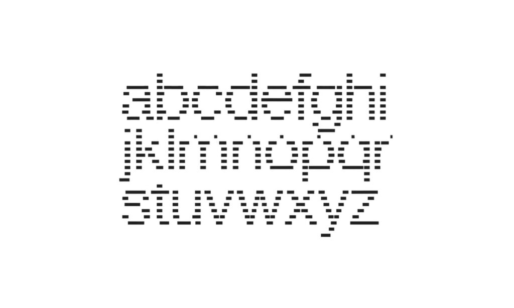
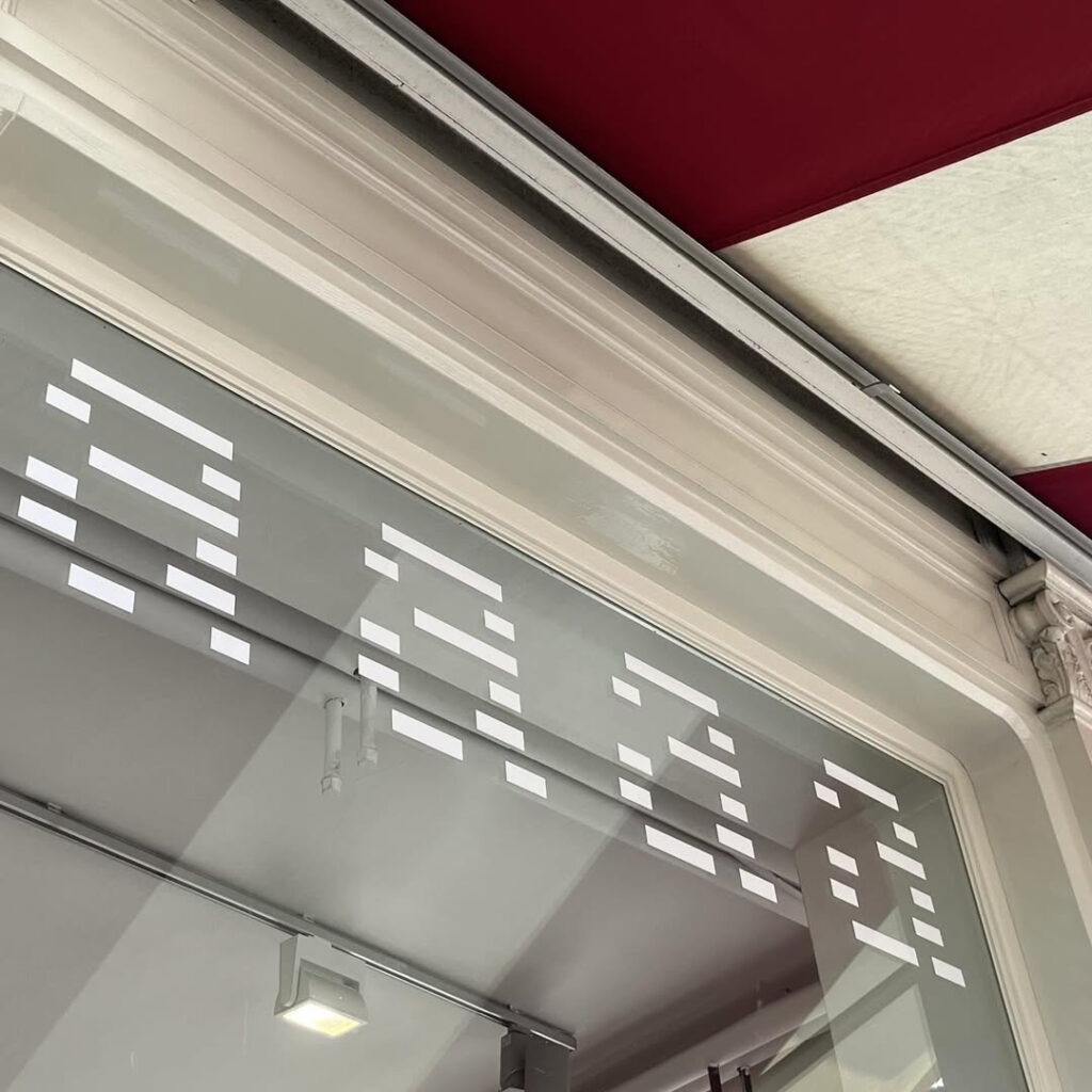
이번 프로젝트는 뉴스센터라는 이름에서 출발했습니다. 디자이너들은 ‘프레스 에이전시(press agency)’라는 개념을 떠올리며 소셜 미디어 이전 시대의 뉴스 유통 방식을 참조했습니다. 전선과 회로, 채널을 따라 흐르던 정보는 텔렉스와 펀치 카드, 종이 테이프 같은 물리적 네트워크를 통해 전달되었습니다. 이러한 아날로그적이면서도 초기 디지털적인 통신 인프라에서 영감을 받아 가로 줄무늬로 구성된 ‘A’ 심볼이 탄생했습니다. 이는 정보의 유동성을 상징하는 동시에 펀치홀과 종이 스트립을 연상시키며, 오래전부터 진행해온 ‘유동적 알파벳(fluid alphabet)’ 프로젝트의 일부이기도 합니다.
이번에 적용된 줄무늬 ‘A’는 옆에 위치한 아테네움 서점의 시각 언어와도 대화를 이룹니다. 서점이 세로 줄무늬를 상징한다면 뉴스센터는 가로 줄무늬로 응답하는 셈입니다. 그래픽적 ‘콜 앤드 리스폰스’라 할 수 있습니다.
레터링 작업은 Riwi Collotype이 실행했으며 캡션에 사용된 서체는 Roman Gornitsky가 개발한 Gramatika입니다. jetset_experimental은 이번 실험에 대해 “초기 디지털 정보 네트워크의 물성을 통해 오히려 자유로운 언론의 감각을 느낄 수 있었다”고 전했습니다. 종이와 구멍의 물리성이 오늘날의 클라우드와 알고리즘보다 더 신뢰감을 주는 듯하다는 회고도 덧붙였습니다.
아테네움 뉴스센터의 이번 시도는 역사와 전통을 기반으로 하면서도 정보 유통의 물질적 감각을 현대적으로 재해석한 작업으로 평가받고 있습니다. 여름 이후에는 더욱 확장된 디자인 애플리케이션이 공개될 예정입니다.