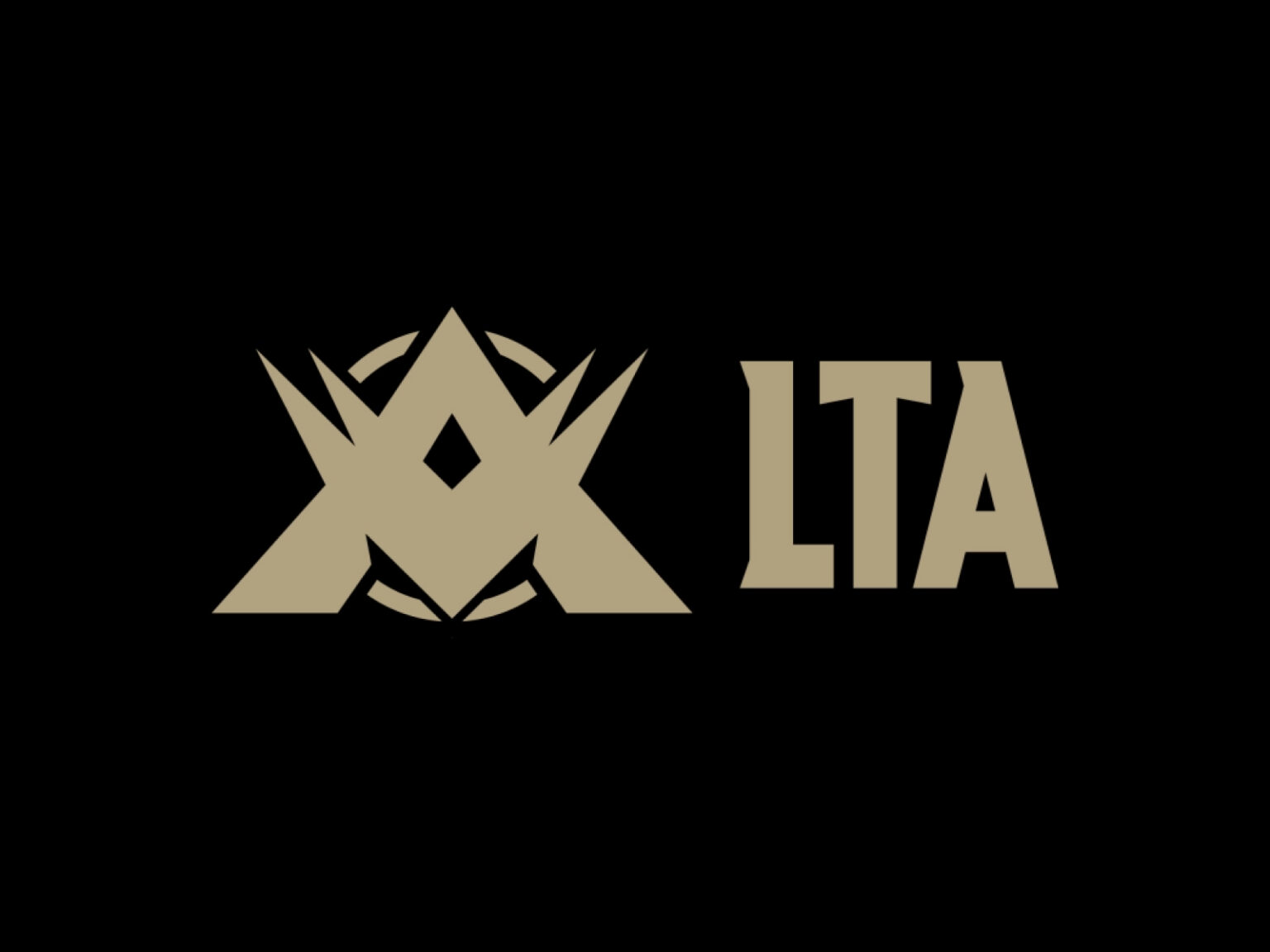

라이엇 게임즈가 북미 LCS, 라틴 아메리카 LLA, 브라질 CBLOL을 하나의 리그로 통합한 ‘리그 오브 레전드 챔피언십 아메리카스(LTA)’ 디자인입니다.
세 지역 리그가 가진 팬들의 애정과 역사적 유산을 훼손하지 않으면서도 새로운 정체성을 부여하는 프로젝트입니다. 이를 위해 LTA는 메인 브랜드 아래 북부(LTA North), 남부(LTA South)의 개별성을 유지할 수 있는 복합 브랜드 아키텍처를 구축했습니다. 북부는 파란색과 위쪽 화살표를 통해 이성적 전략을 남부는 붉은색과 아래 화살표를 통해 뜨거운 열정을 상징하며 서로 상반된 에너지를 시각화했습니다. 중심에는 금색 LTA 로고가 위치해 브랜드 전체의 권위와 품격을 표현합니다.
방송 경험도 새롭게 설계됐습니다. 트위치, 유튜브, TV 등 다양한 플랫폼에서 동일한 몰입감을 제공하기 위해 고속 애니메이션과 다국어 자막 시스템을 도입했고 생방송 중심의 레이아웃도 최적화했습니다. 전용 서체인 Riot Dimension은 LTA의 모든 커뮤니케이션에 일관성을 부여해 팬들에게 통일된 브랜드 경험을 제공합니다.
LTA의 첫 시즌은 그 성과로 브랜드 전략의 성공을 증명했습니다. 총 2,490만 시간 이상 시청되었고 최고 동시 시청자 수는 46만 명을 기록했습니다. 인기 팀인 Team Liquid, Cloud9 KIA, FURIA 등이 출전하며 새로운 팬층을 대거 유입시켰습니다. 수천 시간에 걸쳐 스트리밍된 LTA 로고와 시각 자산은 글로벌 e스포츠 시장에서 상징적 존재로 자리 잡았습니다.