What would a national airline logo look like? – Asia
What would a national airline logo look like? – Europe
Korean Air's new CI has recently become a hot topic. Airline service is one of the first brands recognized when visiting a foreign country. Among the various airlines, the brand design of a country's representative airline reveals the values and culture that the country holds dear.
‘A "flag carrier" is an airline representing a country. While there are no international qualifications, it typically refers to an airline with a long history and high recognition, embodying the identity of a country or nation.
The commonly used term "national airline" refers to an airline headquartered in a specific country, encompassing a wide range of airlines. "National airline" refers to an airline operated by a government, while "national airline" refers to an airline that carries out national policy objectives.
In this article, we explore how the logos of flag carriers around the world are designed. We researched airlines representing each continent and country, and selected three striking logos for each theme.
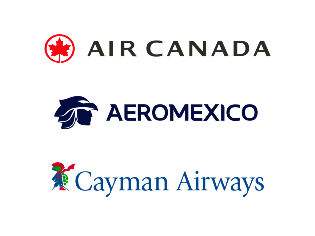
Air Canada uses the maple leaf, a symbol of Canada. The leaf emphasizes Canada's nature and identity, demonstrating the airline's role as a national representative. The logo uses red and black, inspired by the Canadian flag, adding a sense of strength and sophistication.
Mexico's Aeroméxico uses an eagle head design inspired by the helmet of an Aztec warrior. It symbolizes Mexico's strong cultural heritage and independent spirit, emphasizing the airline's historical roots. The colors, blue and silver, add a sense of reliability and modernity.
Cayman Airways, the airline of the Cayman Islands, uses a sea turtle image alongside the Cayman Coat of Arms in its logo and tail design. The sea turtle symbolizes the region's maritime heritage and nature, and embodies the spirit of travel and exploration. The colors, red, blue, and yellow, taken from the Cayman Islands flag, emphasize national identity.
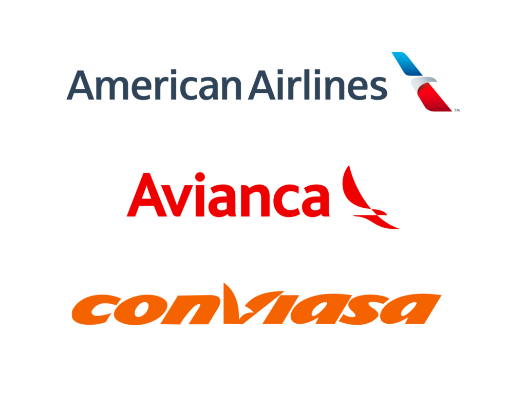
American Airlines, a U.S. airline, uses a design featuring the head and wings of an eagle. Inspired by the bald eagle, the national bird of the United States, it symbolizes national identity and strength. The logo's colors of red, blue, and silver, derived from the colors of the American flag, emphasize innovation and trustworthiness.
Colombia's Avianca uses a logo inspired by the Andean Condor. The condor is the national bird of Colombia and several South American countries and symbolizes freedom and strong flight. The colors, primarily red and white, reflect some of the colors of the Colombian flag while also emphasizing the airline's dynamism and passion.
Venezuela's Conviasa logo features flowing curves, expressing the fluidity of movement and flight. The use of orange and white emphasizes warmth and openness, reflecting Venezuela's bright sun and vibrant culture. The aircraft's tail is adorned with the star of the Venezuelan flag, symbolizing national identity.
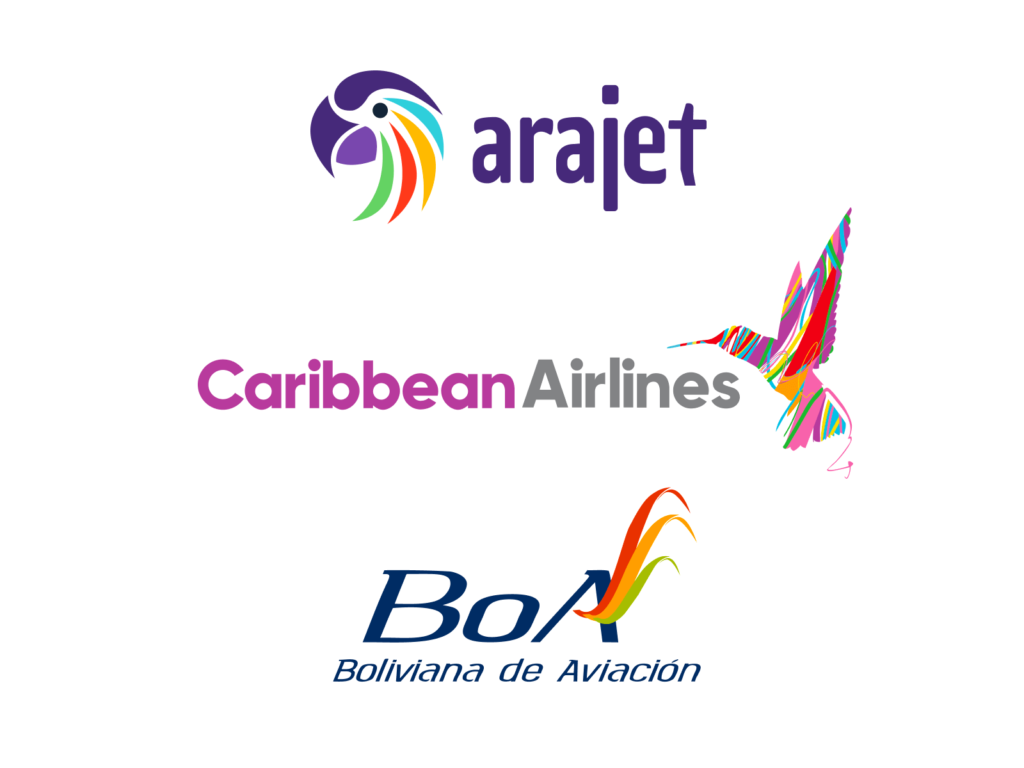
Arajet of the Dominican Republic uses a logo design inspired by the wings of a tropical bird. This symbolizes the Dominican Republic's nature and freedom of flight, while also highlighting the airline's dynamic and modern image. The colors, purple and yellow, reflect the warm Caribbean culture and innovative brand identity.
Caribbean Airlines, based in Trinidad and Tobago, features a soaring hummingbird. The hummingbird symbolizes the vitality and life of the Caribbean region, highlighting the region's natural beauty. The colors, primarily purple and green, evoke a tropical atmosphere and freshness.
Bolivia's Boliviana de Aviación (BoA) logo utilizes soft curves to express the flexibility and connectivity of flight. The colors, red, yellow, and blue, taken from the Bolivian flag, emphasize national identity and symbolize the brand's reliability and the growth of Bolivia's aviation industry.
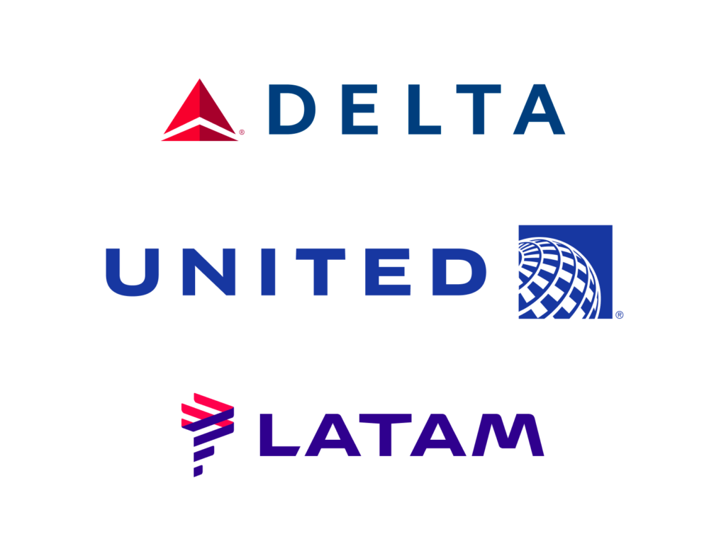
Delta Air Lines, an American airline, uses a logo design featuring a triangle. This design is inspired by the Greek letter "Δ" and signifies the airline's historical heritage and rise. The logo's colors, red and blue, reflect the colors of the American flag while also emphasizing reliability and dynamism.
United Airlines, an American airline, uses a curved design that encircles the globe. This symbolizes the airline's role as a global airline and its global connectivity, emphasizing the brand's international presence. The colors blue and white emphasize reliability and the image of the sky.
LATAM Airlines, operating primarily in Chile and Brazil, uses a logo depicting the South American continent in flowing stripes. This symbolizes the continent's geographical diversity and the airline's extensive network. The colors, purple and pink, emphasize the modern sensibility and dynamism of Latin America.
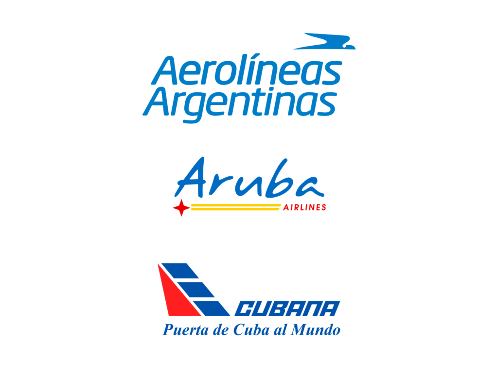
Argentina's Aerolíneas Argentinas uses the condor in its logo. The condor is a bird that symbolizes strength and freedom in South America, representing the airline's strength and soaring spirit. The colors, sky blue and white, reflect the colors of the Argentine flag while also emphasizing reliability and openness.
Aruba Airlines, the airline of Aruba, uses a logo design featuring soft curves and a feather-like shape. This symbolizes Aruba's winds and freedom of travel, emphasizing the airline's flexibility and friendly brand image. The colors, blue and yellow, evoke Aruba's azure skies and sun-drenched beaches.
Cubana Airlines (Cubana de Aviación) uses geometric shapes and a design that evokes a sense of speed in its logo. This reflects Cuba's innovative spirit and the airline's history, emphasizing its strong identity. The colors red, blue, and white, based on the Cuban flag, symbolize national pride.
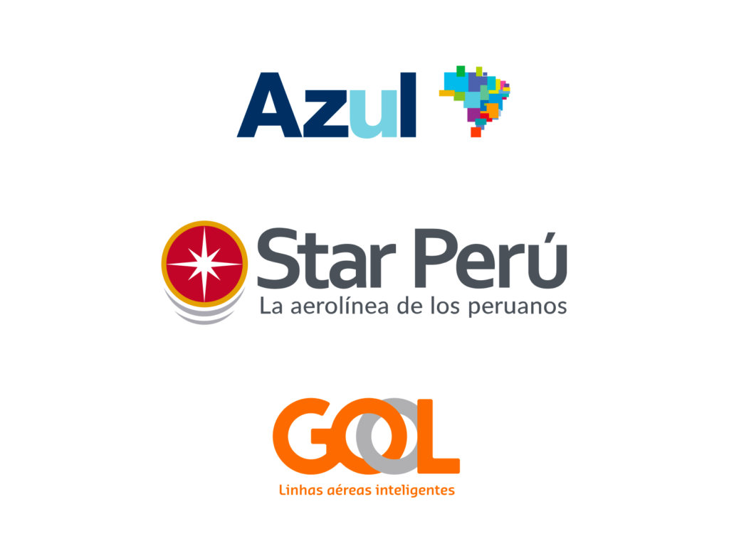
Azul Linhas Aéreas of Brazil uses a pixelated version of the Brazilian map in its logo. This design emphasizes the airline's extensive network of connections across Brazil and its modern brand image. The colors blue, green, and yellow reflect the colors of the Brazilian flag and symbolize reliability and vitality.
Peru's Star Perú uses a star-shaped design in its logo. This emphasizes the airline's connection to its name and symbolizes its commitment to providing customers with a reliable and bright travel experience. The colors, red and white, reflect the colors of the Peruvian flag and emphasize its strong identity.
Brazil's GOL Linhas Aéreas uses a rounded, curved design in its logo. This symbolizes dynamism and flexibility, emphasizing a friendly and modern brand image. The colors, orange and gray, express warmth and innovative corporate values, reflecting the airline's youthful and vibrant identity.