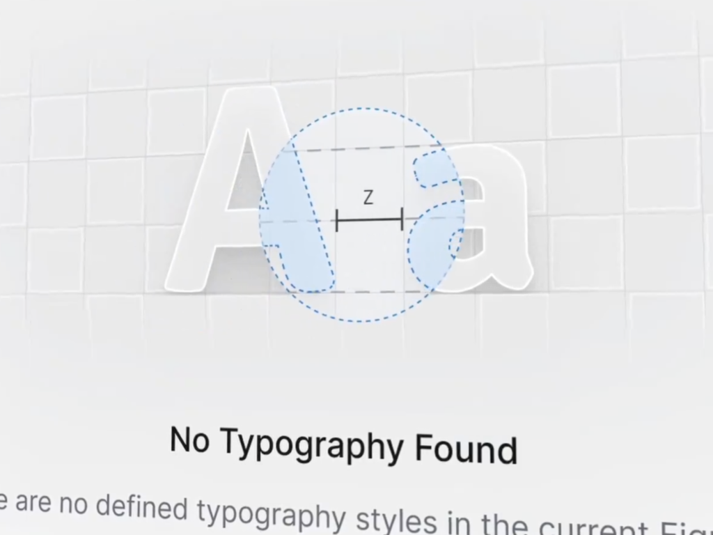
Natko is a UI/UX designer from Croatia. He has created various product designs and Figma plugins. He is impressive with his modern silver graphics and smooth motions. His passion for pursuing the ultimate aesthetic that only a designer can be responsible for is inspiring. The motion when accessing a page with no results is smooth and unfamiliar. He conveys a positive experience by explaining what is contained in the current page at the moment of disappointment when he cannot find the information he wants. He […]
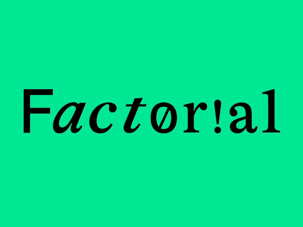
Aegis Asset Management has opened a smart office brand called Factorial. It collaborated with design agency CFC. It is said to contain the meaning of creating something new (1) by adding an idea (!) to possibility (0). The wordmark, which combines various styles, is unique. The alphabet O is replaced with the number 0, the alphabet i with !, and the alphabet l with 1. It uses a unique silhouette icon that looks like it is running excitedly. See more and sources
Microsoft's visual design team shared a visual experience showcase designed for Window 11. This year, Microsoft focused on AI and presented new changes to users. The design grammar that runs through Copilot, Surface, and Windows shows a clear difference from Apple and Google. You can feel the unique philosophy in the design applied to imprint services that do not have physical entities. The UI with delicate palettes and pleasant movements also played a big role in this. […]
The beta version of iOS 18 introduces a new flashlight interface. The True Tone flashlight, which is controlled using dynamic islands, is intuitively expressed. The light itself, emitted from the icon-shaped flashlight, is beautifully expressed. You can see the curve representing the width and brightness of the light and the dotted curve line representing the maximum intensity. It is intuitive to be able to control it as you see it. See more and sources
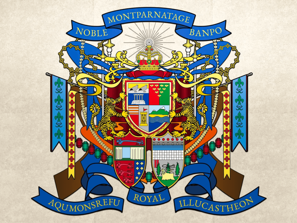
This work by graphic designer Kim Seo-young was submitted to Seoul National University's 2023 graduation exhibition, "THE GREAT BUMP." It criticizes Korea's unique apartment naming system. To make apartments appear more valuable, they combine exotic foreign words with keywords that influence their value. The apartment logo resembles the heraldry of medieval nobles. The designer exaggerated this to the extreme, creating a graphic that feels more tangible. Seoul, Banpo, […]
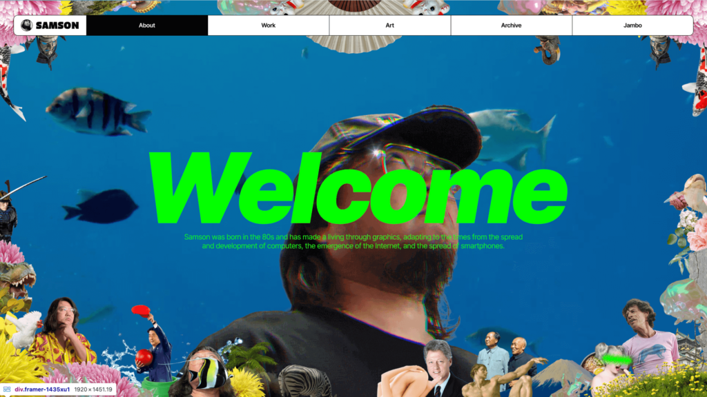
This is the personal portfolio website of Korean artist Samson. He has designed various graphics, illustrations, UI/UX, and collaborated with companies such as Naver and Samsung. It is full of the 2000s fin-de-siècle sensibility. The low-quality images and collage animations that seem to have been recorded on a VCR are unique. The artistic expression mixed with sarcastic criticism is impressive. See more and sources
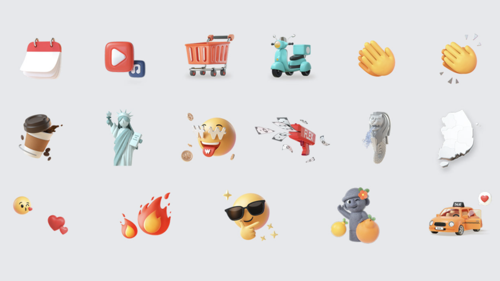
This is a 3D icon design for the annual statement created by Hyundai Card in collaboration with Hand Seoul. It is a report that analyzes customers' credit card payment information and provides insights. It intuitively expresses the content when presented in the form of a story card. It is light but dense, with a feeling between an emoticon and an illustration. See more and sources
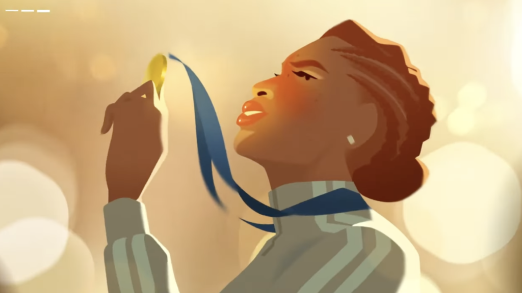
An Olympic film created by BBC Creative, the BBC's in-house creative agency, in collaboration with Nexus Studios. Celebrating the opening of the Paris 2024 Olympic Games. It combines the romance of Paris, known as the 'City of Love', with the passion of the Olympic Games, a symbol of sports. With Edith Piaf's song Hymne A L'Amour playing, it naturally connects the thrill of love and the excitement of sports.
This is the work of Parisian digital artist Laura Normand. The curves, pops of color, and glossy textures are pure pleasure to the eyes. She has collaborated with various brands and you can buy powerful posters and t-shirts in her store. See more and sources
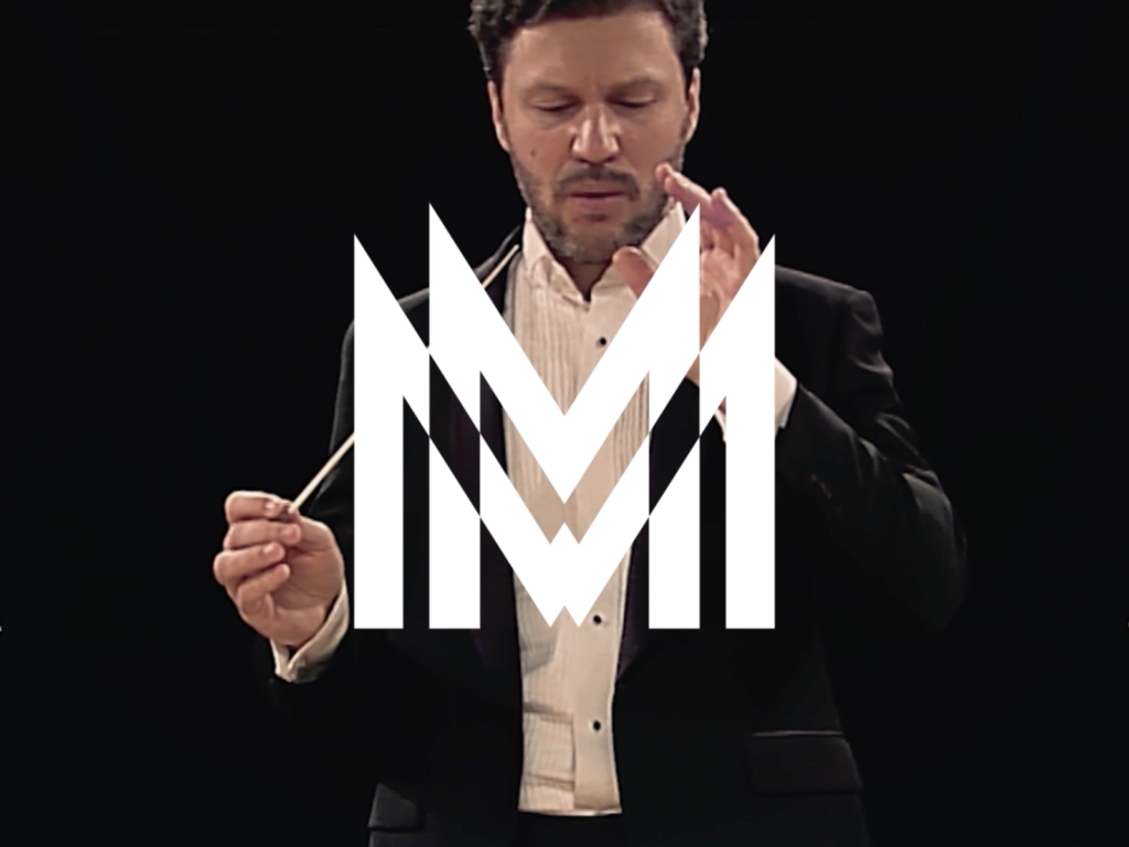
This is a rebranding project for Orchestra Sinfonica di Milano. We collaborated with brand consulting company Lando. Inspired by Italian architecture, art and design, it delivers a unique impression. The movement of sound waves representing an orchestra, a tall tower, and the avant-garde graphics of futurism were appropriately expressed. More and Sources