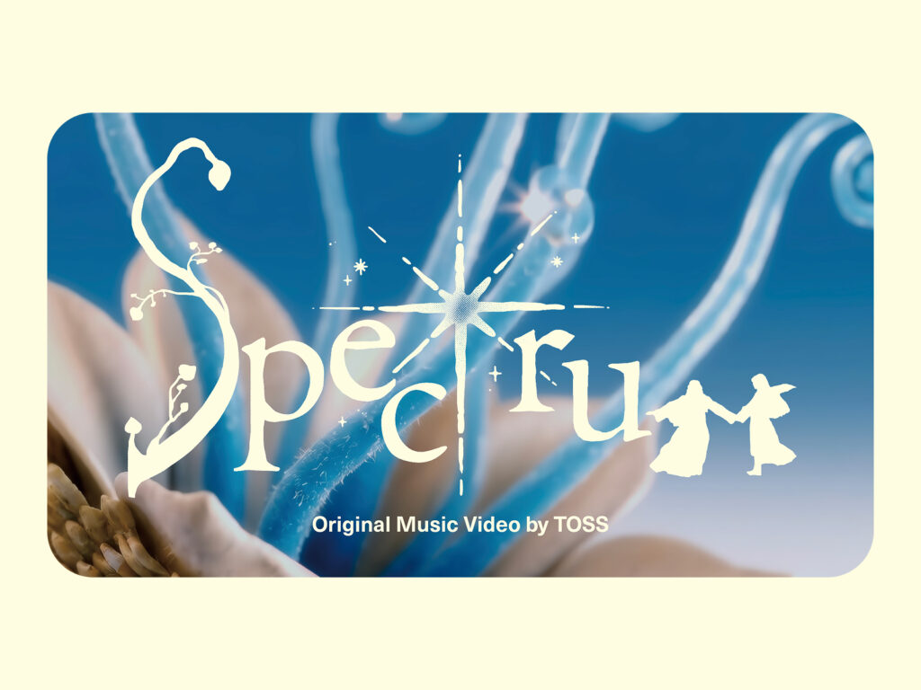
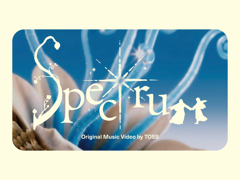
Toss has released their original music video for 'Spectrum'.
The video begins with the phrase "Spectrum," depicted in a unique illustration over warm, luminous colors. Following the question, "What kind of world do you want to live in?", a series of sensory images unfolds rapidly.
Adoi's dreamy voice flows, and the screen drifts as if floating through a dream. Flowers, trees, people. Animals and people. People shimmering in the light. The fresh yet powerful graphics, unlike anything seen before, captivate the viewer.
Previous Toss videos have often cleverly alluded to the essence of the service, such as depicting the freedom of money through a car-riding hero or depicting a con artist as a ghost. However, "Spectrum" offers little in the way of direct visual explanations of Toss. No service immediately comes to mind, even for the image.
They say it was made by Toss, but there's no financial or logo. Only the words "Toss Impact" remain in the final scene. Why would Toss make such a music video? What does "Toss Impact" stand for?

Toss has created a variety of innovations over the years. We've solved problems that people found inconvenient but accepted as "the way things are," and we've changed entrenched financial practices to provide users with the best possible experience. While the countless services born from this process have become conveniences we now take for granted, their starting point has always been the question, "Why should it be inconvenient?".
In 2015, easy remittance without having to visit the bank was the first step. While it's now a common feature, it wasn't easy back then. Since then, Toss has transformed credit score checking, once feared by people who feared it would hurt their credit score, into an easy and safe experience. It also redefined loan matching, a process that required days of complex comparisons, with Toss finding the right loan for you. With a 24/7 customer service center, insurance coverage analysis reports, free remittances, mobile stock trading, and even daily interest payments, Toss has made finance accessible to everyone.
Toss is obsessed with designing a better customer experience, naturally extending beyond the scope of traditional financial services to transform everyday life itself. We provide an easier path for those who still find finance challenging, naturally protect against risks once accepted as inevitable, and lay the foundation for everyone to challenge themselves and grow, helping them move forward with hope.
Toss decided to share the impact and changes it has made on society over the past decade in one place. That's Toss Impact. When we think of corporate social responsibility, there's an image that immediately comes to mind: a webpage typically featuring detailed articles detailing accomplishments and photos of people smiling happily.
Toss went one step further here and expressed Toss Impact in a unique way.
The first thing that catches your eye on the Toss Impact website is the beautiful visuals on the home screen. Starting from the dot of the "i" in Impact, waves of light resembling the Toss symbol spread across the screen. The depiction of chromatic aberration, where colors blur as light passes through the logo and slogan, adds to the real-world feel.
Toss has redefined the standards of finance by focusing on user inconvenience. Even after designing a near-perfect experience, it has always been obsessed with improving it. Now, it is expanding its innovation beyond finance to encompass everyday life.
While this expansion could be seen as a puzzle piece or a staircase representing business achievement, Toss represented the spread of influence with a graphic of warm light expanding.

The logo uses a thick, solid font, befitting the word "impact." The omission of the toss symbol is also striking, suggesting an intention to focus on the project's purpose and values rather than highlighting the brand. The contrast in the thickness of the toss and impact fonts visually emphasizes the power and weight of the concept of "impact.".

The overall color palette is also striking. Focusing on Toss' signature blue, we've added warm, sunlight-like tones throughout to neutralize the overall temperature of the screen. The gentle blend of cool and warm colors further reinforces the message of inclusiveness and warmth.

Minimizing visual contrast between the borders separating information in the UI creates a smooth visual flow. In particular, the unique gradient within the UI cards naturally shifts the screen's center of gravity from the title on the left to the content area on the right.
The illustrations also contain textures and colors that seem to be bathed in warm light, creating emotional empathy beyond functional explanations.

Toss chose a music video as its first campaign to announce the launch of Toss Impact.
The music video "Spectrum" doesn't showcase the future Toss will create, but rather captures the future we all dream of. The indie band Adoi, along with 16 visual artists with their own unique perspectives, participated. Each with their own distinct personality, the possibilities are limitless, encompassing handcrafted, 2D, 3D, AI, live-action, stop-motion clay, and even mixed media. Yet, the music video seamlessly connects as a single work of art.


Without any explanation, the film conveys sensations and emotions through music and images. While blue is central, it doesn't dominate the entire screen. Each artist's unique tone and mood are captured, creating the impression of an art movie. This heterogeneous yet non-conflicting combination creates the feeling that different imaginaries of the future are united into a single dream.
Music and video are the most direct ways to touch the human heart. Instead of directly describing the future he envisions, Toss collaborated with artists who excelled at expressing emotions in their own unique ways, expressing the dreams of all. Rather than focusing on proving himself with quantitative figures, he used music videos to express his desire to embrace and harmoniously connect everyone's dreams.


One of the most challenging challenges for brands when communicating their message is balancing their brand identity. If the brand presence is too weak, communication can become fragmented and confusing for the audience. Conversely, if the brand presence is too strong, it can quickly become boring, giving the impression that the message is being forced.
Especially in projects that showcase one's accomplishments, the inertia of repeatedly using brand-symbolic graphic elements is strong. Naturally, they rely more on brand "colors" and "shapes," and often, new messages end up getting buried in the brand's decoration.
But Toss didn't follow that pattern for this project. True to its heritage, it avoided repetitive patterns and instead designed from a completely different perspective, tailored to the message it was trying to convey.
Attempts to convey a new message while maintaining the graphic language that symbolizes Toss are evident throughout. Deep consideration is evident in how to visually express concepts like "future," "dream," and "heart," which are difficult to describe in words. Particularly striking is the way the gradient is gently applied to create warmth without compromising Toss's primary color, blue. This approach could easily make the brand's signature color appear colder, but the team meticulously adjusted the saturation and brightness of the signature color, pairing it with lighter, warmer tones to achieve a fine balance. This is a prime example of how message and visual expression harmoniously coexist.
Toss envisions a future for everyone, not just a future it desires, and has always expressed that vision through unique designs. This project embodies that philosophy. We look forward to and support the new future Toss will create.
*This article was written with support.