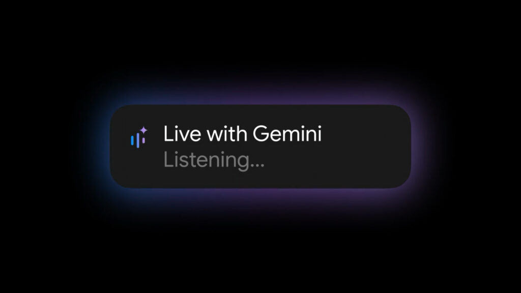
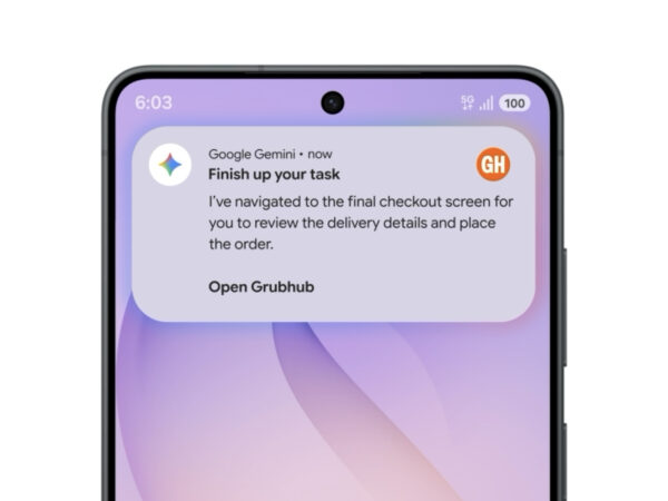
구글이 포르투 로챠와 협업해 만든 제미나이 브랜드 디자인입니다. 제미나이는 기존 ‘바드(Bard)’라는 이름으로 알려졌던 구글의 생성형 AI 서비스입니다. 그러나 AI 기술이 대중화되면서 초기의 참신한 언어와 상징들이 점차 범용화되었고, 구글은 브랜드 정체성 재정립의 필요성을 느끼게 됐습니다.
이에 따라 구글은 제미니를 단순한 기술 브랜드가 아닌, 새로운 세대를 위한 ‘구글 매직’으로 포지셔닝했습니다. 브랜드 리디자인의 핵심은 ‘스파크(Spark)’였습니다. 스파크는 제미니의 마법을 시각적으로 구현하는 상징으로, 사용자의 호기심을 자극하고 탐색의 출발점이 되는 요소로 활용됩니다. 움직임을 통한 표현은 인터페이스 속 내용을 드러내고 제미니의 도움을 직관적으로 전달합니다.
시각 디자인 전반에는 인간의 입력과 AI의 출력 간의 상호작용이 반영됩니다. 이는 제미니를 능동적인 파트너이자 발견의 원천으로 보여주는 중요한 시각 언어입니다. 구글은 기존 제품군과의 통합성을 유지하면서도 제미니만의 개성을 살린 디자인 시스템을 개발했으며, 사용자 경험의 본질에 집중해 복잡성을 최소화하고 핵심 정보에 집중하는 UI를 선보였습니다.